For eCommerce stores, if there is one element which is having a great impact on its sales is the product page design.
You must have also shopped online. Almost everyone does these days. Have you ever purchased any product from an online store having a cluttered and poorly designed product page?
Of Course Not.
The Product page is the place where most of the time customers decide whether to buy the product or not. Thus, should be effective enough to convince the customers to buy from your store.
Let’s have a look at the product page design practices which can improve sales and conversions on your online store.
Table of Contents
1. Product URLs
Product URLs is a vital part of a product page which should not be ignored. You might be thinking as to how a product URL can affect the conversions? A product URL which clearly specifies the destination you are going to land on clicking it can be considered as the perfect one.
This would help in increasing the CTR (Click Through Rate) of your website and improve sales.
2. Product Titles
Product title is something which is first shown to your prospective customers before they even enter your store. Yes, in SERPs, your product titles are shown and should be attractive enough to make people click on it.
Agreed, that product titles should be SEO friendly but they should not be stuffed with keywords. Your product title should make sense for humans too. Google considers user intent above anything else these days. So, keeping that in mind write a simple and precise title for your product.
3. High-Quality Images & Videos
The biggest challenge of selling on the online store is that your customers cannot touch and hold your product. The options left with you through which you can make them feel the products are images and videos.
- The quality in terms of resolution and size of product images should be appropriate on your product page.
- The product images should be zoomable so that your customers can view the products in detail.
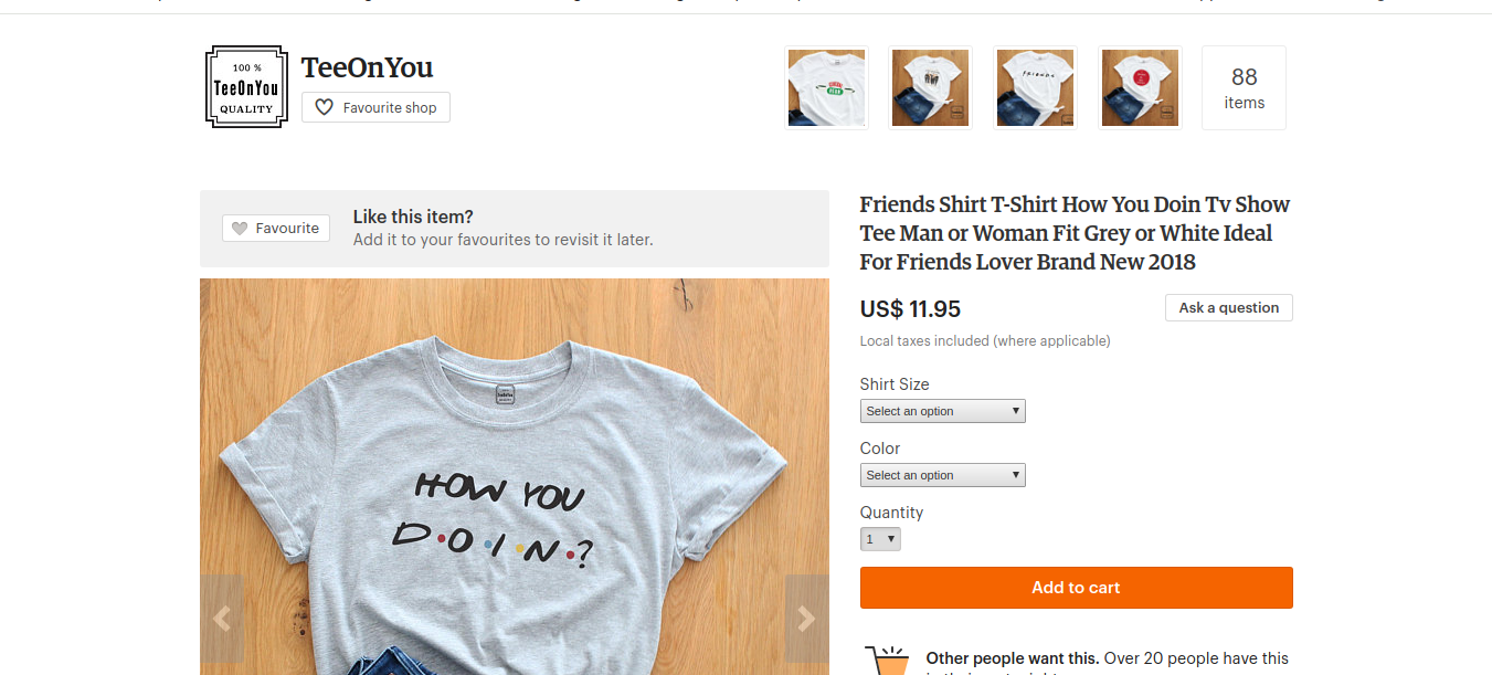
- Multiple product images should be given from different angles. For example, if you are selling a dress, you can display different photographs showing the front, back, side, and the neckline of the dress.
- Maintain consistency in terms of the background of the images to give a professional look to your online store.
As far as videos are concerned, the how-to-do videos telling about how to use the products are very popular these days. If you are selling such kind of products which require giving instructions on how to use them, you can embed a how-to-video. People prefer to watch interesting videos rather than reading the long and boring text.
As per a recent statistical report, companies using video enjoy 41% more web traffic from search than non-users.
4. Unique and Persuasive Product Descriptions
To convince a customer to buy a product, you need to display maximum information about the product. Keep the product description unique. Just don’t copy it from a respective brand site if you are selling a branded product.
Also, you need to ensure the style in which it is written. No one would like to read long paragraphs. Keep it short and crisp. Use bullet points, as that would be easy for your customers to read the specifications of the product.
Your product description should be convincing enough to sell your products. Mention what is unique about your product and how its qualities would help your customers.
Any detail of the product lacking in the product description can make your customer leave your website and move on to another online store. So, this can be a quite crucial element of your product page.
5. Size Chart
Having clothing & accessories online store? If yes, a size chart becomes a must-have for your online store. It is quite frustrating to receive a size which doesn’t fit well with your customer. Thus, the customers always want to have a look at the size chart before they purchase confidently.
6. Appealing Call To Action
The call to action which can be “Add to Cart” or “Buy Now” buttons should be appealing enough for your customers to click. Choose a suitable location and color for your call to action button so that it is easy to find and use by your customers.
Also, ensure that it works properly before your website goes live. Test it properly and check its functionality.
7. Customer Reviews
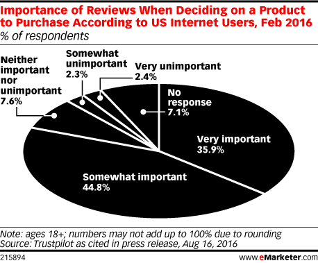
People these days look for customer reviews before they buy the product online.
As per eMarketer report, for 35.9% internet users, reviews are very important, whereas, for 44.8% internet users, reviews are somewhat important while deciding whether to purchase a product or not.
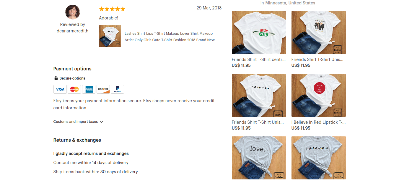
Reviews make it easy for customers to make purchase decisions. So, encourage your past and present customers to post positive reviews about your products and improve conversions.
8. Trust Badges and Seals
Having trust badges and seals on your product page would help you in gaining the trust of your customers. Especially, if your brand or store is not very popular, the winning trust of first-time buyers is very important. When there are so many eCommerce frauds going on, people are reluctant towards trusting any online store without trust badges and PCI (Payment Card Industry) Certification.
9. Transparent Information
If you are a customer and after reaching to the checkout page, you come to know that you need to pay more than the product price for the shipping will you buy the product?
Or, If you come to know on the checkout page that you would receive the delivery after 10 days and you require it within 1-2 days, will you buy the product?
Of course not.
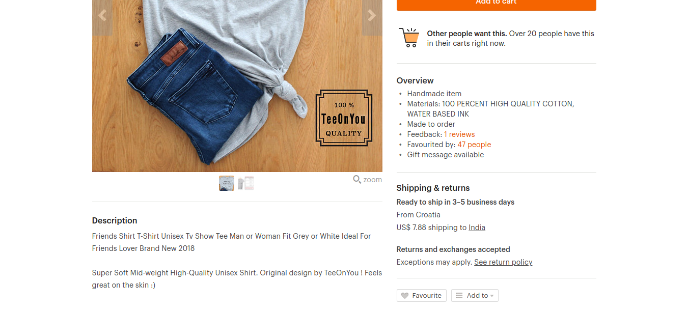
Clearly mention the shipping cost and delivery time on the product page itself. Otherwise, you would face abandoned cart problems later.
You can go through – 6 Steps to Plan a Perfect Abandoned Cart Recovery Campaign
Also, provide a link to the return policies on your product page, so that your online shoppers can buy with confidence.
10. Breadcrumbs
The breadcrumbs on your product page make your store user-friendly. After landing on your product page, if your shopper wants to go back to the product catalog, the breadcrumbs make it easy for them to navigate easily.
This would not only help customers but also help you by reducing the bounce rate of your online store.
11. Optimized Page Speed
You might be having a beautiful design with appealing images and video on your product page, but if it doesn’t load quickly, you might end up losing customers.
“2 seconds is the threshold for eCommerce website acceptability. At Google, we aim for under a half-second.” Maile Ohye, from Google.
Moreover, the customers who have found that your website doesn’t load quickly, are never likely to return back to your store again.
12. Responsive
With so many devices and platforms available these days, you never know from where your customer is browsing your store. Keep your store responsive so that it is best viewable on other devices besides desktop-like smartphones, tablets, etc.
Besides being viewable properly, your product pages should be loading quicker and providing a seamless checkout process on all the devices.
13. Option to Subscribe
Selling subscription-based products has become trendy these days. If you are selling grocery or any kind of beauty product which is required regularly, you can provide a discount if the customer subscribes to that product.
By providing this option, you are guaranteeing the purchase of the same product for months altogether and ultimately increasing revenue.
14. Social sharing buttons
You can also ask your customers to share their purchase from your store. If it is a unique product, it can attract many other buyers too from social media platforms.
This is a clever way to market your products on various social media platforms where users are increasing day by day.
15. Customer Support
What if your customer is having a query and is stuck up on your product page not able to decide whether to buy or not? Give them options to contact you instantly from the product page itself.
Those options would be to get live chat integrated as well as providing information about the phone number and email id. Ensure, that your live chat and phone is available 24/7 for your customers and email is responded as quickly as possible to retain the customers.
16. Live Stock Level
To create a sense of urgency on your product page, you can show the livestock level of that particular product. If the buyer is desperate to buy the product and finds that the quantity is low, they are likely to purchase instantly.
Also, you can show how many people have purchased that product. This can also encourage online shoppers to buy the product.
17. Show Related Products
Related products recommendations on the product page can increase the cart value and overall revenue of your online store. This is not only beneficial for you but also makes the job of finding related products easy for your customers.
It saves your customers’ time and if you give them customized recommendations, the way Amazon gives, they would like to come to your store on a repetitive basis.
18. Visibility on Google
Last, but most important is the visibility on Google.
All the above tactics will fail if your product page fails to rank well in search and get visitors.
Ensure, that you have used proper meta tags, Heading tags and assigned relevant ALT tags to the images in order to get ranked in Google search engine result pages through keywords relevant to your products.
Product Page Design Practices – Final Considerations
Your eCommerce website sales depend on how well you have designed your product pages. Everything from product title, images to call to action, each and every element of your product page can affect your sales figures.
None of the above aspects relating to product page design can be ignored to create out-of-the-box and superior product pages.
If you have any questions on the above-mentioned product page design practices, you can get in touch with QeRetail – an agency helping eCommerce companies in designing, managing and marketing their websites.


