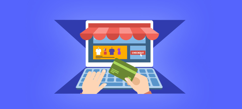
As per the recent study by Statista, around 77% of carts were abandoned. This means 3/4th of your customers leave your online store without purchasing anything.
The questions arising in your mind would be what can you do to stop your customers from abandoning shopping carts on your store and checkout after completing their purchase?
For that, you need to ensure that your checkout page is persuasive enough to keep your customers engaged with your store and complete the purchase.
Unlike, physical stores, you don’t have salesmen appointed to continuously convince your customers to complete their purchase. On the contrary, there are many challenges which online stores face like –
- Shoppers don’t trust online stores easily while paying online.
- Shoppers never like to pay extra shipping charges.
- Shoppers didn’t find preferred shipping option on your store.
- Shoppers required customer support during checkout but could not find that in your store.
There are many such problems which online shoppers may be facing, that can be answered by following checkout page optimization techniques.
Checkout Page Design
A checkout page is a place where most of the buyers take a decision whether to buy or not. A professionally designed checkout page with enough white space and attractive use of colors can have an effect on the purchase decisions of your customers. Additional steps would be –
- The checkout button should be on the top as well as bottom of the page. The customers should not be spending much of their time in looking out for the checkout button and so it should be clearly visible on the page.
- Add credit card logos and security seals to your checkout page. Your customers should perceive that they are buying from a secure online store.
- Give an option of “continue shopping” on the checkout page to your customers so that they can add the products to the cart if they have forgotten. Pressing back button to add other products and coming back to the checkout page having no products added previously can be frustrating for your customers.
- Asking your customers to register on your site before they purchase might be annoying for them. If you ask them to checkout as a guest and just ask for their email id during checkout, they would very well do that to track their product delivery.
- The color of checkout button and continue shopping button should be different as the customer might click the wrong one by mistake.
- The customers should be able to add the products to the wishlist if they are removing from the cart on the checkout page. This would help them remember the products for their future purchases.
- On the checkout page, the links like shipping policy, returns and refunds policy, customer support, and FAQ should be included oto help your customers if they have any queries during checkout.
- Get a live chat integrated to your online store as that can solve the queries of your customers while they check out.
Product Details Optimization
After you have ensured that your checkout page is having an attractive design, the next step would be to ensure customers that they have purchased the right products as per their specifications. Here are some relevant aspects which should be taken care of on your checkout page –
- Include the summary of each product including its size, color, brand, etc., as that would ensure the customers that they have made the right choice as per their needs.
- The customers should be given the option of editing the quantity of the product or removing the product from the cart on the checkout page.
- Provide relevant product recommendations on checkout page which can encourage them to buy more products from your store.
- If the customers come to know that the products they are ordering are not in stock on the order page, they get disappointed. Better let them know that on the checkout page itself.
- Show the actual price of the products on the checkout page to the customer after adding shipping and taxes if any. Don’t surprise them with additional costs on order page.
- Including gift wrap option would add a personal touch and give an extra convenience to your customers. So, if this is relevant for your products, this option should be given to your customers on the checkout page.
Shipping and Payment Options
Most of the shopping carts are abandoned because they feel that it’s not worth paying shipping costs or some hidden costs which online stores fail to inform at the time they are adding the products in their cart. There are some aspects, which can convince your buyers answering to this problem –
- Providing free shipping on a specified order amount can solve your problem and your buyers’ concern of paying extra bucks for shipping. On the contrary, to avail free shipping, the buyers may add some more products from your store to increase their order amount.
- By providing multiple shipping and payment options on the checkout page, the customers can decide how quickly they want to receive the order and the payment mode they would like to use to pay for the order.
- Provide discount codes on the checkout page itself. Searching for a discount code on different coupon sites can create uncertainty in the minds of your customers and might encourage them to abandon your store.
- Inform an approximate date of delivery to your customers on checkout page itself, if you are not able to provide them different shipping options. This will help your customers to know when their delivery will arrive if they order now.
- Give them a profitable deal on the checkout page. For example, if you include the statement “This product would be available at 10% discount if you order within an hour.”
Special Deals and Rewards
You not only want your customer to get through the checkout page at present but also make them ready for the future orders. So, here are some tactics which can help you to make your customers return for their future purchases –
- Provide your customers information about special deals, cash back or rewards which would be given to them for their future purchases if they complete their present purchase.
- Allow your customers to set up notification alerts for receiving the information about discounts offered by your store in future.
Testing Checkout Page Optimization Techniques
Last but not the least, keep on testing these checkout page optimization techniques and analyze which ones got you the highest conversion over a period of time. Your customers are likely to surprise you by responding differently to your applied techniques.
In that case, it is always worth testing and updating your online store with these checkout page optimization techniques and finding new ways to improve conversions on your online store.
Need help in optimizing checkout page on your online store? Get in touch with QeRetail – an eStore Handyman offering designing, managing, and digital marketing services for eCommerce stores.


