In the world of eCommerce, landing pages serve as powerful gateways to success. A landing page is a standalone website page dedicated to a specific marketing campaign that is meant to convert site visitors into leads. These dedicated web pages are crucial in capturing visitors’ attention, sparking their interest, and ultimately driving conversions. The average conversion rate of a landing page across all industries is 9.7%, seeing that it is a good conversion rate.
With the 4th of July approaching, eCommerce owners have a prime opportunity to leverage landing pages and boost sales. In this blog post, we will explore the best practices for designing an irresistible 4th of July landing page that captivates your audience and motivates eCommerce sales. Let’s dive in!
Table of Contents
What is a Landing Page and Why Do Ecommerce Owners Need One for the 4th of July?
A landing page is a focused web page designed to drive conversions. For eCommerce owners, creating a dedicated landing page for the 4th of July can yield tremendous results. Here’s why:
Targeted Promotions:
A 4th of July landing page allows you to tailor your offers specifically for the holiday, capturing the attention of eager shoppers.
Higher Conversions:
By directing traffic to a dedicated landing page, you create a seamless user experience that guides visitors toward making a purchase or taking the desired action.
Personalized Experience:
A well-designed landing page enhances the user experience, increasing the likelihood of converting visitors into loyal customers.
Statistics highlight the impact of landing pages:
- Companies with 10-15 landing pages experience 55% more conversions (HubSpot).
- Top-performing landing pages achieve conversion rates of 5.31% or higher (WordStream).
- Redesigned landing pages result in an average conversion rate increase of 27.4% (Unbounce).
To ensure your 4th of July landing page stands out and entices visitors, follow these best practices:
Best Practices for Crafting an Irresistible 4th of July Landing Page
To ensure your 4th of July landing page stands out and entices visitors, follow these best practices.
1) Choose a Relevant Offer: Igniting Customer Interest with Tailored Promotions
To make your 4th of July landing page irresistible, start by offering a promotion that aligns with the holiday spirit. Tailor your discounts or special deals specifically for the occasion to capture customer interest.
2) Craft a Compelling Headline: Sparking Patriotism and Curiosity in a Few Words
Grab attention with a compelling headline that evokes patriotism and curiosity. Use concise and impactful language to spark interest and encourage visitors to explore your offerings further.
3) Use High-Quality Visuals: Illuminating the Path to Purchase with Stunning Images
Enhance the visual appeal of your landing page by incorporating high-quality images that showcase your products or the holiday theme. Visuals have a significant impact on customer engagement and can influence purchase decisions.
4) Write Clear and Concise Copy: Guiding Customers through a Captivating Narrative
Craft clear and concise copy that tells a captivating story. Guide customers through the benefits of your products or the excitement of the 4th of July celebration, highlighting how your offerings can enhance their experience.
5) Use a Clear and Prominent Call to Action: Directing Customers Toward Conversion
Include a clear and prominent call-to-action (CTA) button that stands out on your landing page. Make it easy for visitors to take the desired action, such as making a purchase, signing up, or exploring further.
6) Use Patriotic Colors and Imagery: Infusing Red, White, and Blue into Design Elements
Infuse your landing page with patriotic colors like red, white, and blue to create a strong visual association with the 4th of July. Incorporate patriotic imagery and elements to evoke the holiday spirit.
7) Offer Exclusive Deals and Discounts: Lighting Up Sales with Limited-Time Offers
Create a sense of urgency and drive conversions by offering exclusive deals and discounts for a limited time. Highlight the time sensitivity of the offers to motivate customers to make a purchase.
8) Personalize Your Landing Page: Creating an Engaging and Tailored User Experience
Tailor the content and messaging of your landing page to create a personalized experience for visitors. Use data such as their location, browsing behavior, or previous interactions to deliver relevant and engaging content.
9) Make It Easy to Share: Amplifying Reach through Social Sharing Buttons
Include social sharing buttons on your landing page to encourage visitors to share your offers with their networks. By making it easy for them to spread the word, you can amplify the reach and potential impact of your 4th of July promotions.
10) Keep It Simple: Streamlining Design and Navigation for Seamless User Experience
Simplify the design and navigation of your landing page to create a seamless user experience. Remove any distractions and focus on guiding visitors toward the desired action, ensuring a smooth path to conversion.
By implementing these best practices, you can create an irresistible 4th of July landing page that engages visitors, boosts conversions, and drives eCommerce sales.
Examples of Irresistible 4th of July Landing Pages
Here are two examples of irresistible 4th of July landing pages from good well-known brands:
Example 1: Ignite Excitement with a Captivating Landing Page for a 4th of July Sale:
Brand: Walmart
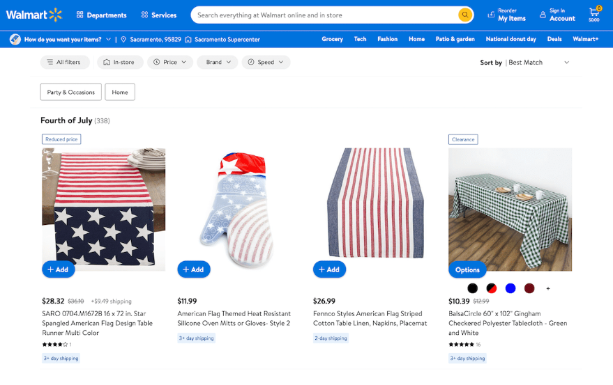
Headline:
Independence Day Blowout Sale: Unbeatable Deals for a Limited Time!
Subheadline:
Save up to 50% on everything you need to celebrate Independence Day in style.
Image:
A vibrant background with fireworks imagery and patriotic colors. The headline boldly states, “Independence Day Blowout Sale: Unbeatable Deals for a Limited Time!” A carousel of product images showcases the discounted items, accompanied by persuasive descriptions and prominently displayed discounted prices. The CTA button “Shop Now” is strategically placed above the fold, drawing visitors’ attention and guiding them towards the conversion.
Example 2: Engage and Delight Customers with a 4th of July Giveaway Landing Page:
Brand: Old Navy
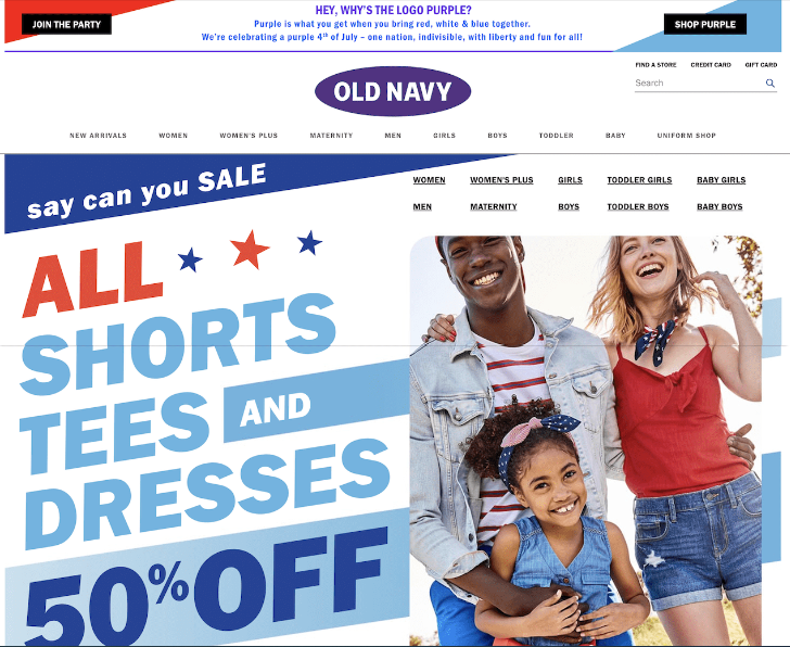
Headline:
Celebrate the 4th of July in Style with Old Navy
Subheadline:
Save up to 50% on patriotic outfits and gear for the whole family.
Image:
A group of friends having a 4th of July barbecue, all dressed in red, white, and blue. They are laughing and talking, and they look like they are having the time of their lives. This landing page is also effective because it uses patriotic colors and imagery to create a festive atmosphere. The headline is clear and concise, and the subheadline provides more information about the sale. The image is high-quality and captures the attention of visitors. The call to action is strong and encourages visitors to convert.
Conclusion: Test, Optimize, and Stay Current for Landing Page Success
Crafting an irresistible 4th of July landing page requires careful planning, creativity, and attention to detail. Remember to continuously test and optimize your landing page to maximize conversions. Analyze data, gather feedback, and make data-driven improvements to enhance your landing page’s performance. Additionally, stay current with design trends and customer preferences to ensure your landing page remains engaging and attractive. Qeretail is here to help and be your partner in achieving landing page success. By implementing these best practices and drawing inspiration from the showcased examples, you’ll be well on your way to boosting e-commerce sales this 4th of July.
Happy Independence Day!!


