When we look at an e-commerce website with a bird’ eye view; as a whole, we see a normal website with a functioning UX and a routine checkout process. An e-commerce website from the macro-level is nothing but an online store with online aisles and electronic bill counter.
It’s when we look at it at a micro-level, all the elements come into picture bit by bit. A perfectly functioning website has each one of those elements vastly optimized.
Often times, online store owners get into pipe dreaming with the website’s front end display. A major chunk of their focus gets drained into the design part and in that process one of the most important part of online shopping, Checkout, gets overlooked.
This is where most businesses lose their customers, cart abandonment. Over the years, marketers and e-commerce experts developed multiple ways to tackle this and increase conversion at checkout.
Here are 5 ways to a complete Checkout Page Optimization for your BigCommerce store
1. Make your images more clear, crisp, and HD
Online shopping is by and large a complete visual experience. Overall aesthetics of the website and how the products look online, matter the most for a customer.
This calls for a display of as detailed image as possible so that the customer can know what they are buying. High quality and meticulous images should be used throughout the complete checkout process. This helps gain the customer’s trust.
2. Keep it easy to reach out to you
If they cannot find you, they will not trust you. To increase your credibility with shoppers, display your phone number very clearly on every page. This ensures users that your business is not a balloon that will fly at the first sight of dawn.
Try A Free Sample Today
If there is any problem with the product or services they are buying, customers know that your business is just a call away. This further increases the credibility and decreases the customer’s intent to abandon shopping.
This has ought to be one of the most underrated techniques of checkout page optimization.
3. Keep you cart page process simple and easy
A customer has already traveled a long way to the checkout, the key is to keep things as simple as possible. Your customer’s cart should epitomize all that the user has added to cart with the proper instructions for the next step.
Make sure you do not include any unnecessary instructions and remove the clutter. Keep the call to actions on the page very clear. This means, If the next step is to choose shipping method, it should be self-explanatory to the customer. You can also use a simple type of progress indicator for your BigCommerce store.
4. Use Trust Seals
Would you buy from a website that has not been verified and looks suspicious? No one would risk making a payment on a website that has not been verified by security firms.
No sooner does the customer reach the card form field, than they start to become paranoid. This is where they will most definitely expect the trust seals to be displayed.
If you have a BigCommerce store, displaying the following trust seals is recommended:
- Merchant reviews / rating (e.g. rated 4.9 / 5 based on 100,000 orders)
- SSL certificate and mention of secure shopping experience. You could also potentially look at third party security validation, such as Norton, McAfee, GeoTrust etc
- Very clear customer service / help, returns and T&Cs links
- Logos of available payment options (and ideally payment certification – e.g. verified by Visa)
- Any other business accreditations
Among various research, Paypal, Norton, and Visa/Mastercard scores the most when it comes to placing trust for the users.
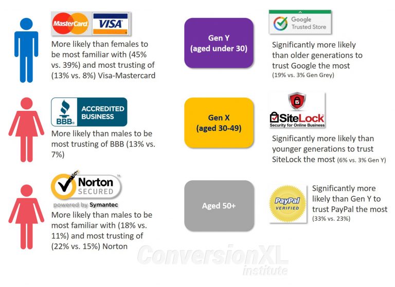
Source: Conversion XL
5. Allow users to pay with various options
No one would like to be restricted when it comes to shopping their product of choice, then why would you bring those restrictions when it comes to payment?
Not every customer has access to or has the same payment service provider with them across the world. Even in a single city, different customers use different payment methods. Providing different payment methods makes customers feel your website is reputed.
Following are the payment service providers recommended for BigCommerce stores:
- Klarna
- Adyen
- Digital Wallets: Apple Pay + Amazon Pay
Final Word
Your online store’s checkout page is undoubtedly the most important part of your online store. Your conversion and sales are measured at your website’s checkout.
Website’s design, look and feel help in building trust among the users. The checkout page is where that trust gets tested. Reducing friction and making the complete process effortless should be the prime focus.
Offer everything that you can to the customers. Make the buyer’s journey a vacation for them and not a tiring field-trip.


