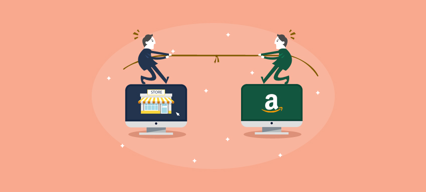
According to CNBC News, Amazon was responsible for about 44 percent of all U.S. e-commerce sales. Rest 56 percent is still approachable right?
Just remember – “Good things come in small packets.”
Many buyers still go to small online retail stores instead of big marketplaces like Amazon. What may be the reasons?
- Looking for a niche product
- Require simplicity in navigation (Marketplaces are huge and have lot many categories to confuse the buyers)
- Brand loyalty
These are the reasons, due to which many people rely on small to medium online stores for their requirements.
To use these reasons to your advantage, you require building a website which is a pleasure to use.
Just go through below-mentioned web design tips which would help you in presenting an aesthetically beautiful, well functional website providing the best user experience in front of your buyers –
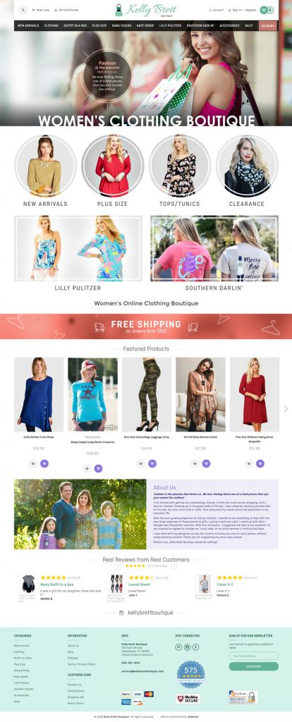
Uncluttered Design
Have you entered a brick-and-mortar store with dust all over and disorganized, smelling really very bad? Would you buy from there? Of course not.
Same is with online stores. A cluttered homepage with lot many elements and no white space would not give an inviting feel to your customers.
The neat design of your online store would form a good impression in the mind of your buyers. It would give a feeling that there is a reliable company behind this online store.
Quick Loading Speed
Your customers would feel good if your online store takes minimum time to load. They don’t like waiting for images to get downloaded or if there is a timeout error, you know what would happen. They would just close your website and look for their required products on Amazon or other marketplaces.
Concise Product Selection Options
You must be knowing that Amazon has a wide range of product selection options. Obviously, your store cannot give as many options as Amazon, but you can, of course, give better options.
It is a myth that giving too many options can encourage sales. Actually, providing better quality options can drive sales. Many times giving less number of product options can help customers to decide their product as soon as possible and eliminate their confusion of which one to select.
Convincing Product Pages
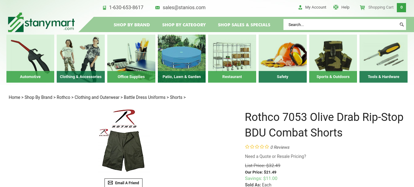
The product page is the most important part of your eCommerce store, where you have maximum opportunities to convert a customer. There are some elements which you need to ensure to have a perfect product page –
- High-quality product images
- Detailed product description
- How-to-do video or product explanatory video (if relevant)
- Attractive call to action
All the important elements required to convert should be placed above the fold of the page to be easily noticeable for your visitors.
Easy Checkout Process
Your customer has put in a lot of time and efforts in selecting the product and has reached to the checkout process. So, now if the checkout process is tedious, it can eat away all the efforts you have done to driving the customer to your store and convincing them to buy the product.
Just ensure that you have a seamless checkout process on your store. Allow your customers to checkout as a guest, not forcing them to sign up on your website in order to complete the purchase. Also, ensure secure payment process so that the customers can buy with peace of mind.
Competing with Amazon: Surpassing Web Design Tips
Besides your online store design, there are other factors also which can help you in competing or beating Amazon.
- Focus on your niche market.
- Provide multiple shipping options.
- Introduce a subscription service.
- Keep the price competitive.
- Leverage best customer support. For example – live chat integration.
- Ensure that your store is search engine friendly.
- Build fantastic social media presence.
Competing with Amazon is something which seems to be difficult for most of the small to medium online stores. But, with some web design efforts and keeping your store updated with latest trends can really help you in winning over the market and compete with Amazon successfully.


