Whenever a person visits an eCommerce store they don’t have a mental algorithm against which they test your store’s design. Whether an eCommerce store design will make a lasting impression on a visitor’s mind depends on few direct but crucial factors which are universally true for all eCommerce store, irrespective of which domain they cater to.
Easy to Understand Navigation
The navigation by any assumption can’t be complicated and hard to understand. The moment a person lands on your website they should be able to figure out the navigation and know-how of your eCommerce web store within few minutes.
Too many menu options and call to actions is going to drive the visitor crazy and they may end up getting annoyed. The longer it takes people to understand the navigation, the more likely they will leave your website for good.

Don’t hold yourself back for the sake of keeping the layout simple, you are free to work around and design elements as far as you don’t rob the website of its ease.
Balancing Familiarity and Uniqueness
People are often habituated to see websites which more or less following a common pattern. For example the description of product is generally adjacent to the product image. It is generally written in bullet point format.
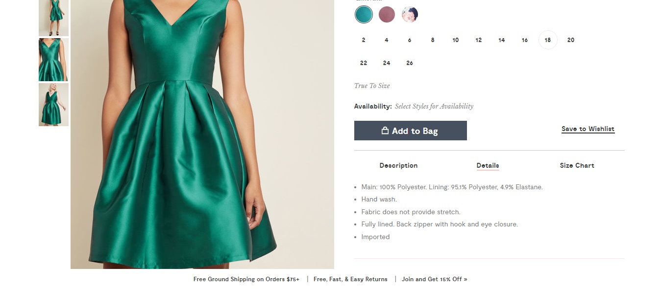
How would you react if you saw the description on the left and the product image on the right? Well, check out this eCommerce website.
Well you can check out their English version as well to see how it affects your version.
One should strictly avoid doing something which is completely against the norm. For example removing all the Call To Actions from the pages just for the sake of making them look different.
You may study websites like Amazon, eBay etc. for eCommerce store design inspiration and observe how they have standardized certain features on their website. These changes have been implemented based on their extensive study of their wide user base.
Reviews and Testimonials
People are more likely to buy a product which offers numerous reviews and testimonials. Amazon has adopted a format where it displays the most positive review alongside the most critical review. This section is undeniably critical and easy to manage as it is user generated.
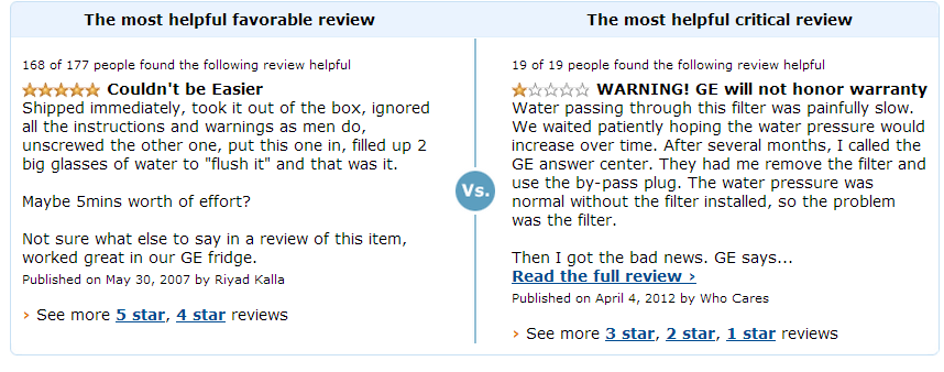
Before buying any product a visitor is most likely to check out the reviews and if they can easily find them, then your eCommerce store design has done its job.
Clearly Defined Checkout Process
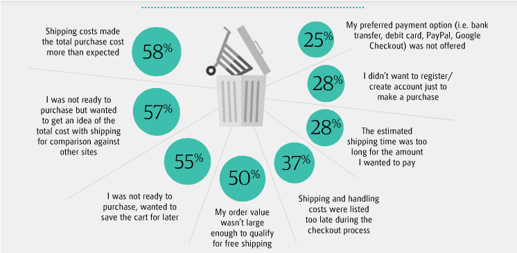
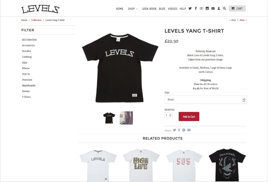
The most critical stage during the buyer’s journey is the checking out process. It is also the stage which experiences highest bounce rates for any eCommerce store. The solution: Ensure all payment and logistics related information is clearly mentioned on the page. You have to be transparent and upfront about any charges that your customer has to pay. This saves them from any last moment surprises.
The rest of your eCommerce store design should also deploy a clearly defined pathway to reach the cart page. Make it as simple as possible, preferably a single click check out process is the ideal situation.
Never Too Far to Reach Out
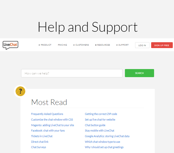
You should always try to make your customer feel at ease with easy to communicate channels. They may not be interested to buy yet but they might have questions about your products, services and other things. Use a chat messenger and always be pro active to let your customers know that you are always accessible.
Make your contact page welcoming and easy to comprehend. You can even create an informative FAQ section for visitors. Showing your customers that they can approach you even for the most common query goes a long way in building your brand identity.
Quick Loading Time
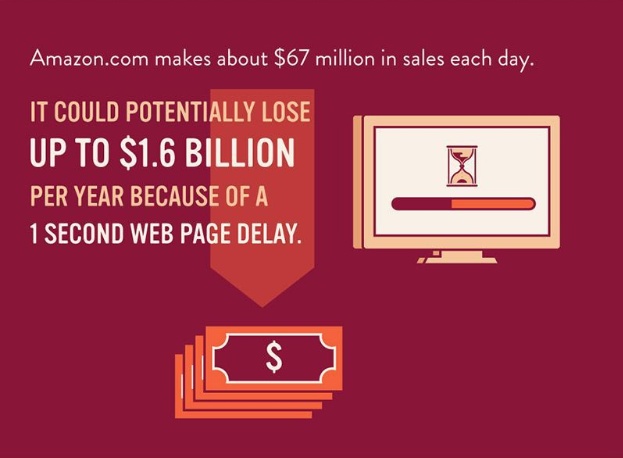
Website loading speed depends on a lot of factors like internet speed, website pages, images etc. While choosing the images for the website, you can optimize them for faster loading speed. Slow website loading is a major sales killer for any eCommerce store.
You can compromise on the aesthetics part a little bit for the sake of retaining the customers for a longer duration.
Shipping Details and Trust marks
Assuring your customers of consistent and standardized delivery service is a sure shot way to earn their long term trust for your brand. Your logistics partner may need to have a deep understanding of your commitment towards your customers and how package delivery plays an essential part in the whole customer experience.
Your idealistic nature may urge you to offer a world class service to your customers which may not be practical for your logistics partner to fulfill. In this scenario, you must be upfront about your delivery standards on the website to avoid any confusion.
Your website should also clearly showcase all the security badges (trustmarks) which assures the visitor that his or her banking/credit card details will be safely handled. This also boosts your brand image in front of your customers by showing them that you are sensitive towards their transactions.

Bonus Rule: Sport The End User Mentality
Develop the end user mentality when it comes to designing your eCommerce store. This will keep you hooked in the shoes of your audience all the time. And it will prevent you from implementing changes on the website which may be creative but is pointless from the user’s perspective. This will also help you identify the hurdles and pain points of your audience which you as an eCommerce store owner are oblivious.
The human mind can brace change only up to a certain level before it starts to experience discomfort. As an eCommerce entrepreneur you face the challenge to come across as unique but yet a well know online store. Creating the right kind of website experience for your audience is an ever going process and you have to constantly evolve your strategy.
Call us on +1 209-753-4470 or email us at [email protected] to know how we can take your eCommerce website to the next level.


