Every year we notice new web design elements emerging highly impacting online sales. These web design elements are based on one sole intention and that is to provide the best user experience.
Many eCommerce marketers are so busy in getting their website on top of Google search result pages that they overlook the importance of customer experience on the store.
SEO, social media optimization, PPC, and other digital marketing techniques are important but are useless if the online store functionality is not flawless. People come to your store through Google search but immediately leave if your website navigation structure is not user-friendly or has a cluttered design.
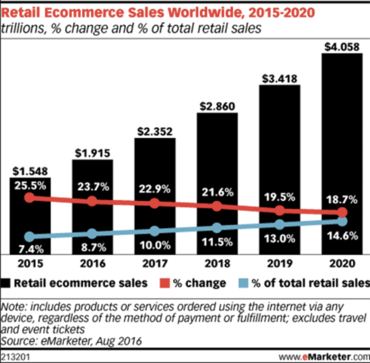
eCommerce sales increasing every year, as you can see in the graph by eMarketer below, you cannot just overlook the importance of eCommerce web design elements hold in achieving conversions.
Here is a list of some important eCommerce web design elements which you should incorporate in your online store to improve brand loyalty and grow your online business.
Eccentric and Properly Sized Typography
The content of your website can engage and encourage your visitors to stay and make a purchase, so ensure that it is readable. This is possible only if the typography you have chosen is properly sized.
Also, the typography you have selected for your website should be aligned with your brand. Choosing the right typography can be a crucial decision as it gives a clear indication of what your business is all about.
From the typography, your audience can judge whether you are functional or informative, fun or serious. So, just choose unique and properly sized typography.
Intuitive Navigation Structure
The products available on your online store should be properly organized into relevant categories and subcategories. Ensure that there are not more than 5 to 6 parent categories otherwise, the visitors might get confused.
As per eMarketer, in 2017, mobile eCommerce sales worldwide reached $2.304 trillion, a 24.8% increase over the previous year, eMarketer estimates.
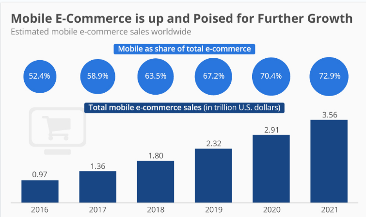
With this rising eCommerce sales worldwide through mobile devices, you need to ensure that your navigation structure is friendly for all the platforms and devices being used these days.
Attractive Hero Image
As soon as you land up to any eCommerce website, you may have noticed a large hero image. If placed above the first fold, it encourages the visitor to scroll down and explore the other elements of your eCommerce homepage design.
You can go through – Hero Image Design Ideas for Successful eCommerce Websites.
Engaging Videos
According to Adobe, shoppers who view demo videos are 1.81 times more likely to make a purchase than non-viewers.
Including a video which explains how to use the products you are selling or other details can help your customers to make quick buying decisions. Just keep it short to engage your audience until the end.
As per Forester Research, a minute of video Is worth 1.8 million words. So, instead of convincing your audience with words, better to use videos which can help them comprehend your product details easily.
Appealing Product Images
Buying online has the biggest drawback and that is your customers cannot touch or feel your product. To eliminate this drawback, provide your visitors with appealing product images which can help them to actually feel your products.
Also, give your audience the facility of zooming your product images, as that would help them to make purchase decisions quicker.
The product images you display on your eCommerce website should be responsive so no matter which device your customers are using, they get an optimized view of your products.
Prompt Live Chat
What if your visitors have some queries while making a purchase? Agreed, they can email or call you. But, the response to an email can be slow and to make a phone call might be inconvenient for your prospects.
Integrating live chat to your online store can help you in solving the query of your visitors promptly and help them complete their purchase.
You can also go through – How Can Live Chat Increase eCommerce Store Sales?
Distinctive Call to Action
Whether it is your eCommerce homepage or product page, keep the call-to-action button distinctive enough to attract your audience to click and take action.
A distinctive call to action should have 2 main properties – eye-catching colors and convincing content. If you get both things right, you can really achieve your sales goals.
You can also go through – 6 Captivating Call to Action Design Tweaks That Trigger Clicks.
Easy Checkout
Last but not the least, the checkout should be easy for your customers. If the checkout is ambiguous, then getting all the above elements getting right would not even help in improving conversions.
There are many factors which should be considered for an easy checkout process on your eCommerce website. Some of them are –
- Quick loading speed
- Minimized fields in forms
- Progress indicators
- Allowing guest checkout
Still, if you need a detailed information on how to make checkout easier on your online store, just go through – 4 Checkout Page Optimization Techniques to Improve Conversion Rates.
eCommerce Web Design Elements – The Key Takeaways
Driving customers to your online store might not be enough. Repeatedly attracting them to your store can only help you in improving conversions. Your online sales goals can be achieved only if all the above-mentioned eCommerce web design elements are in place.
An eCommerce website is never perfect. But, your goal should be to keep on improvising it and keeping it up-to-date matching with the latest eCommerce web design trends.


