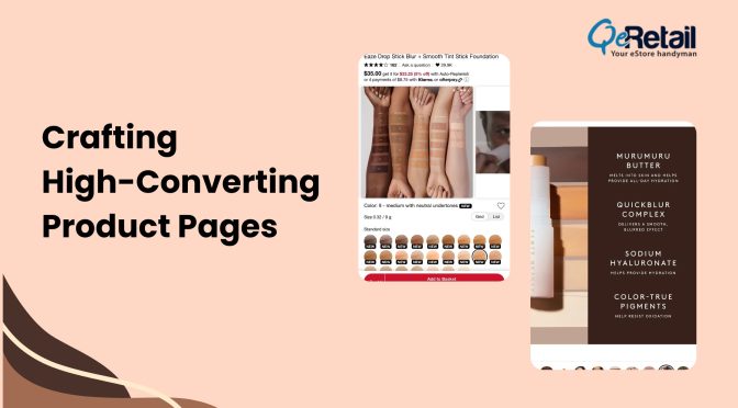
Till now, whenever we talked about an Estore, special importance was given to the way conversion rate can be increased, 404 pages, SEO, etc. But in the midst of all of them, we forgot the most used gadget nowadays. Mobile phones are used the most in current time as it is easy to use and also it has become an integral part of our life. We can think of leaving the laptop for once, but never a cell phone.
To increase the revenue generated by an Estore, it is really important to have a mobile store as well. So, if you do not have one, get it developed right away. It is definitely going to increase the value of the store. The factor discuss right now to have a mobile store is only one aspect for store success. There are many other factors too, that are responsible for a website’s success.
It is noticed that the sites which have both ecommerce store as well as the mobile store pays more attention to the former, whereas, there is a need of improving the latter too. Below are a few practices that can be followed to improve the mobile ecommerce UX.
- Auto Carousels
Auto carousels are used frequently nowadays to beautify the look and feel of a website. Though it is in trend, still the use must be confined to limited places. On a mobile device, it makes the content difficult to read out that result in being a useless website and people abandon the ecommerce store for the same reason. Therefore, using an auto carousel should be avoided as far as it is concerned with the mobile ecommerce UX. - Zoom out option
We all know very well that the main concern of the users to visit an online store is shopping. When they are paying for a product it is their right to analyze the product to all extend. On a mobile device as we all know that the product seems smaller and to see it to the fullest to get the nuance detail zoom out option is required. So, in order to increase conversion rate you must add this feature to your app. - Create guest checkout and sign in on a single page
Searching for the guest checkout and sign in option takes time. To reduce the time and also to ease down the efforts it is suggested to use the options on the same page. For them to be on the same page, collapse option can be provided. With this option user can select the form as per their choice. This can definitely increase the sale on an online store. - Do not use auto correct in checkout
On the checkout page the address details and other details related to the user are asked to be filled. As it is difficult to type on the mobile, it becomes more tiring when the auto correct option is enabled. So, this option must be disabled to avoid any inconvenience to the customers. Though it is a minor change, still it needs to be taken care of as sometimes minor problems can cause big trouble. - Add save checkout feature
Sometimes a situation occurs when a user cannot complete the checkout process. In this case, the customer leaves the store as he/ she is left with no other option. So, the option to save the shopping cart in the future should be added. It shall be accessed by the customer on the desktop also.
The points that are not considered by the ecommerce store holders are small, but they create a great impact on the performance of the e-store. We must not take the above mentioned mistakes for granted. They can be the damaging factor in the future. If you want to know more about creating the mobile app for online stores, you can contact us and also have a look at the services we provide.


