Social media branding has become an inseparable part of ecommerce store branding today due to the influence or effect social media has on internet users today. ‘Like’ what you like, ‘Share’ what you want to tell others, post on what inspired you, post on what annoyed you and a lot more privileges, every form of social media gives the people all over the world is inexplicable! How can businesses make the best use of this online branding for their ecommerce stores to give a competitive edge? How can we best fit various media icons, badges over areas of the online store site?
- Placing the media icons in website Headers is a great choice because people don’t tend to miss the Header read ever. Keep the colours on the Header consistent and get the right match between the background and text colour so the users get to view them aptly!
- Placing them on the menu at the top right corner can be a good idea too.
- If you like to make the icon display more attractive, you may try designing special icons for each social media and put them as bold displays on the website Header. Apart from this, references to activity widgets in these media or recent posts/shares too could be given. You may repeat these in Footer too in relevant display sizes!
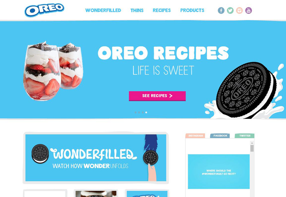
- For a blog like website, sidebars can be the best place to integrate the media icons.
- One of the best known designs is the subscription area integrating media icons/badges/plugins on the website top portion close to the header.
- Placing the icons even in the middle of the homepage, as mini side bars having media plugins & links to media profiles has been proven to be a great idea, implemented by one of the well-known beverage manufacturers!
- One of the well-known American coffee company has these links displayed as simple text forms in the left side bar where it gives the privilege to the user to get allured towards them to view them or to just go on with their job in the website. Being simple works too!
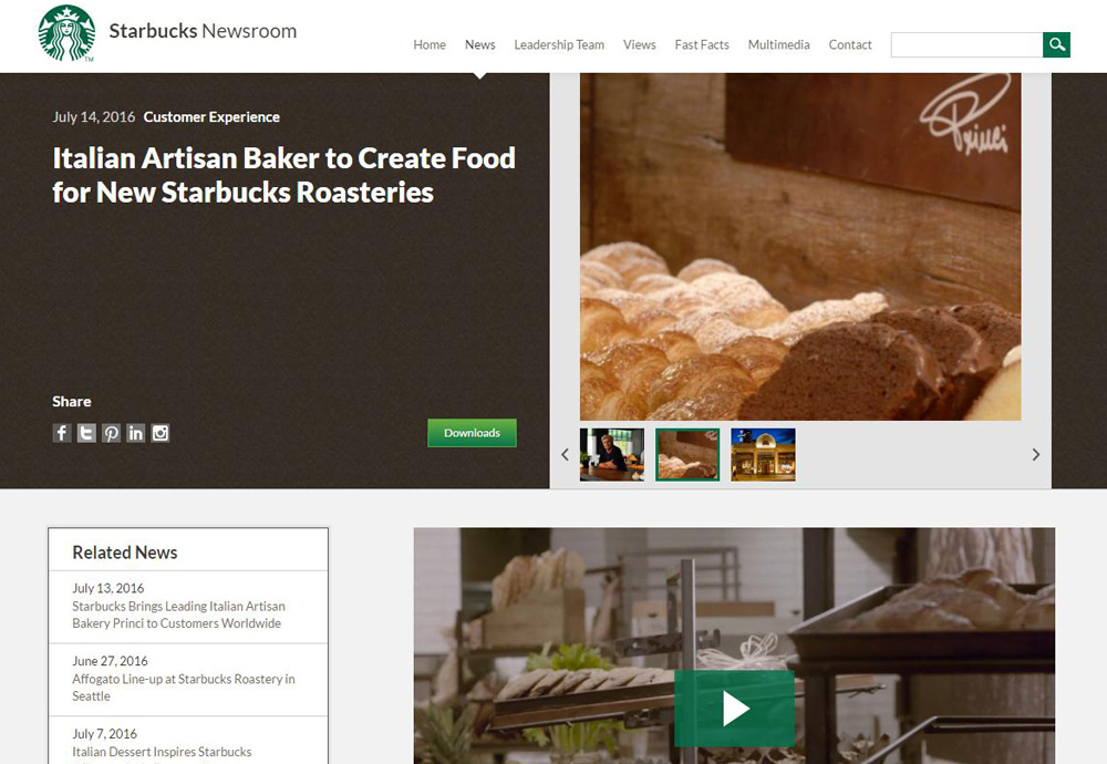
- Having the media links just in Footers is a good point when it comes to conversions because this stops the user from getting distracted away when they are into checking the site for activities.
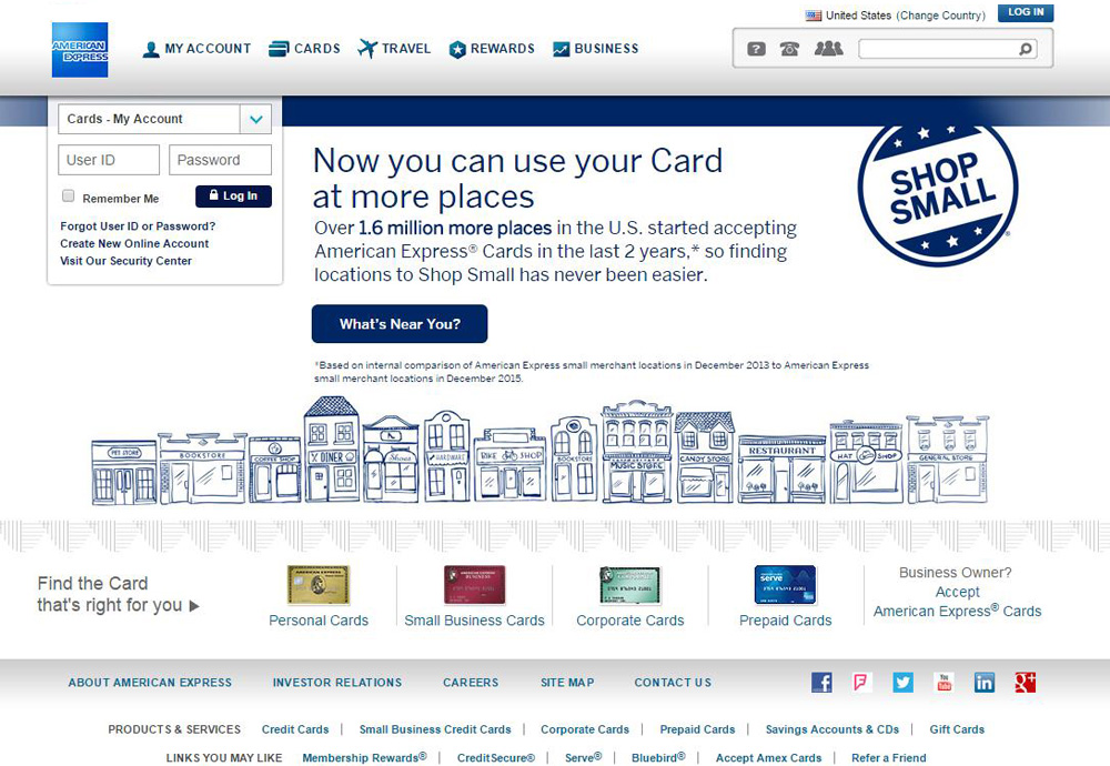
- Rotating banners with even reward notes on various activities to people with/without memberships attracts users to get into viewing them/getting involved in them/and result in more coversions.
- Small icons aren’t bad choices too!
- One of the top companies gives the media links just beneath the registration form/customer email capture section; this is great where the customers feed in their mail ids to get the blog feeds to mails and consequently get to the media links!
- Asking people to start with a ‘Like’ on the website and then go ahead with rest of the acts is another tactic worked out well till now!
If you realize you have a long way to go in leveraging social media to the best of your abilities to your business success and in need of support here, ask us now for our eStore Social Tools Representation services assure to take you to a higher step in your social media efforts!


