eCommerce stores have the upper hand as the number one reason people shop online is that they can shop 24/7, and by just providing an online shopping option, you guys are already leaving past many in this race! But, a larger part of online store owners deals with a dilemma that whether their online platform is compatible enough to turn the visitors into consumers or not. And this isn’t surprising because the eCommerce competition is fierce out there!
To offer a helping hand, we will address 14 eCommerce store features that can work as charms for your website! Quintessentially, sales conversions are the heroes, and to drive those, eCommerce stores need to optimize user interface (UI) by aiding the following seven features. The others will be disclosed in our second and final part of this article. So let’s get started…
Table of Contents
1. The Navigation Nation
Uncomplicate as much as you can! When it comes to eCommerce website navigation, people do not like to dig deep. Shoppers prefer a faster Checkout or even have a brief look at their desired product with minimum possible clicks.
Categorization
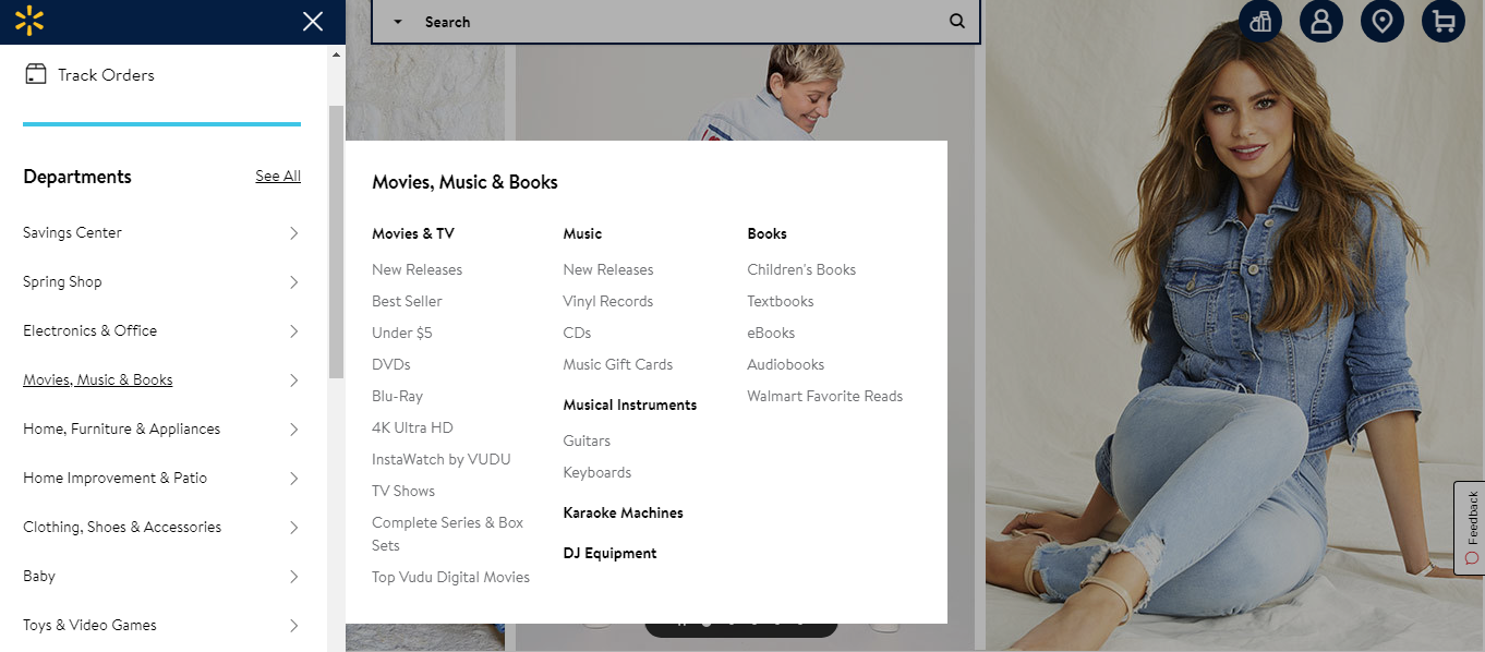
Your eCommerce store should have a streamlined categorization for the offered products. It should contain defined categories and subcategories for swift product search. If you’re a multi-product eStore, make sure to design the drop-downs in a way that does not create a clumsy outlook. Please take a look at how Walmart has categorized its vast product line.
Breadcrumbs
Breadcrumbs are yet another crucial feature of page navigation. Breadcrumb navigation provides links back to each or main previous pages that the user navigates through and shows their current location in your website. Users can easily get back to the previous and home page by adding these, and the more attractive they look, the more impact they leave! Take an example of Macy’s website, where they’ve placed breadcrumbs at each level.

Pagination
eCommerce websites are bound to have multiple product pages and a smooth transition from one page to another. For example, from the first page to the eighth, proper pagination should be applied for a better visitor journey. You can go for infinity scrolling or the page number scrolling. Either way, your website should have this feature! Moreover, properly inserted pagination HTML codes help in SEO too! Take a look at the example below.

Footer
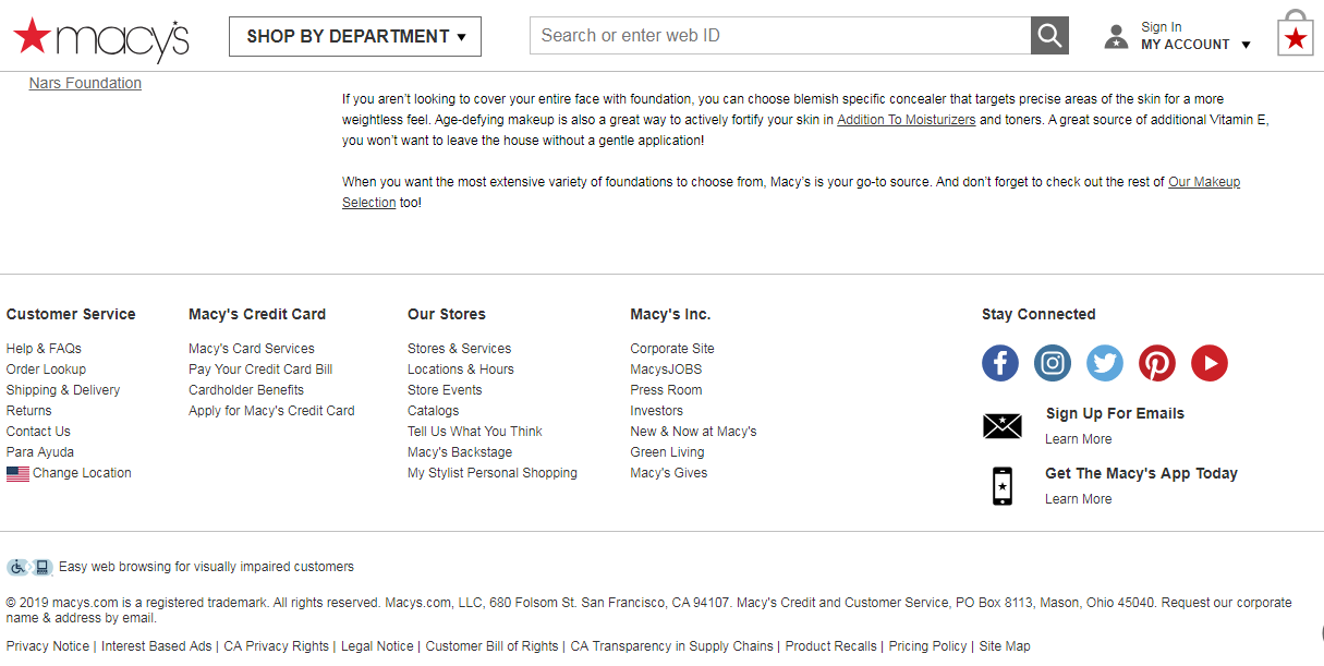
The final navigation feature that needs to be added to your eCommerce site is a large-sized footer! This is where you can add all the information regarding your company policies, term & conditions, social sharing buttons, other service links, contact & about us sections, and any other additional informative links. The footer stays unchanged despite any location that a customer is on. This provides ease of access at every stage of the sales process. Let’s continue with Macy’s example and have a look at their footer.
2. Optimized Site Search
Site search is the ‘search bar’ available on your website. eCommerce websites should always embed an optimized site search option for ease of access. If you want to increase conversions, you need to make sure visitors can find what they want on your eCommerce site. It will help if you improve the search feature usability by,
- Supporting the search through product name and model number
- Simplify the search queries for symbols and abbreviations
- Make sure your search bar returns with results even if the search queries don’t match exactly to the products or descriptions
- Provide intuitive drop-down search options for faster and easier product searches
- Enable the search with misspellings and typos
3. Eye-catchy Visuals and Details
As per the Adobe state of the content report, if the website has an unattractive layout or imagery, 35% of the visitors switch devices, and 38% even stop engaging. This being the reason, it is highly recommended to create your product pages with eye-catchy, high-resolution images and descriptive content! Include use cases of your products, if a utilitarian one, and provide the photos from all the dimensions. Keep the product description long enough with all the necessary information. Add manufacturing details, features, functionality, and more for better consumer understanding. Doing so is vital because, based on all this information, the visitor will buy the product without physically touching it.
4. Sort the Sorting
The eCommerce shopping experience is all about ease of purchasing! Being said this, your website should have multiple sorting options to narrow down the results that they’re expecting. Sorting the brands, colors, sizes, types, and other sorting options is required for your products. Because as mentioned earlier, if there would be so many clicks before buying, the prospect might lose interest.
5. The MVPs are Stickies
The most valuable players (MVPs) of any eCommerce site are its key stickies. The ‘Buy’ button, ‘wishlist’ icon, and ‘Add to cart’ features should be highlighting enough for quick clicks. These buttons should be present in prominent spaces on your website. The more easily accessible they are, the more likely people are going to click on them.
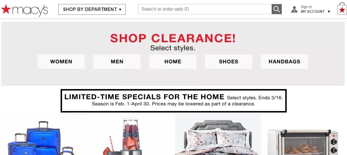
6. Special Offer Callouts
Limited time and discount offers are the major purchase triggers for any visitor. So when you have such sales, events, or offers running, never miss a chance to showcase it at the most desirable place on your website. These callouts should be tempting enough with good, catchy lines to draw the visitor’s attention.

7. Let the UGC Do The Talking
User-generated content (UGC) always create the buzz! When users who would review a product or share their experience about a particular service, your credibility will increase. People find it authentic when fellow customers rate and review a product they are looking for. Thus, always have an eCommerce feature added to your website that encourages customers to post comments, ask questions, and upload original product photos that they had bought.
Until Next Time…
So, this was it for the first part of eCommerce Store Features That Help Driving Conversions. But there’s more to it, and all the mentioned and lined up next are vital features for any eCommerce website that needs to gain a competitive edge in this rat race. Check out the conclusion in 14 eCommerce Store Features that help driving conversions part-2.


