Embed this infographic:
You need to first visually sell things to convert them to physical ones!
Talking about the ever-evolving eCommerce website design world, shoppers are changing their preferences day by day. If you think that your eCommerce website can go on without matching the steps to the changing design preferences, then you may be mistaken.
Even if you have executed a highly effective digital marketing strategy for your online business, if your website is not up-to-date and appealing, you may not get significant results. Stats has it that 38% of people will stop engaging with a website if the content/layout is unattractive.
The process of website redesign demands time and effort which are otherwise wasted if not accompanied with desired results. We have compiled 10 comprehensive signs that can indicate if your eCommerce website design needs an upgrade. Read on…
Table of Contents
1. Conversion Drop
If your analytics report shows a significant amount of traffic on your eCommerce store but no justifiable conversions, then your eCommerce website is lacking something which is driving the visitors off.
A well-planned and executed eCommerce website makeover can help you deal with this scenario. Digital marketing can drive visitors to your website, but a good design can help you to convert those visitors into customers.
2. Bounce Rate
Another sign that your eCommerce website design is underperforming is by analyzing the Bounce Rate. The website bounce rate is calculated by the visitors who leave your website after visiting only one page. Most probably when people leave your website as soon as they enter it, that increases the bounce rate of the website.
This happens only if your homepage or landing page is having –
- Cluttered design
- Unattractive design
- Slow loading speed
- Unclear message
- Grammatically weak content
Ensure that your eCommerce website homepage has an appealing design, user-friendly and SEO friendly content, and quick loading speed to eliminate bounce rate.
3. Outdated Design Framework
In most cases, the eCommerce website is the only source for visitors to connect with the brand. A professional looking website is the primary requisite for any visitor to establish a relationship with you. Customers’ preferences evolve with time, and if you are still running an eStore with an outdated design framework then visitors might consider your site to be spammy and would avoid buying from you. You cannot expect a website designed in the previous decade to yield results in the current year.
The color palettes, placements of the CTAs, swift webpage shifts, captivating imagery, relevant content, and smooth checkout process are a few of the elements which should be in alliance with the current marketing drifts and your branding. Get your store designed as per the latest trends to enjoy high conversions.
4. Make it Mobile-friendly and not just Mobile Responsive
Going digital also stands for being convenient, and maybe, that’s the reason why buyers prefer mobile devices to shop online. Let alone in the United States, mobile retail eCommerce sales were reported for $207.15 billion in 2018. Optimizing your eCommerce store for mobile responsiveness is more of a necessity than an advanced website redesign feature! There’s a huge difference between mobile responsiveness and mobile-friendliness. Being able to browse a website on a smart device is not friendliness but being able to effortlessly use all the features is! If your users are having a hard time navigating or filling up the forms or even reading the content on your website through mobile, then you can consider it as not friendly to mobile devices.
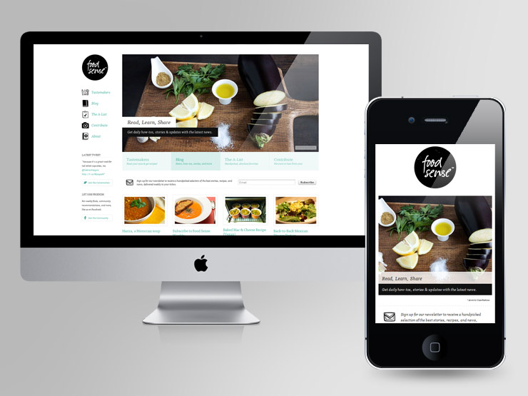
eCommerce website design’s prime feature should be being mobile-friendly and that is why you need to focus on the mobile experience of your eStore. Check each and every functionality of your eCommerce store using mobile devices. Step into the shoes of your customers and ensure that buying from your online store is easy on the go.
5.Optimization
Optimizing the smallest of the details on your eStore at the time of redesigning is one of the unmissable factors. Product page optimization, prominent checkout page features, safe & easy payment process, and useful content are some of the major areas to optimize while redesigning an eCommerce website. User experience is what you should focus on the most! The mentioned elements should be optimized enough to provide a seamless shopping experience. If you’re lacking in any of these, it’s time you start thinking eCommerce website redesign!
6. Branding Disconnect
Does your eCommerce store represent your brand well? The pillar philosophy (per se, environment-friendly) that you follow or the array of products that you sell should be in alliance with how your website looks. From logo to colors to everything else, branding should be in the center of what you show! A great example here could be a dull website of a flower seller who has such a bright offering. People recognize your brand through your brand identity. You can take another instance of having a brick and mortar store where you have used vibrant interiors in the store design but lack the same on your eCommerce website design. In this case, there are higher chances of your online credibility to be lower than that of your physical store.
If your branding is not consistent, you may not be able to win the trust of your customers. Keep your eCommerce store updated with the other elements of your brand and give it a professional look.
7. Exclusivity
The combo of smart buyers and ferocious competition has made it challenging for the eCommerce stores to stand out. Buyers visit several stores before landing their choice on any particular eCommerce store. Your customers are expecting something different from the crowd of online stores. So, if you lack exclusivity, there are chances of getting lost in this pool of online retail.
To stay competitive, you need to consistently check for what your competitors are doing and stay a step ahead of them. That can be done by introducing a new product, policy or something special that others aren’t offering. This requires constantly updating your website which would help your store in standing out from competitors resulting in better conversions. A trending eCommerce website design component is adding a touch of personalization! eCommerce personalization with the help of customers’ purchase preferences, buying behavior, and overall customer journey is something that’s trending in 2019.
8. Difficult Navigation
If your eCommerce website design is not smooth enough to glide from one web or product page to another, you need an immediate website design to revamp! The navigation structure of an online store should be swift, easy, and simple. Including eCommerce store features like pagination, breadcrumbs, categorization, site search et Cetera is essential. The first focus of navigation needs to be a trouble-free transition from the last visited page to the first. Check out the IKEA’s breadcrumbs in the below image!
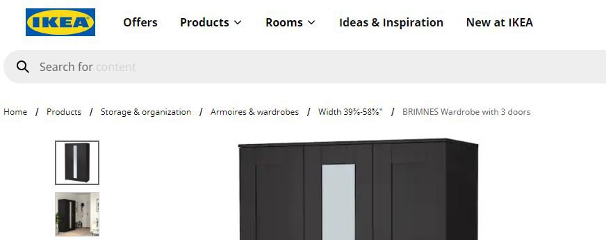
It is also necessary to highlight the links providing information for shipping, returns and refund policies, customer care, FAQ and more on your online store. Moreover, the products or services you specialize should be highlighted so that your customers can navigate to it easily and make a purchase.
9. Lack of On-page SEO
If you are not ranking on search engines, no one’s gonna know how good you are! So even if your product line is amazing and you offer exclusivity, it will all go in vain until people can find you when they perform a search. If on-page SEO is a missing feature on your eStore then you might already not getting significant traffic followed by enough sales.
Updated meta tags, title tags, page speed, SSL security (https//:), high-quality images with alt tags and rankable keywords are the on-page SEO factors you should always stay aligned to when running an eCommerce store. Here’s a DIY On-page SEO Guide that can help you implement these basic features in your online store.
10. Obsolete Content
Content is THE king and this proverb will not stop making a difference for a long long time! If your product descriptions are not informative enough or miss out on essential parts, you should definitely rewrite them. People are hesitant to buy online because they can’t touch and feel the product. Your product categories and content should be convincing enough for them to buy the products just by reading it.
If you’re running a blog section on your eCommerce store then make sure you publish relevant content that supports your product offerings. Helping customers with informative content increases their trust in your brand which can result in a loyal customer base in the long run. If your eStore content is not keyword-rich, relevant or backed with intent oriented structure, it is time you should reframe your content management system.
Website Redesign Services – Is It Worth Investing?
Many may argue that constantly investing in eCommerce website design services can prove to be expensive. But, for being a credible source and sell more, you need to move along with the latest design trends and technology upgrades.
If you are doubtful whether it is worth investing in a website redesign service or not, get a performance optimization report specifically for your online store. We will provide you with a detailed report about the strengths and weaknesses of your online store as per the latest trends to help you make a wise decision.
Wrap up
eCommerce website design upgrade is a decision one needs to make when the above-mentioned signs are ranting loud. You can refer to our Definitive Website Redesign guide for being double sure while redesigning your eStore. Hoping this list of signs helps you come up with a website design that gains you more and more conversions. Happy eCommercing!


