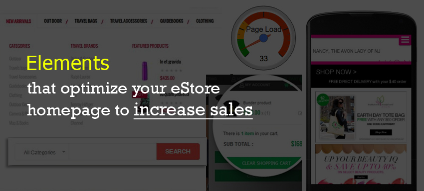
Homepages in an ecommerce store really matter a lot when it comes to rankings, traffic, conversions and success of the online store. It’s not a math where there’s just a single way of designing it; rather it involves a lot of design elements for a homepage and it’s just about which way/approach of design of these elements works the best for the business. It would be an easy read for designers to get these elements jotted down one by one so they know what is already good and what is more required for their page design, we believe!
- Main menu: Product search ability is one of the most important elements of an estore and how your website is structured for navigation adds a huge impact to the estore success. How menus are aesthetically designed, the text on them, their design hierarchy, and the links they contain such that they take the user to the page the user makes out from what the links read are all various nuances coming under the Main Menu Design!
- Navigation menus: Clearer the navigation is, more time the user spends on the site. Clean & well defined navigation structure boosts conversions and contributes to SEO too!
- CTA: Whatsoever be the item categorization, product navigation, search optimisation and store design you have made, if you don’t see users adding items to the cart, it definitely means you haven’t directed them to go about it. Yes that’s where a clear CTA comes into picture. Primary and secondary Call To Action links in right positions on the homepage are very essential to instigate the user towards the buying action resulting in lead generation.
- Product details: While you display the products you sell, users get this question of “What is in it for me and why it should be you from whom I buy?” Make sure you focus on clear product descriptions (that aren’t ‘simply’ copied from other websites but innovatively aptly written), listing the advantages of the item, deals on the product and so. Daily deals, top most sellers, newbies and so remove the user confusion of what to buy and get them fascinated to buy on the first go they realise their need for the product.
- Search & Guest checkout: Search function is one of the top most elements of a homepage design and an online store without a Search in a prominent location is like a Home with all items but messed up that you simply can’t find what you need when you need it. Without Guest check outs you are forcing the user to register with you so as to buy from you and no user likes it. While the registered users can easily come back for further purchases without having to key in details again, forcing it isn’t a great idea. So make sure you keep both the options open & let the users decide what’s okay for them!
- Go Mobile: There isn’t any big text needed on why responsive websites are very important today. Make sure you optimize homepage & estore such that they look the same ‘great’ on tablets/phones as they do on desktops & laptops.
- Speed: Not just Google loves higher speed on page loads, for a great rank but that’s what the users want too. A report says there’s a significant increase in revenue for every few seconds improved in the site load time duration! Consider using html, CSS, Javascript, remove spaces/breaks, handle indentation, have lesser code sizes, keep medium sized images, make sure to have a lesser server response time, decrease the page bandwidth and follow a few more nuance tips to optimize the online store to make it the best!
Yet another broader checklist below for an online store design,
- Buyer personas
- Relevant messages for specific buyers
- Compelling value propositions
- Clear buying cycle
- Clarity all over the store journey
- No distracting elements on the store design pages
- Engage users to the best possible
- Create the sense of urgency to buy
- Keep up the standards
Should you require assistance in creating such successful homepages or estore designs or eStore facelift, contact us right now!


