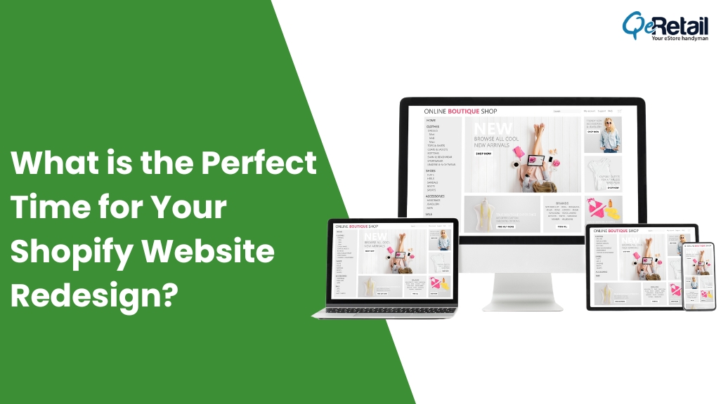
Is a Shopify website redesign on your mind?
Is your Shopify website still living in the digital equivalent of the early 2000s?
Do your competitors’ online stores make yours seem outdated and uninspiring?
Have you noticed a drop in your conversion rates and a decline in customer engagement?
If you’ve nodded along to any of these questions, then you’re at a crucial crossroads. It’s time to ask yourself the most pivotal question of all: Is it the perfect time for your Shopify website redesign?
Do you know more than 38% of designers think that the main reason for customers to leave a website is its outdated design? Another study says a user can form an opinion about your eStore in less than 0.05 seconds of visiting.
In the fast-paced world of eCommerce, where change is the only constant, your website’s appearance and functionality can either be your greatest asset or your Achilles’ heel. But how do you determine when the stars align for a complete website overhaul? That’s precisely what we’re here to explore.
Welcome to our journey of unraveling the enigma of timing when it comes to redesigning your Shopify website. In this blog, we’ll navigate the signs, trends, and strategies that will help you pinpoint the perfect moment for your online transformation.
Your next chapter in online excellence begins now!
Table of Contents
Signs Your eStore is Begging for a Shopify Website Redesign
Recognizing when it’s time to refresh your Shopify store design is the first step towards maintaining its competitive edge. In this section, we’ll dive into the telltale signs that your website is sending out distress signals, pleading for a redesign.
1. High Bounce Rates and Low Conversions
If your visitors are coming and going without taking any action or making a purchase, it’s a glaring sign that something isn’t resonating with them. High bounce rates and low conversion rates indicate a mismatch between your website’s content, design, and your target audience’s expectations.
2. Outdated Design and User Interface
Your website’s appearance speaks volumes about your brand. If it looks outdated, clunky, or unappealing, it could be turning potential customers away. User experience is paramount in the digital age, and a modern, user-friendly design is essential for keeping your audience engaged.
Upgrade your website's appearance with our service. Get a free mockup to see the difference.
- Sleek and Modern Layout
- Mobile first design
- Color Psychology
- Interactive Elements
3. Slow Loading Times
In a world where seconds matter, a slow-loading website can be the kiss of death for your online business. If your pages take ages to load, you’re not only losing potential customers but also damaging your SEO rankings.
4. Poor Mobile Optimization
With more and more users accessing websites from their mobile devices, a mobile-responsive design is no longer a luxury but a necessity. If your Shopify site isn’t optimized for mobile, you’re missing out on a significant chunk of your potential customer base.
5. Decline in Search Engine Rankings
Google and other search engines favor websites that are up to date, mobile-responsive, and user-friendly. If you’ve noticed a steady decline in your search engine rankings, it might be time to revamp your website to meet the latest SEO best practices.
6. Evolving Business Goals
Your business isn’t static, and your website should reflect your evolving goals and objectives. If your business has expanded, shifted focus, or undergone rebranding, your website should adapt accordingly.
Embracing Current Web Design Trends for a Stunning Redesign
In the fast-paced world of web design, staying ahead of the curve is key to creating a website that not only looks fantastic but also delivers an exceptional user experience. As you embark on your Shopify website redesign journey, it’s essential to consider the latest web design trends that can make your digital storefront stand out. Here are some of the hottest trends to consider:
1. Minimalist Design
Less is often more in web design. A minimalist approach with clean lines, ample white space, and a focus on essential elements not only looks elegant but also ensures a clutter-free user experience. Streamlined, minimalist designs are highly effective in conveying a sense of modernity and professionalism.
Upgrade your website's appearance with our service. Get a free mockup to see the difference.
- Sleek and Modern Layout
- Mobile first design
- Color Psychology
- Interactive Elements
2. Dark Mode
Dark mode is gaining popularity for a reason. It’s easier on the eyes, conserves device battery life, and gives your website a sleek, contemporary feel. Offering a dark mode option can enhance user experience, making your website more accessible and visually appealing.
3. Bold Typography
Typography is a powerful design element that can create a strong visual impact. Large, bold fonts not only improve readability but also serve as a statement piece in your design. Select fonts that resonate with your brand and help convey your message effectively.
4. Microinteractions
Microinteractions are subtle animations and feedback mechanisms that engage users and enhance their interactions with your website. These small, delightful details, like button animations or hover effects, can add personality to your site and improve user engagement.
5. 3D Graphics and Illustrations
Adding depth to your website with 3D graphics and illustrations can create a visually immersive experience. It’s a trend that captivates visitors and sets your site apart from the two-dimensional crowd.
6. Video Integration
Video content is a powerful way to engage users. Incorporating video backgrounds, product demonstrations, or brand storytelling into your website design can help convey your message more effectively and keep visitors engaged.
7. Sustainable and Eco-Friendly Design
As sustainability becomes increasingly important to consumers, eco-friendly web design can resonate with a socially conscious audience. Utilize sustainable design practices, consider eco-friendly hosting options, and highlight your commitment to the environment on your site.
These trends are just the tip of the iceberg in the ever-evolving world of web design. The key is to choose the trends that align with your brand and goals while ensuring a seamless, user-friendly experience.
Navigating the Perfect Wave of Change
Picking the perfect time for your Shopify website redesign isn’t just a matter of aesthetics; it’s a strategic decision that can shape the future of your online venture.
Upgrade your website's appearance with our service. Get a free mockup to see the difference.
- Sleek and Modern Layout
- Mobile first design
- Color Psychology
- Interactive Elements
As we’ve explored the signs, trends, and strategies in this journey, it’s evident that the right time for a redesign is when your website’s potential meets your business aspirations. High bounce rates, outdated designs, slow loading times, and declining search engine rankings are not roadblocks; they’re signposts pointing you toward the path of transformation.
Embracing current web design trends isn’t just about following the crowd; it’s about enhancing user experience, capturing attention, and telling your brand story in the most compelling way possible. Whether it’s the elegance of minimalism, the depth of 3D graphics, or the impact of bold typography, these trends are tools in your hands, empowering you to craft a website that resonates with your audience.
Seize the Moment with QeRetail Shopify Store Redesign Services
Get your free eStore Mockup and claim your Shopify website redesign services today. Don’t wait to revitalize your digital storefront and elevate your brand’s online impact with QeRetail.
Contact us and redefine your online presence. Your perfect wave of change awaits, and with the right redesign, you’re not just redesigning your website; you’re redesigning your success story in the digital age.


