In the eCommerce arena, your product page acts as your sales showroom. Studies estimate a whopping 218.8 million online customers in the US this year. The content and presentation you provide on the product landing page will make or break the sale.
This page is especially crucial for small and mid-sized businesses trying to scale their revenue targets. You hardly have a few seconds to establish an emotional connection and trust to influence a purchasing decision. How can you make each moment of their attention count?
Table of Contents
Crafting High Converting Product Pages to Maximize Conversions and Revenue Growth
A glance into a well-optimized and executed product page helps multiply your eCommerce revenues. That’s exactly what we’ll address in this piece. Fasten your seatbelts and understand the crucial elements required to transport your browsers to the cart.
Here we go! Let’s increase those product page conversion rates.
Understanding Your Target Audience
Who is your target audience? What pain points does your product address? Market research on these lines is key to motivating your customers to make the purchase. A high-converting product page that solves your prospects’ objections will eliminate delays and confusion.
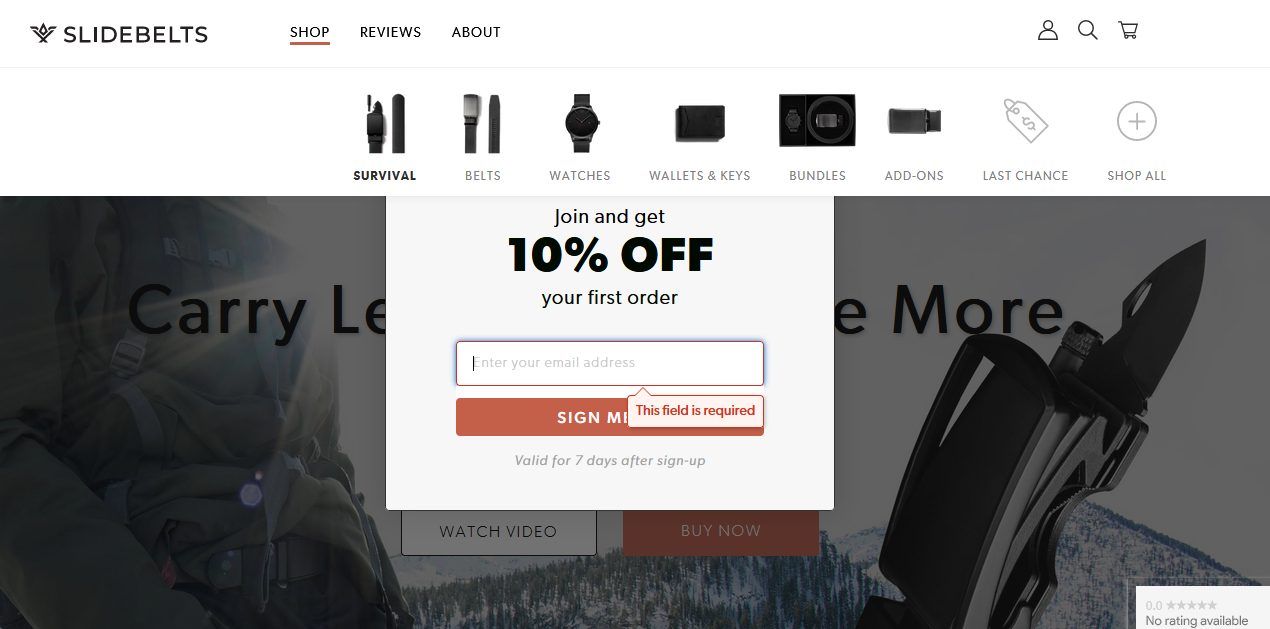
Survival Belt 2.0, for instance, nails this aspect. Its product landing page crisply covers how the accessory overcomes the challenges faced by the customers. The product landing page design and appealing visuals, help capture the reader’s attention and instantly showcase the value proposition.
A seamless user experience, along with targeted research on customer pain points, enables you to hit the bull’s eye and fosters initial trust.
Clear and Compelling Product Descriptions
High converting product pages don’t keep the customers’ wants on wait mode. Even though your offering may have multiple features, describe the differentiators upfront. Uber’s “Tap a button, get a ride.” is a prime example of eCommerce product page best practices showing a one-line description that oozes value. Unnecessarily maintaining suspense can make them lose interest in your product and backfire.
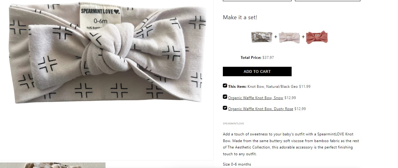
Additionally, the choice of words and tonality must suit your target demographics. Weave a story that appeals to their emotions. Spearmintlove, a leading seller of children’s apparel, adds large, colorful banners and simple, compelling descriptions that captivate young parents and children.
Visual Appeal: High-Quality Images and Videos
Your customers can’t feel the product like in brick-and-mortar stores. So your best bet in setting a solid first impression on the best conversion website design is through high-quality images. Add product images in multiple angles, and proper lighting, and use a model if needed. In this way, you elevate your e-commerce website into a virtual showroom.
Similarly, adding videos of users trying your product boosts credibility. Surveys find that around 50% of internet users check product videos before visiting an online store.
Include a 30-60 sec video that offers a brief about:
- Product benefits
- FAQs
- Certifications (if any)
- Product ingredients/components
Adding user-generated videos is also social proof that builds your brand authenticity.
Upgrade your website's appearance with our service. Get a free mockup to see the difference.
- Sleek and Modern Layout
- Mobile first design
- Color Psychology
- Interactive Elements
Call-to-Action (CTA) Optimization
Sales is the ultimate goal of a high-converting product page. And that result is achieved via the Call-to-Action (CTA) button. Your page needs a contextual CTA button that can be spotted easily. Make their buying journey as simple as possible without overdoing it.
JLo Beauty’s strategically placed and aesthetically designed “Add to bag” CTA compels the user to slide into the cart. Its product page designs definitely catch your attention.
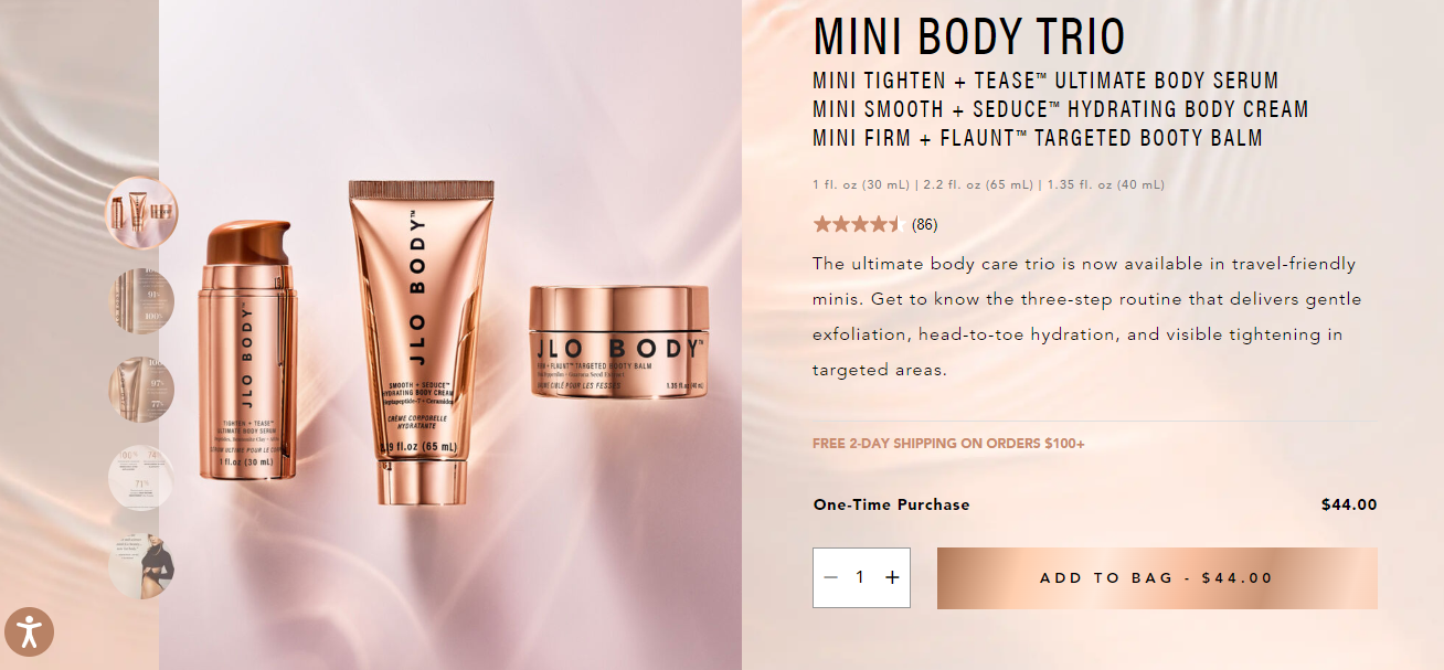
You can also create FOMO (Fear Of Missing Out) or a sense of urgency via time-limited buttons and promotions. To maintain strong conversions in the long run, test your CTA performance using proven techniques like A/B testing. This will help in continuous assessment and improvement.
Streamlined Navigation and User-Friendly Layout
High converting product pages often create a smooth buyer’s journey. Almost everyone is transacting via mobile. Having a responsive and mobile-optimized page layout is no longer optional in a product page design.
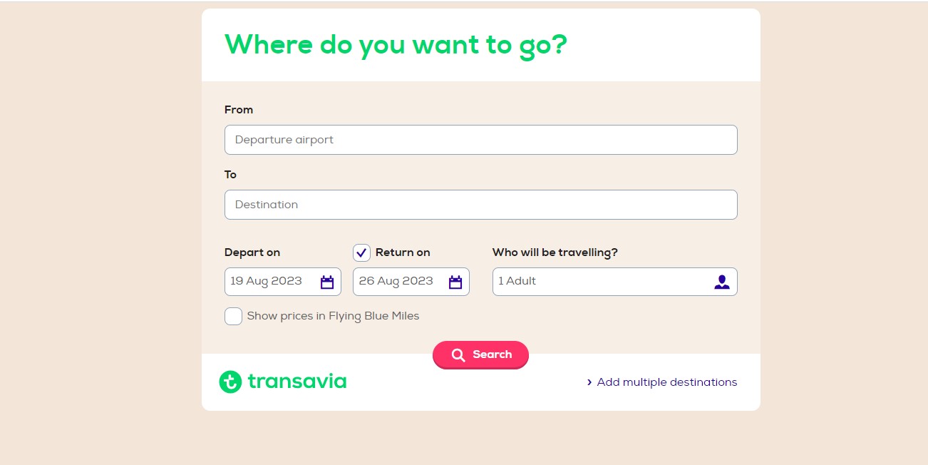
The navigational path, in tandem with a pleasing User interface, allows memorable User Experiences. The Dutch airline Transavia’s product page is the epitome of this. They employ plenty of best practices needed in the tourism niche. Along with a simple brand identity, they’ve used a well-structured -part flight booking section and user-friendly search engine.
Social Proof and Customer Reviews
Over 88% of customers look for social proof before making an online purchase. It doesn’t matter how well you’ve described your product; customers trust peer reviews more! A 4.5/5 rating and a majority of positive testimonial statements never go unnoticed. User testimonials are the fastest way to judge product quality and efficacy in an eCommerce site.
Ensure to provide the option to add customer photos and videos that showcase the product benefits for more trust.
Brand loyalty needs to be earned. For that, your customers need to feel that their concerns are heard. Proactive response to customer queries and troubleshooting generates a customer-centric brand image.
Transparency on Pricing, Shipping, and Returns
Around 70% of customers abandon carts when they observe additional shipping charges and taxes. Why give them a shock? Display actual prices upfront to avoid this major sales setback.
Delivery timelines are another pivotal deciding factor! Industry leaders like Amazon’s USP have been their same-day delivery option. Customers these days expect free and fast shipping from eCommerce providers.
And what if your customers aren’t satisfied with the purchase? You need to offer them the confidence to shop more via robust reverse logistics. Take additional care to implement a hassle-free pickup and refund policy, and notice your sales conversions multiply!
Leveraging Cross-Selling and Upselling
If your customer has purchased a t-shirt, why not ask them to pair it up with an appropriate pair of jeans? That’s cross-selling. It’s your golden ticket for extra revenue by complementing their existing purchase with a new one.
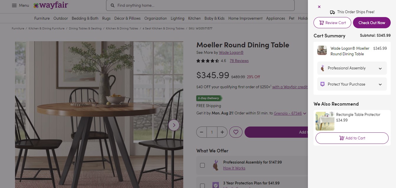
High-converting product landing pages offer the dual benefit of cart value addition and enhanced user experience via cross-selling. For example, if you’re about to purchase a dining table from Wayfair, they display a “Frequently bought together” section in the to pique customer interest.
However, overdoing it can lead to opposite outcomes. It’s essential to balance recommending additional products and giving due respect to your customer’s core shopping preferences.
Alternatively, when you encourage your customer to make a premium upgrade to their purchase, that’s upselling. Unlike buying things around the existing order, you persuade them to stack up their order. Adding a slice of cheese to your chicken burger is a common upselling technique.
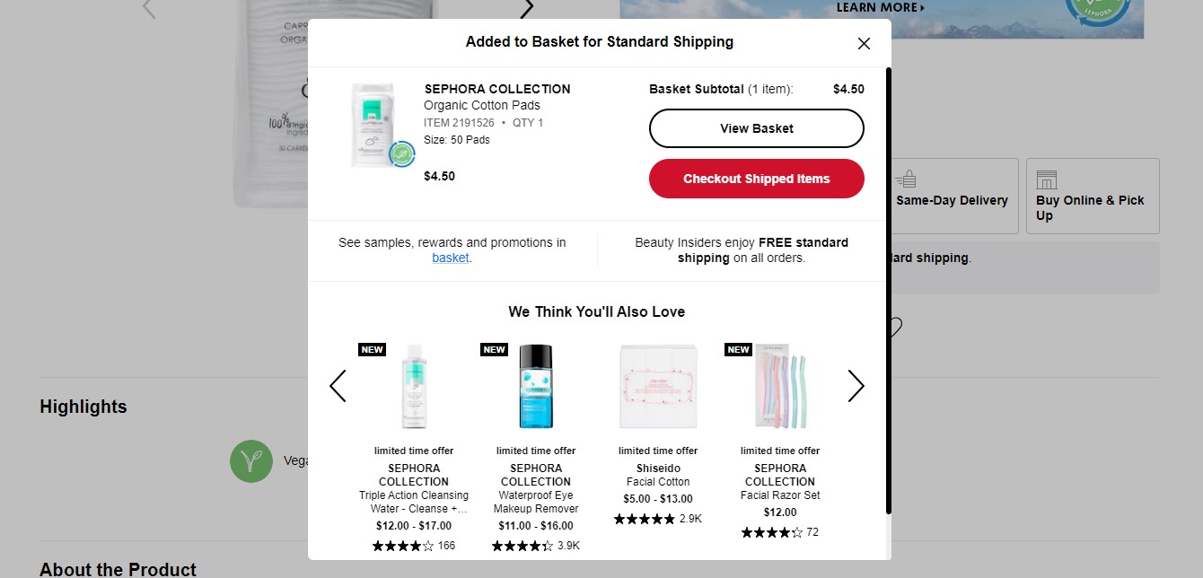
Reviewing the purchase behavior of repeat buyers is a good technique to offer relevant upgrades. Luxury beauty and skincare retailer Sephora applies this strategy to attract customer attention by highlighting new arrivals.
Optimizing for Search Engines
Keyword research is the cornerstone for making your product page SEO-friendly. High converting product pages never fixate on search volumes. Instead, they give due emphasis on relevancy and chances of conversion.
Make sure you incorporate relevant keywords in title tags, and meta descriptions, such as:
- Product brand
- Product name
- Model or version number
- Key dimensions
- Variant name
In addition, optimizing your URL is equally important for search engines to quickly identify your eCommerce pages.
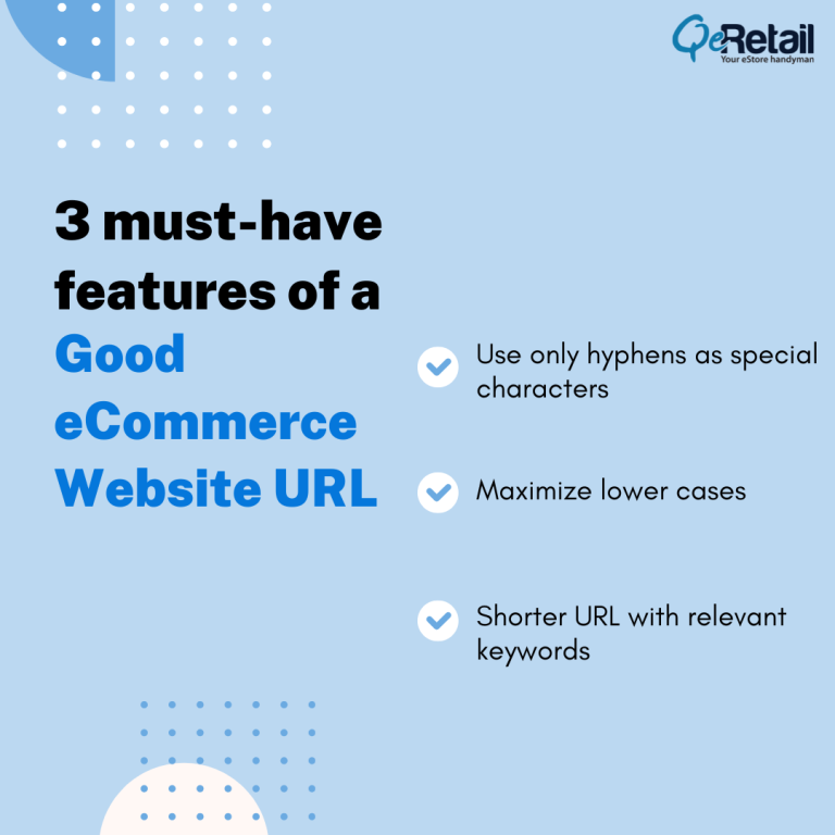
Here are 3 must-have features of a good eCommerce website URL:
- Use only hyphens as special characters
- Maximize lower cases
- Shorter URL with relevant keywords
We’ve observed that high converting product pages often have an FAQ section. FAQ structured data helps boost your SERP scores and aids in brand visibility.
Monitoring Performance and Making Data-Driven Decisions
Analytics is an integral part that’ll decide the sales conversion of your product page. How can you increase your traffic in the next quarter? How can you curb your bounce rates? Can you increase their visiting time? eCommerce players that regularly focus on improving such pain points improve their market share.
Some of the key eCommerce metrics include:
- Times a user visited your page
- Cart abandonment rate
- Number of unique purchases
Product performance metrics help you assess how well a product performs through a sales funnel. You can either use built-in analytics tools that come with your eCommerce platform. Alternatively, leverage external tools like Google Analytics to gain insights and make data-driven refinements.
Now that you know the significance of eCommerce metrics and continuous performance checks, the next question is, “How often should you check?”
Answer: It depends.
You need to assess performance metrics at different frequencies. For instance, website traffic on a weekly level, shopping cart abandonment on a bi-weekly basis, and newsletter subscription every quarter.
High converting product pages aren’t a sprint; they’re marathons. Upskilling yourself on analytical tools and metrics and strategy refinement is essential to witness continuous revenue growth.
Upgrade your website's appearance with our service. Get a free mockup to see the difference.
- Sleek and Modern Layout
- Mobile first design
- Color Psychology
- Interactive Elements
Conclusion
Creating, nurturing, and testing high-converting product landing pages requires time, effort, and marketing expertise if you’re in it for the long haul. From understanding your target audience to social proof to eCommerce analytics, QeRetail laid the proven strategy roadmap. We highly recommend the examples given in this blog post to analyze the boxes they have ticked.
Ultimately, the more customer centric your product page, the more would be sales conversions and revenue growth. By leveraging these strategies, your eCommerce site’s user experience will escalate, and bounce rates will diminish. And you will be left with high converting product page designs that
Our QeRetail team of seasoned experts are pioneers in helping small and mid-size business owners thrive in their eCommerce ventures. If you need further clarification on improving your product landing pages, let us know in the comments section.


