The art of persuasion is what psychologically triggers the customers to convert. Yes! If they are convinced enough to bring their business to you, you are pressing all the right buttons.
But what are these so-called psychological triggers?
These triggers tap into online shoppers’ subconscious desires and motivations, influencing their decision-making process. By incorporating elements such as persuasive colors, compelling product descriptions, and well-placed calls to action, designers can create a seamless and emotionally resonant shopping experience.
The result?
Higher conversion rates, as individuals are more likely to make purchases when their psychological needs and preferences are effectively addressed within the website’s design and layout.
Let us discuss how we can master these psychological triggers in design to improve the eCommerce conversion rate.
Table of Contents
Understanding the Psychology of eCommerce Conversion
Psychology is pivotal in shaping online shoppers’ decisions, impacting their every click and purchase. Design choices can harness psychological triggers to increase eCommerce conversion:
Color Psychology:
Selecting the right color scheme can evoke emotions that align with your brand and product. For example, Unbounce proved that warm colors like red or orange for urgency and action buttons could drive immediate clicks.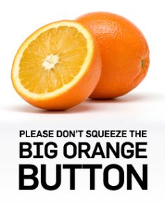
Social Proof:
Displaying reviews and testimonials taps into the psychological need for social validation, reassuring shoppers that others have had positive experiences.
Scarcity and Urgency:
Limited-time offers or low-stock warnings trigger the fear of missing out (FOMO), motivating quick purchases.
Simplicity and Clarity:
A clean and user-friendly layout reduces cognitive load, helping shoppers make decisions more easily.
Personalization:
Tailoring recommendations based on browsing history or preferences taps into the need for relevance and increases the likelihood of conversion.
Upgrade your website's appearance with our service. Get a free mockup to see the difference.
- Sleek and Modern Layout
- Mobile first design
- Color Psychology
- Interactive Elements
Anchoring and Decoy Pricing
The anchoring effect is a cognitive bias where people depend on the first piece of information encountered when making decisions. In eCommerce, it can be harnessed to increase eCommerce conversion rates
For instance, by showcasing a higher-priced product first, followed by a moderately priced one, the latter appears more appealing, influencing customers to opt for it.
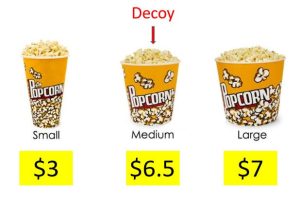
Decoy pricing strategies like offering a premium product as a reference point can guide customer choices and increase eCommerce conversion rate.
Reciprocity through Gifting
Offering valuable resources like informative guides or free ebooks can invoke reciprocity among eCommerce customers, enhancing their trust and loyalty.
- HubSpot provides free marketing resources and courses, fostering goodwill.
- Neil Patel offers valuable SEO insights and tools, encouraging users to explore paid services.
- Canva offers a range of free design templates, increasing the likelihood of users upgrading to a paid subscription.
These tactics effectively improve eCommerce conversion rates by nurturing customer relationships.
The Power of Storytelling in Design
Storytelling in website design can captivate users and boost conversions:
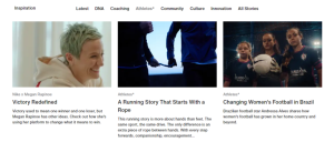
Nike’s Inspirational Journey:
Nike forges emotional connections with customers on its website by showcasing inspiring athlete stories, creating personalized experiences, and actively participating in social causes, fostering a sense of belonging and motivation while aligning with shared values.
TOMS’ Social Impact:
TOMS’ site narrates its mission to provide shoes, compelling customers to support the cause.
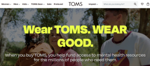
Incorporating narratives into design is one of many eCommerce conversion optimization tips, enhancing user engagement and conversion rates.
Upgrade your website's appearance with our service. Get a free mockup to see the difference.
- Sleek and Modern Layout
- Mobile first design
- Color Psychology
- Interactive Elements
Fear of Missing Out (FOMO) in Design
Fear of Missing Out can be effectively harnessed through design elements in e-commerce. Techniques such as limited-time offers, flash sales with countdown timers, and real-time purchase notifications create a sense of urgency.
By strategically placing these elements in the design, potential customers are encouraged to make quicker decisions and purchases, boosting conversion rates and sales.
Limited-Time Offers:
Amazon often promotes limited-time deals and discounts on its homepage, creating a sense of urgency for shoppers to purchase before the offers expire.
Flash Sales:
The “Amazon Lightning Deals” feature offers deeply discounted products for a short period, encouraging immediate purchases.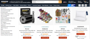
Real-Time Purchase Notifications:
Amazon displays real-time notifications of products others purchase, fostering a fear of missing out among potential buyers.
Cognitive Fluency and User Interface Design
Cognitive fluency in user interface design emphasizes simplicity and clarity to boost the eCommerce conversion rate. To enhance user understanding and drive conversions:
Clear Navigation:
Ensure straightforward menus and categories for easy browsing.
Minimalist Layout:
Remove clutter and distractions, focusing on essential elements.
Readable Typography:
Use legible fonts and appropriate font sizes.
Intuitive Buttons:
Make CTAs prominent and action-oriented.
Visual Hierarchy:
Prioritize key information with contrasting visuals.
By simplifying design elements, you streamline the user experience and increase eCommerce conversion rate.
The Endowment Effect and User Experience
Design plays a pivotal role in fostering a sense of product ownership in eCommerce conversions.
Virtual product trials, for example, allow customers to interact with products digitally, creating a personalized experience.
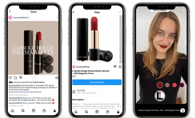
Meta has partnered with L’Oreal’s AR and AI company ModiFace to introduce virtual try-ons for makeup companies on Instagram Shopping. L’Oreal brands Urban Decay, NYX, Maybelline New York, and Lancome are the first to utilize AR, with more on the way.
Additionally, incorporating customizable options, detailed product descriptions, and high-quality visuals can empower shoppers to envision the product in their lives.
By employing these design strategies, eCommerce platforms can enhance user engagement, build trust, and ultimately drive higher conversion rates as customers develop a deeper connection with the products they are considering.
Visualization and Imagery in Design
Visual content holds profound psychological sway in design, influencing user perceptions and choices. High-quality images, videos, and product demos are pivotal due to:
- Attention and Engagement
- Trust and Credibility
- Emotional Connection
- Clarity and Understanding
- Reduced Cognitive Load
Upgrade your website's appearance with our service. Get a free mockup to see the difference.
- Sleek and Modern Layout
- Mobile first design
- Color Psychology
- Interactive Elements
Gamification and Rewards in User Interface
Integrating gamification elements and rewards into user interface design is a potent strategy for conversion optimization eCommerce. Elements like progress bars, badges, and points systems engage users, making their shopping experience more enjoyable and interactive.
Amazon, for instance, employs a progress bar to indicate how close shoppers are to free shipping, encouraging them to add more things to their cart.
Similarly, Sephora’s Beauty Insider program offers rewards and tiers, motivating customers to shop more frequently and spend higher amounts.
Nudging Techniques in UI/UX Design
Leveraging behavioral economics in design, UI/UX designers can influence user decisions to increase the eCommerce conversion rate. Designers nudge users towards conversion-friendly choices by applying principles like scarcity, social proof, and choice architecture.
For instance, showcasing limited stock indicators (scarcity) or displaying positive customer reviews (social proof) subtly guides users toward purchasing.
Additionally, perfectly placing call-to-action buttons and simplifying the decision-making process (choice architecture) can further encourage conversions.
Transparency and Honesty in Design
Transparency and honesty in design yield a powerful psychological impact, enhancing ecommerce conversion rates. Prominently displaying clear pricing, transparent return policies, and honest product descriptions build trust with users.
Such design elements create a sense of reliability and authenticity, fostering a positive user experience and improve ecommerce conversion rate.
Harnessing Peer Recommendations Through Design
Peer recommendations and referrals significantly impact design. This increases ecommerce conversion rates through social validation. To encourage customer referrals:
- Referral Programs: Develop a user-friendly referral program with incentives for referrers and referees.
- Social Sharing Buttons: Integrate easily accessible sharing buttons to facilitate word-of-mouth promotion.
- Testimonials and Reviews: Showcase positive testimonials and reviews to highlight satisfied customers.
- User-Generated Content: Motivate customers to share their experiences and content related to your products.
- Personalized Invitations: Send personalized referral invitations to customers based on their shopping behavior.
Design-Driven Conversion Success Stories
Several eCommerce businesses have leveraged strategic design to improve eCommerce conversion rates effectively. These three standout examples showcase the transformative power of design in boosting conversion rates.
First up is Amazon, the big player in the industry. Shopping on Amazon is like having a smart friend who really gets what you like. They make buying stuff super easy with one click. The product suggestions are so accurate. Online shopping has become an art, leading to more people buying things.
Next, there’s Shopify, the favorite platform for online stores. It gives you a website that’s easy to use and lets you change how it looks. This helps businesses create websites that turn visitors into buyers easily. Shopify makes it feel like you’re working with your own web designer, and that helps you make more sales and money.
In online shoe shopping, Zappos is the top choice. They make it easy to find what you want on their website and provide great customer service. This makes more people buy from them and keeps customers coming back. Zappos is like a trusted online store for those who want quality and convenience.
Upgrade your website's appearance with our service. Get a free mockup to see the difference.
- Sleek and Modern Layout
- Mobile first design
- Color Psychology
- Interactive Elements
Conclusion
We’ve delved into the effective use of behavioral economics concepts, emphasizing transparency and trust in design, the visual impact of high-quality content, and the influential role of peer recommendations.
By implementing these strategies, businesses can create a more conversion-friendly user experience, fostering trust, engagement, and loyalty among their customers, ultimately leading to increased eCommerce conversion rate and improved business success.
Are you ready to improve eCommerce conversion rates for your website?Get a free design mockup for your eStore from QeRetail and see how a good design makes a drastic difference.


