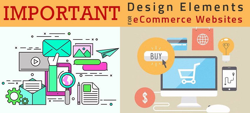
An effective UX (user experience) depends on all the relevant details an ecommerce website provides to the user that takes him across a smooth journey from browsing to addition to cart to checkout till completion of purchase in the estore. Let’s take a look at the essential design elements to be considered in web development of an ecommerce platform for a classy ecommerce website.
- Product name: A simple to-the-point yet descriptive product name, as in “A stretchable cotton maxi dress” instead of a “maxi dress” adds a great value to the SEO aspects improving the search-ability of the product. Giving repeated names doesn’t get you unique for the search engine bots.
- CTA: Colour, text and size of the Call To Action button highly influence the visitor’s decision making on the site. Colour is the one that brings out the emotional liking in the audience; also how it stands out contrastingly from the rest of the page matters to grab the user attention. Choosing a text should get along with the country for which the site is designed; ‘cart’ and ‘basket’ are 2 different text options for the same “Add to cart” in the shopping cart; make sure to use what suits the context.
- Price: Product price should be clearly visible to the user; product name & price tag visibly placed close to the CTA buttons simply grabs the customer sight
- Image of Products: Pictures directly connect to how a user friendly eStore should look and how they contribute to the conversion of a site. Multiple image design to give the product overall look, consideration of a reasonable pixel image to accommodate lower speed internet users, choosing inspirational images are all things to be noted
- Description: A clear yet simple easy-to-follow product description is something you just cannot ignore because there isn’t any point if the user doesn’t get to follow what your product is for
- Quantity: Make sure to include the quantity option so the user doesn’t have to click the ‘buy’ button 50 times if he needs 50 pieces of a product!
- Reviews: More than 50% of the users read the reviews before making a purchase and more than 50% of the web visitors choose a site having user reviews. Get the buyers give the product feedback sending them such promotional mails and get the public rate the feedback so most helpful reviews drive conversions
- Wish list: Make sure to use a wish list option making it easier for regular customers to buy the same product again with lesser efforts and even for people who would like to buy later to be reminded of the buy
- Clear cost save detail: Make sure to clearly project the original price and current discounted price of a product if you wish to convince the customer that he really saves buying things with you
- Cross-sell & Up-sell to be clear: Providing up selling and cross selling options to instigate the buy of add-ons or accessories of a product results in a better browsing experience
- Connect with media: Share buttons providing connectivity to the social media not just lets people know of your buy and the satisfaction behind but as well leads to them trailing the information to a further bigger crowd thus increasing the brand awareness and thus conversions
- Returns: There may a lot of instances a buyer would want to exchange or return a product. Make sure to make the returns processes easier in the return policy description you give in the product page or in the website home page. Every customer enjoys this flexibility; note it!
- Videos: Pictorial representation and short videos of the product add a lot of value for the simple reason they tend to convey the details much better than a text would do. Include videos sensibly and aptly
- Chat window: Include a chat window for the customers to get the answers they need quite instantaneously rather than having to wait till their mails are answered
- Bread crumb navigation: This navigation display is important to show the customers where they are on your site. “Men » Shirts » Medium” shows them they are in search of which item on your site
- Search box: Search button is the most important inclusion in an ecommerce site making it easy for the users to search for what they want in the site
- Security seals: Customers are worried of their private information. Make sure to show them your site is secure enough; display the security seals prominently
In addition to having responsive eStores/mobile friendly eStores, all the above elements are very important to be noted while creating a customized eStore that provides the best to the users. If you are in need of an expert advice in any of the above or require a support in ecommerce services, make sure to ask us at QeRetail for you know you would get just the best!


