Clicking on a broken link is like thorns on the rose. But if instead of the boring 404 error page, a well-designed page not found error is shown, it gives a sigh of relief. All the websites build on an ecommerce platform adds this page as the chances of occurrence of this page is 90%.
The reasons behind the appearance of this page can be a lot like if the website is under maintenance or a single page is under construction. If you write blogs or create a blog page, as a developer do not forget to include innovative 404 error pages. They help in the retention of customers.
404 pages have been the source of frustration for many years, but the scenario has changed now. Now, the creative heads are designing these deadly dull pages in such a way that they are shared as an example on the social media websites like Facebook, twitter, etc. Below are a few examples that have created a level and are used by many websites.
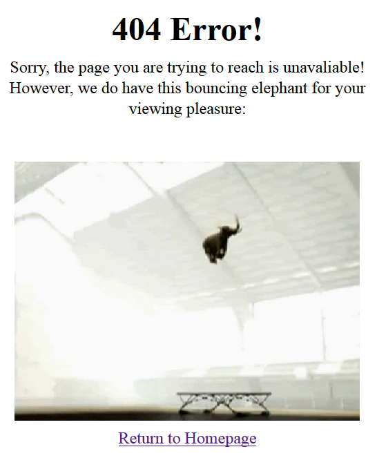
- Soundserum is an online music store having a collection of genres. It has an error page that is simple yet very effective. The clever 404 error page, on load displays a message. You must be wondering what is so innovative in this. The creative part is that it has a bouncing elephant and also a navigation link that takes you to the home page. While reading about the page, you must be curious to see the page. Well, we have added the elephant’s image below, but to see how it bounces, you have to visit the page.

- Converse has used a totally different approach to create a simply different 404 error page. The page is really simple containing only black and white color without any picture including a single back link to the home page.

- After creating a clever 404 error page, Lego has proved that a lot of technicalities are not required to create an error page. All you need is a few Legos indicating that the page is not present. Below is the 404 page image. See how cute the tableau looks.

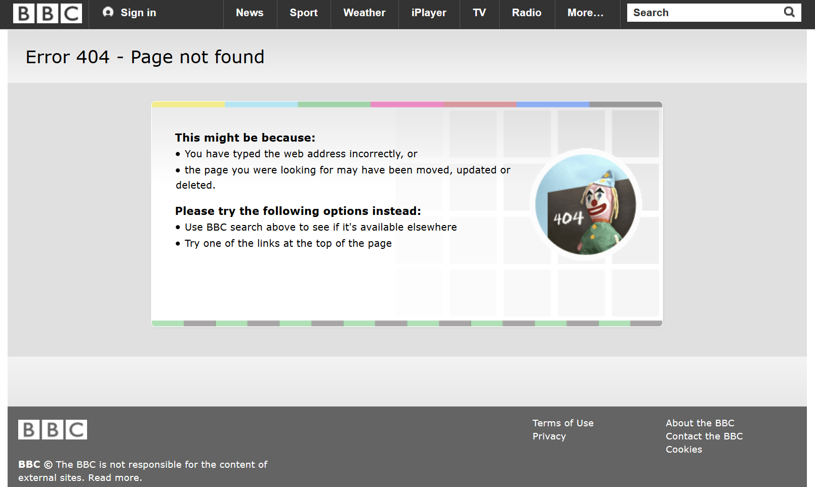
- BBC does not need an introduction as it is already a world famous website. The business sense attached with this innovative 404 page is worth praising. You can use the idea on the page as it has fulfilled all the requirements needed for an error page . Besides this, the page shows the sense of wit by adding the navigation which takes you back to the home page.

- You all must be aware of this website as this is a prominent website where all the home decor products are available. Here the innovative minds have added a funny image to show the appealing 404 error page. Do you think there is anything much better than this?

Creating a website is not a big deal, but the way you manage it is really important. Now, the boring concept of following the clichés has finished and creative minds are being used to design even a single error page. Nuance details are taken into consideration to make the concept stand out of the crowd and to entice the visitors. So, this is the time to use your creativity to set an example for others. If you think something is lacking in you, you can contact us and ask for our services.


