48% of people mentioned that eCommerce web design is the most important factor in deciding the credibility of an online business.
Are all eCommerce websites successful in gaining conversions? Probably No.
So, what does it take to gain high conversions and maximize the profit of an online business?
Providing best user experience is one of the major aspects responsible for driving sales on your online store. Best user experience can be provided through appealing design and functionality of the store.
Here, we have compiled a list of 10 inspiring eCommerce web design examples each one giving an idea of a unique element converting your online store profitable one.
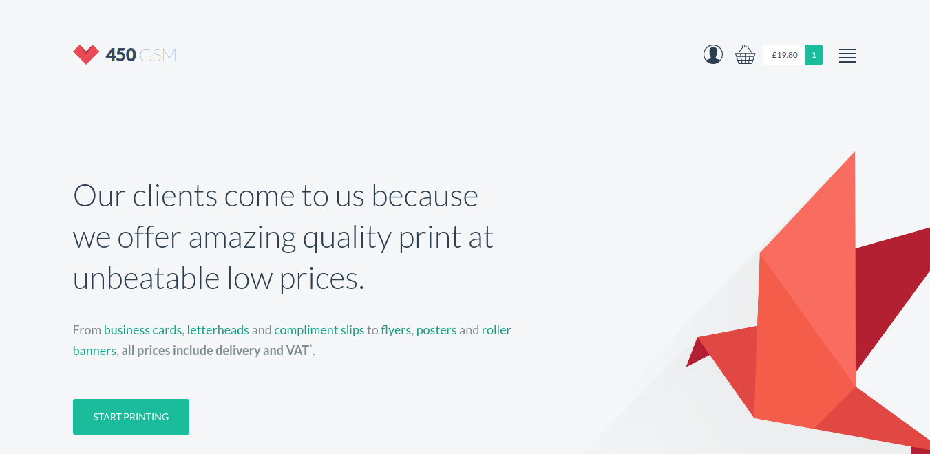
450 GSM – Uncluttered Look
450 GSM store offers online printing services. Simplicity is the key ingredient of this store. White background with a clean layout is what appeals to the visitors of this store. Creating an uncluttered layout of this sort is an art that is really inspiring.
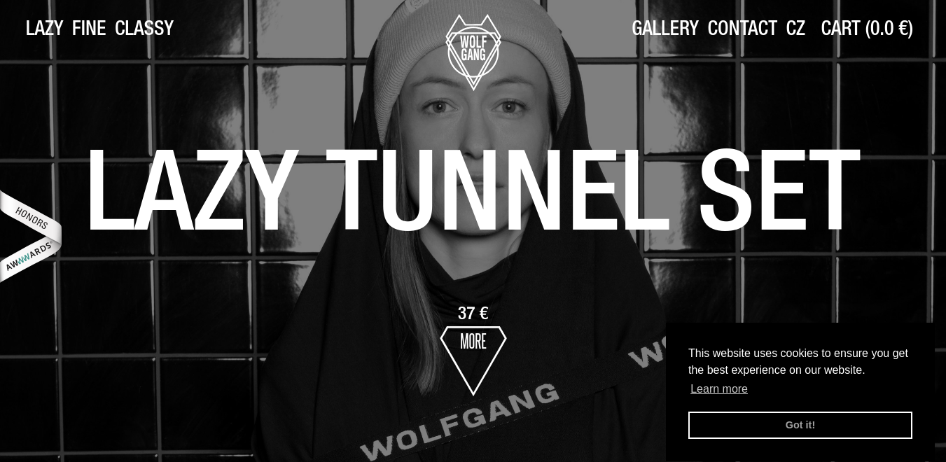
Wolf Gang – Bold Typography
Wolf Gang is an online clothing store. The unique element of this store is the bold typography which has been appealing to the visitors of this store. Almost all online clothing stores prefer to have a colorful layout, but this store has grabbed the attention of the viewers with its dark shades and heavy fonts complimenting each other.
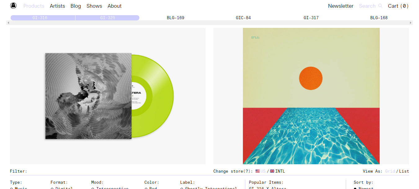
The Ghostly Store – Hero Banner
The Ghostly Store is an online branded store well known for its niche products. The unique element of this store is its hero banner, divided into 3 sections that can fit multiple offers in the same place. Moreover, its well-organized navigation menu clearly showcases the unique products they sell.
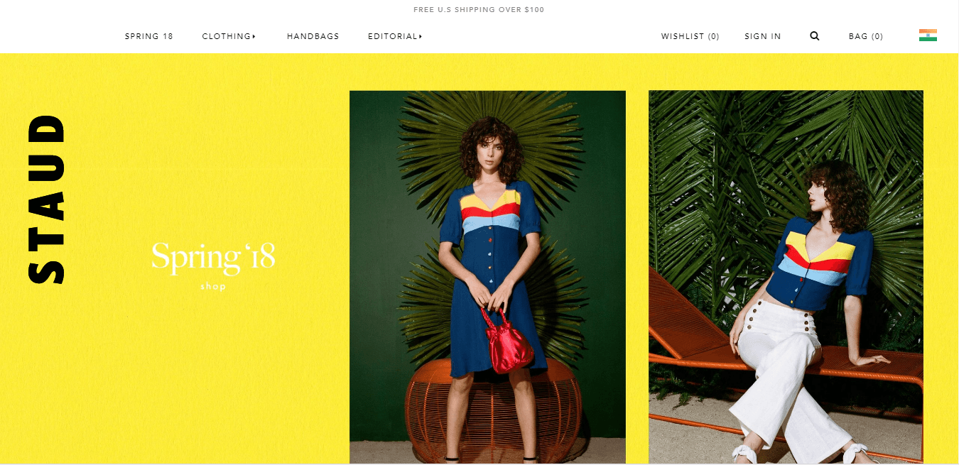
STAUD – Bright Colors
STAUD is an online store of clothing that appeals to visitors due to its bright colors used in the photos and background. The font in white color complements those bright colors very well.
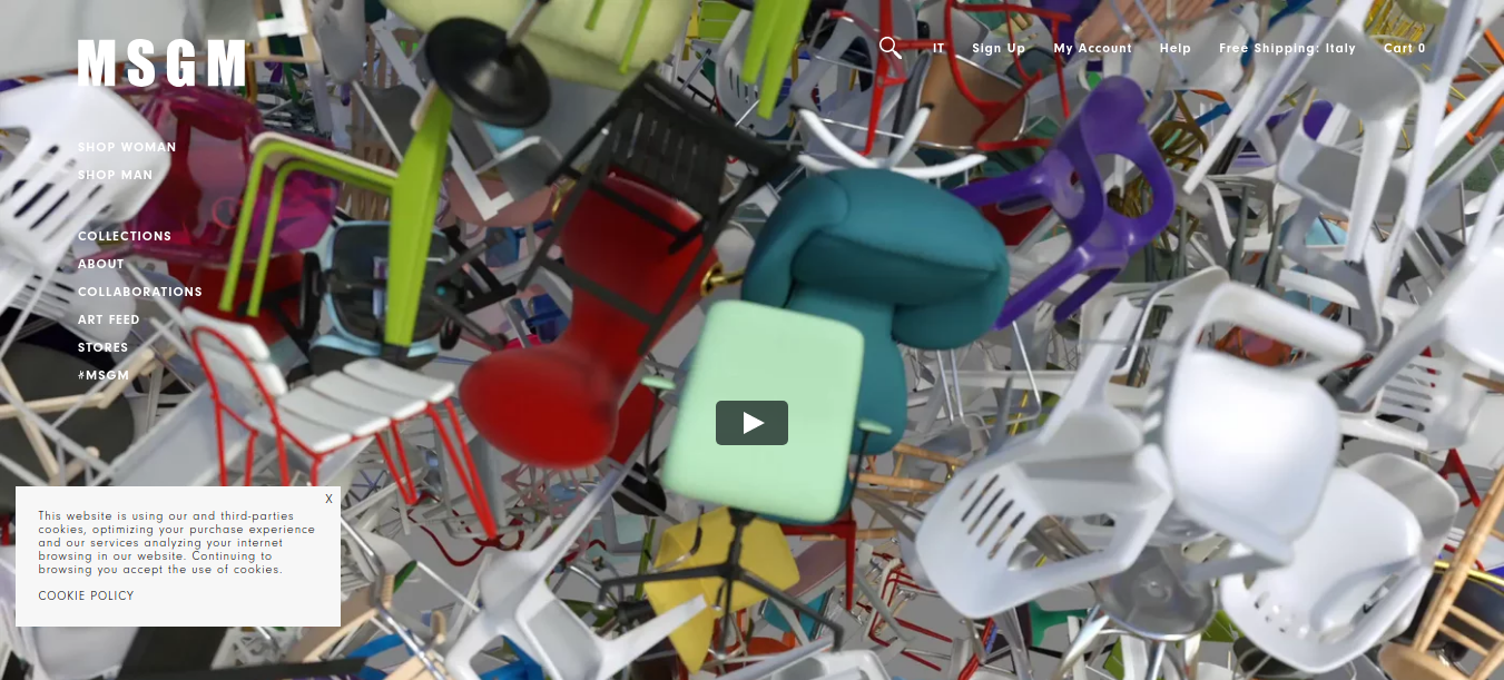
MSMG – Homepage Video
MSMG is an online store of clothing that has attracted visitors with the video on its Homepage. The interactive video covering the entire first fold of the Home Page is real fun to watch and is the key element behind the success of this online store.
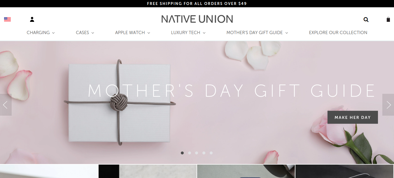
Native Union – Sliding Banner
The sliding banner of Native Union represents the products they sell in a creative manner. It helps visitors to navigate to their different product pages easily. The use of product images in this online store is awesome.
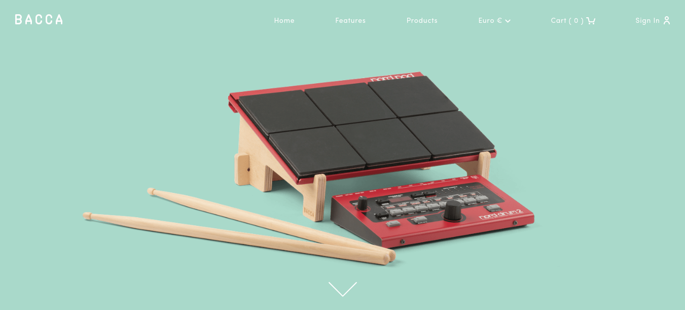
Bacca – Stand-alone photograph
Bacca is an online store of handmade wooden laptop stands. The Home Page design above the fold has a picture of their niche product without any background, which makes it highly attractive. The excellent photography on the entire website is the strength of this online store.
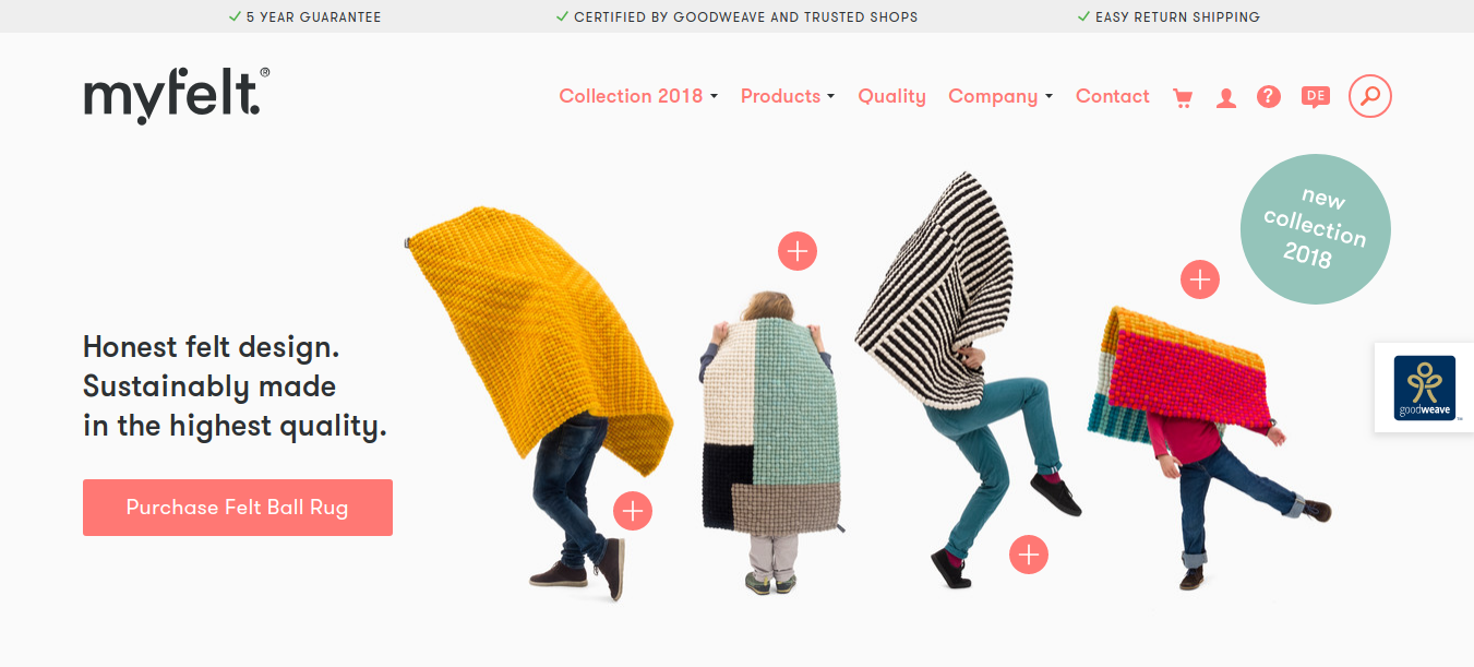
MyFelt – Attractive Photography
The unique photography in MyFelt is something that has made this online store extremely attractive to its visitors. The comical and cute photos on this website give a fun look to the website rather than the professional one. Still, has been successful in converting visitors into customers.
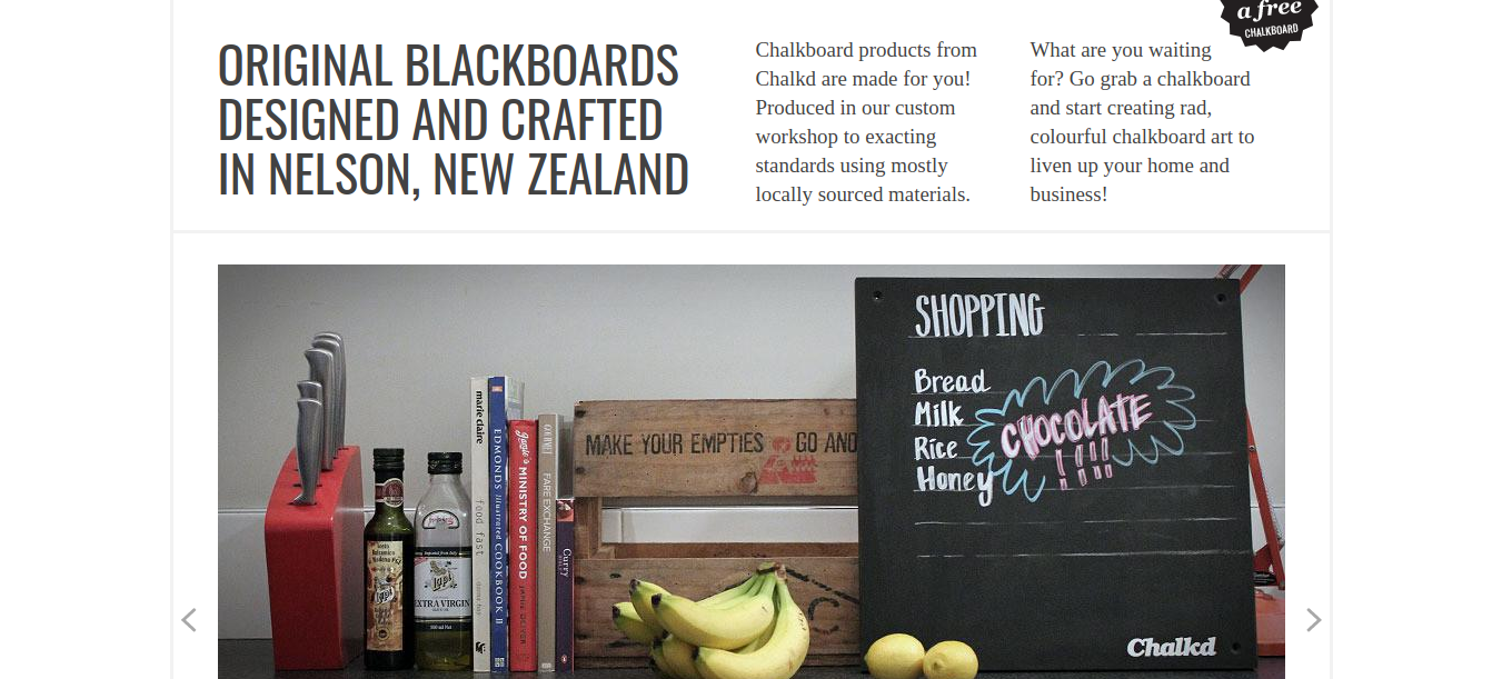
Chalkd – Clear Value Proposition
Chalkd is an online store of original blackboards. The clear value proposition on the top banner is the key element behind the success of this eCommerce website.
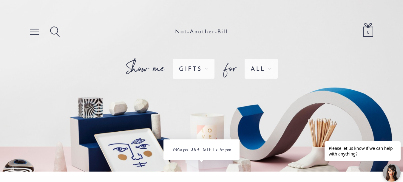
Not Another Bill – White Background Enhancing Creative Products
Not Another Bill is an online gifting store selling unique products. The white background enhances the colorful, creative products in the store. This attribute of the store has an appealing effect on the visitors and thus helped increase conversions.
eCommerce Web Design Examples – Feeling Inspired?
We hope that you must have got inspired by the above eCommerce web design examples and the unique ideas they have used. Just remember that it is not all about how we need our store to look. It is all about how our visitors want it to look and work.
Keeping users’ perspectives in mind, we should design an online store and ensure that it works well and provides the best user experience.


