Supposedly, if the eCommerce store is a living object, product pages are its heart and soul! Product page optimization is vital when it comes to increasing the reach. If we focus on the search intent of a consumer and not just the search keywords, it is clear that a potential consumer will land first on your product page. There’s no second opinion about building your product page effectively for skyrocketing both your traffic and conversions.
Table of Contents
Ideally, a high-converting product page should have the following features:
- Should psychologically trigger to convince potent buyers to add to cart
- Should be able to explain the product while staying true to your brand image (after all, the product page is representing your brand as a whole too)
- Should have the potential to upsell, cross-sell and resell to/from other categories
Now let us dive into the anatomy of a perfect eCommerce product page design and optimization!
5 eCommerce Product Page Best Practices
1. Feature Image
Would you even bother to stay on a product page which has clumsy images?
The foremost element of any eCommerce product page design is its feature image. It is next to impossible to compete when your product photos are clumsy. The most enticing part of any purchase is always how the product looks and a properly photographed image can create a lasting impression. Make sure to position your products in white backgrounds where the highlight is just the product. Market places like Amazon stay true to their name and follow a pattern in every product display.
2. The Photo Gallery
Would you be convinced to buy a product by just seeing a single photo?
If your feature image is to drag the visitor’s attention, the product image gallery is to convert them into shoppers! The prominent aspect of any eCommerce product page design in their well-portrayed product image gallery. In most cases, visitors need to see all the angles of the displayed product. It is advisable to exhibit one to two use cases of the product for better understanding. It is more convincing to see someone wearing the shirt that we wish to buy than just seeing its pictures right? The same thought process applies here.
It is essential to make the prospects visualize how the product will actually look on them or in their home. Using 360-degree shots or video tutorials and visuals can also engage them more. Make sure to always use compressed images to increase the page-load speed!
3. Unique Title, Overview and Product Description
Everyone likes variation, be it in products, functions or description copies!
Providing different page titles, overview, and descriptions for all your listed products are important for both your visitors as well as the web crawlers.
- Product title
- Price
- Features and components
- CTA
- Customization options
The mentioned five elements should be present in any product page for the ease of shopping and quick checkout. Writing product descriptions that are both optimized for your product page keyword as well as speaks to your branding should be the target. To do that:
- Use Google or other tools to search for your keyword. Take inspiration from your competition’s product pages. Your goal is to make your eCommerce product pages better.
- Mention all the relevant information about the products like its functionalities, manufacturing details, prescriptions, special guides, tutorials, etc.
4. User Authorization
Would you rather listen to what the brand itself has to say or what the existing customers have to say?
An essential element of any product page is it’s shoppers’ reviews, ratings, and comments! Visitors tend to buy products with actual user ratings and reviews. You need to build more trust with your audience. As Daniel Wallock, a Marketing Strategist at Wallock Media describes, ‘Displaying reviews below the product and testimonials from major magazines or other outlets can be incredibly effective at building trust. Overall, it’s important to provide real evidence that your eCommerce store is more than just another generic site’. Attaching social proof should be the foremost tactic for product page optimization. More than 80% of consumers consult reviews when making a purchase, and adding them to your site can help lift sales by as much as 18%.
5. eCommerce Product Page Optimization with Hyper-personalization
AI is future, and enabling it for hyper-personalized user experience will enhance your eStore
Hyper-personalization includes many things. Suggesting products according to the user’s past purchase or browsing history, suggesting similar products, giving options of what goes well with their searched product, what other people are viewing with the same search, what others are purchasing along and more. eCommerce stores which enable AI personalization, get the attention and visitors stay on the site for longer.
Best eCommerce Product Page Examples
1. Levi’s Hoodie
Key Takeaway
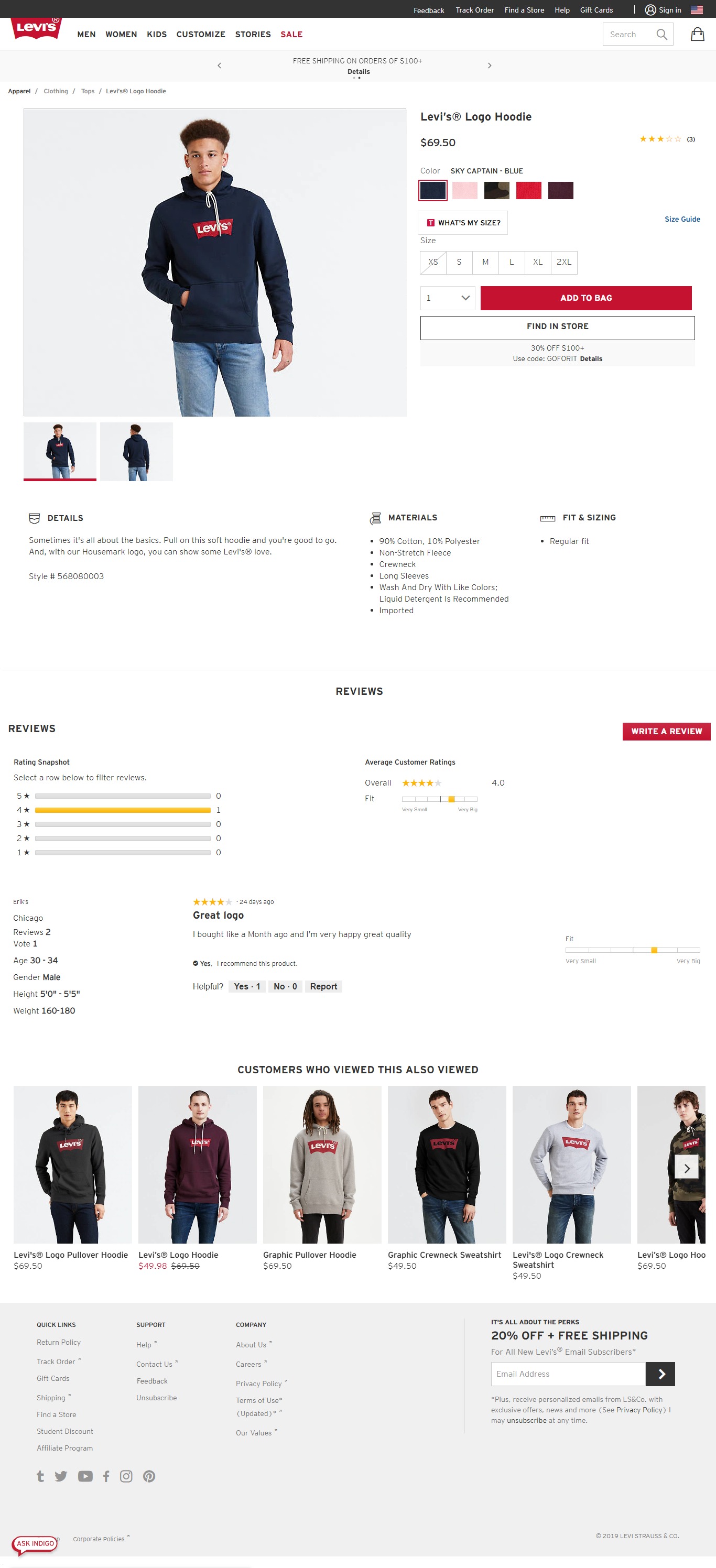
Levi’s is grabbing attention from its real-time ratings and customer reviews. Moreover, they’re providing a common personalization as ‘Customer who viewed this also viewed’ option. Another catch here is providing the model body stats.
2. M.A.C Ruby Woo Lipstick

Key Takeaway
M.A.C is highlighting its lip color shade on different complexions! This helps the visitors in comparing their skin complexion. A video tutorial is another attraction of their product page, along with a personalized section of ‘Works well with’. Realist reviews and shoppers’ comments are there too. One more highlighter here is to have the palette of all the available lipstick sades on the same page. Visitors can simply shuffle and see whichever they wish for!
3. iPhone Xs

Key Takeaway
iPhone product displays need no introduction! Only a single image display with hyper-personalization is their motto. The highlight here is their comparison of other iPhone models, amazing single image, up-sell feature display of iPhone Xs Max, model color option, storage capacity option, freebies inside the box, FAQs, and reviews. Pretty much everything can be considered as eye-catchy details.
4. Tesla Car
Key Takeaway
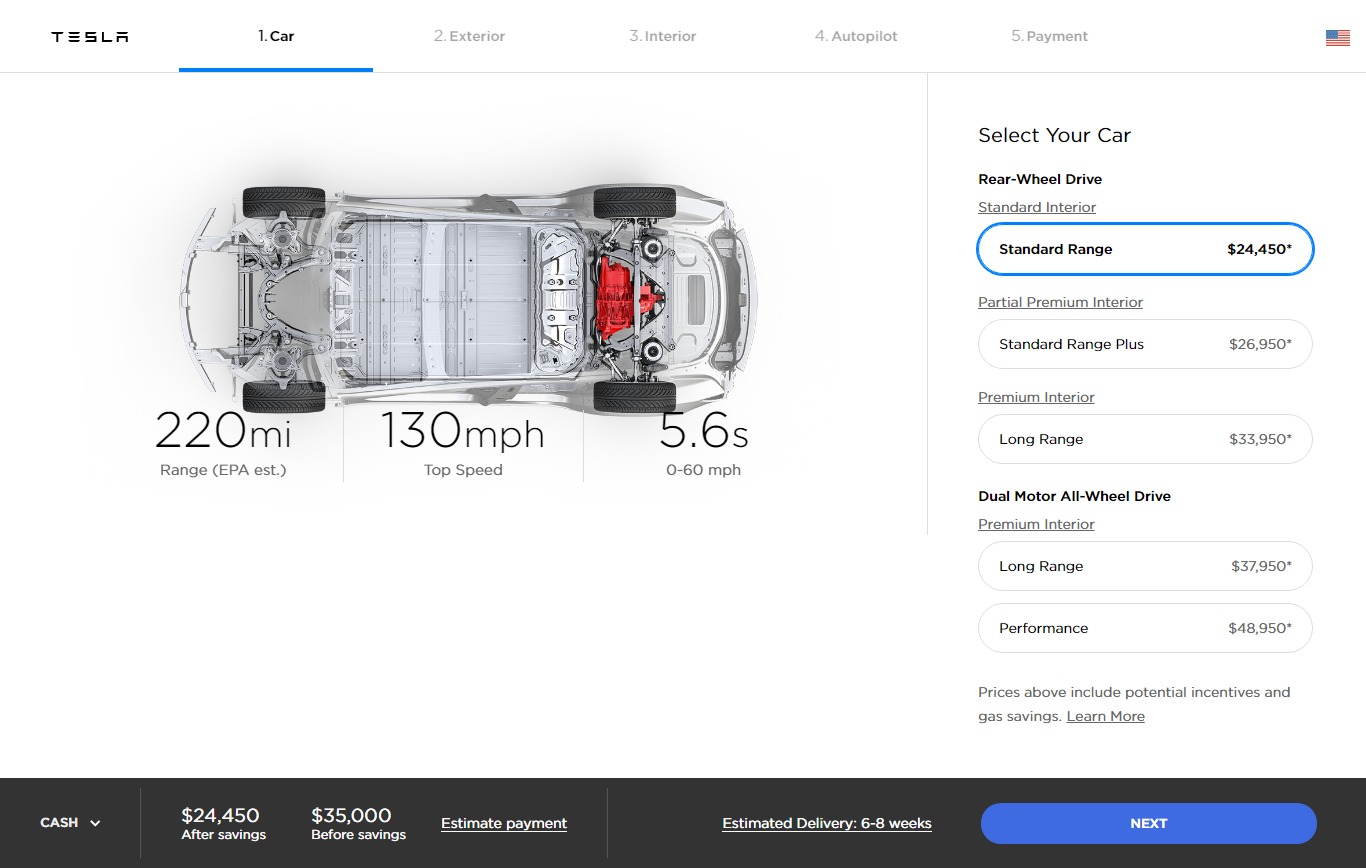
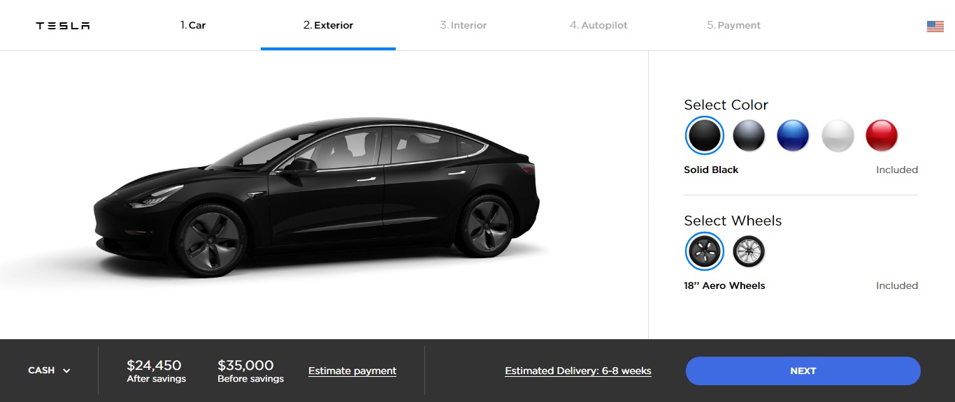
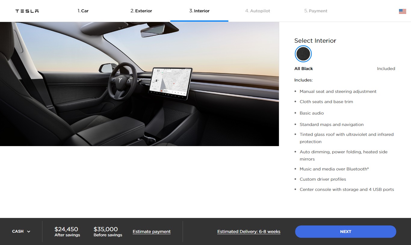
Yes, Tesla is selling a car online! Again a master of product page design where almost every other thing is inspirational. First of all, they’re providing side-scrolling for their single product (car) where each feature is explained in detail. Interior, exterior, the car, autopilot, and the payment option. Selection of color, wheels, model and other details like delivery estimation, cash/loan options, etc. is just to the point!
5. BOSE Wireless Headphones

Key Takeaway
Yet another product page marvel is created by BOSE! This attractive piece has many things to offer. The video for the starters, functionality highlights like noise-canceling, AR, Voice assistance, battery life, etc. In personalization, they’ve crossed a line by providing customized headphone designs with a few inspirations. Apart from that, the other accessory suggestions, FAQs, Rating & reviews with a touch of multiple images nails the show!
Wrap Up
To close the curtains on this one, we would say that your product page, it’s content, the swiftness of the navigation, the visual cues, and consistency to the brand image has the power to make or break your sale and so is your eCommerce store. If you seek custom web page design for your eStore or need a facelift, get in touch with QeRetail!


