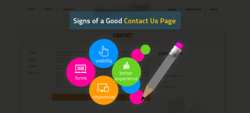
“Contact us” pages in ecommerce stores get more views than the other pages do, in a lot of websites. Do you believe? Dedicating more time to develop a “Contact us” page is necessary because that is the beginning form on your communication with visitors/customers/prospects having a long way to go towards eStore conversions.
To mention on a few tips to be taken care on “Contact us” pages,
- Make sure to have no grammatical errors in them.
- Have simple content, to the point and clear enough, in those pages.
- If you are using a contact form in your online store for visitors, ask them just the essentials, say name, mail id and their message. Keeping mail ids and phone numbers as mandatory fields are frustrating to the people. We understand you really need those information but unless a trust is established via products/services in first place, there is no way you can get to the point of grabbing those customer details with the customer will and wish.
- Contact us page of eStore is meant to be equally attractive to a landing page or a cart page, the reason being “contact us” being the primary way of exchanging details between the business and the public.
- Make sure the personality of your business is very well reflected in these forms. When you have an estore selling baby toys, you might not want to have an electrical equipment in the background of the contact us page or a simple phone symbol as the icon next to the contact number. You may look smarter having a baby holding onto a phone at the background image end and a similar one as the icon for the contact number!
- Having a functional ‘contact us’ page is very important. Should be responsive for mobiles/tablets, make sure of it.
- Visually appealing ‘contact us’ pages do make a lot of connect than done by blunt ones.
- Trust-establishing statements like “We look forward to hear from you”, “We check the notes from you every hour” on a ‘contact us’ page gives a nice feeling to the customer that his/her voice is being received and makes way for better relations and even a faster increase in conversions.
- Clubbing ‘About us’ and ‘Contact us’ showing your business establishments on a map and the contacts with respect to each location/each department is one of the best ways of designing these pages.
- ‘Contact us’ pages showing the contact based on departments and having a language switch catering to various language speakers is a good mention here!
- The best mix of message, design and functionality is a must in these pages
- Small steps in ‘contact us’ pages taking the visitors through a simple way of details sharing is a great way to talk!!
Be it the right background or re-assuring phrases or being to the point or even inserting blog links or pushing in business ads looking for specific people or whatsoever, it requires a basic expertise to get these pages done in the best manner. Are you looking for one of such supports for your ‘Contact us’? Contact us!


