So, you have created an account on Instagram. You are already equipped with some best photos of your products. You have a satisfactory number of followers. You are getting likes on your products. This is your everyday routine: You upload a pic. Your followers look at it. Hit like. Then scroll ahead. How many of those likes have been of real value? How many of those scrollers or followers have turned into your customers?
What started initially as a photo sharing platform has now made its place in the list of the top social media platforms with 700 million active users as of April 2017? That number shows a huge user base you can tap to market your products and brand.
Instagram is used by 48.8% brands and is predicted to grow 70.7% by 2017. These statistics shows that day by day more and more of your customers would be getting on Instagram and you have to be there clearing your way through all the noise and stiff competition in order to get noticed. Though it looks a very simple platform to market your products, it’s not that simple after all. Creating a beautiful Instagram feed takes in a lot of efforts but the results would make it all worthwhile.
Let’s begin…
Table of Contents
How to create an Instagram feed that can attract user attention?
First impression matters.
It’s like someone entering your house for the first time. You want them to feel good. You would want your house to smell good. Everything is at its correct place. The same way, when visitors stroll through your home page, you would want to make sure they stay there longer and check your posts thoroughly.
How can you do that? Let’s have a look below
- Maintain the aesthetics of your posts.
When buying online, people cannot touch, feel or sense what they are looking at. Your feeds should be a pleasure to the eye. Your posts aesthetics should represent your brand’s identity. Fun, Bold, Classy, Elegance – What does your brand really exude? Your posts should be such that can immediately establish a connect with your target customers, whether they are Baby Boomers, Gen X or the millennials.
Take for example ZGallerie

- Think of Instagram as a whole rather than just different separate images
Weaving your Instagram posts in one big story board is a great idea to add a recall value to your posts and help you stand apart in your customers feed. Apart from a theme maintaining a variety in your posts will create a balanced and uncluttered view. Your new visitors would definitely want to check your previous posts, make sure your home page is welcoming enough. It should look like a collage of vivid colors. - A new pic that you are about to upload should compliment your previous picture
An expansion of the previous point, have a look at your previous uploaded images and make sure it fits perfectly in your home feed. - Beautiful sells, clumsy doesn’t
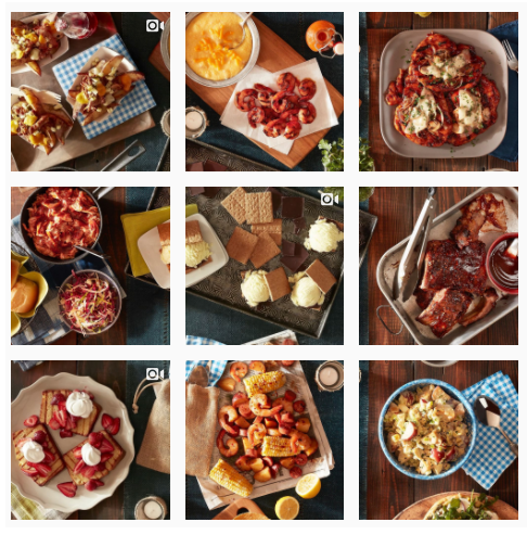
Editing photos and using various filters is a good idea for Instagram when done keeping a consistency in mind. However going overboard with filters and effects may lose you the aesthetics that you have chosen to follow for your posts. Use selected filters to edit your photos and creating a visual appeal.
Take this grab from Reynolds Kitchen as an example.

- Use quality photos and good lighting. People would want to buy what they see
Quality of the images you upload on your Instagram can have a huge impact on your product branding. Poor quality images lacking proper lighting will make your feed look dull and totally uninteresting. Take good quality pictures of your products in presence of proper lighting. Use correct angles to take pictures. People will not buy it if they are not satisfied with its appearance. - Last but not the least, stick to a good theme
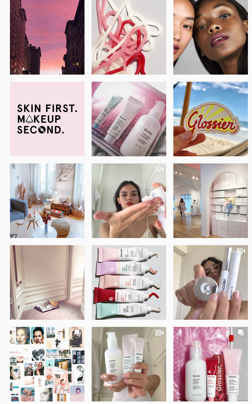
Consistency is the key. Be creative and develop a good theme. This doesn’t mean including all the colors of the rainbow in your pictures. A simple yet visually appealing theme should just do fine. Keep this simple factor in mind: What are you selling? Work your way around it and decide a good theme for all your pictures.
The page for Glossier uses a beautiful pink theme in all its images.

Now that you have created visually appealing posts, let us move to the next intersection down this road:
The Caption
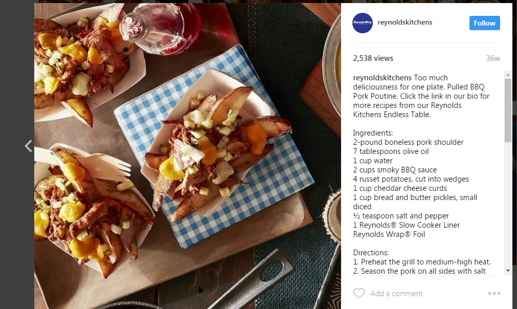
A good caption will always grab viewers’ attention. Captions should be such that will make them stop in their tracks and take notice of your posts. A witty caption will increase your posts views and will compel your followers to comment or tag someone, thereby increasing the reach.
Look how the guys at Reynolds Kitchen have used a proper ambiance in their picture meanwhile explaining the recipe in the caption.

Next in line are the #hashtags.
They are your weapons or pocket drones. By using correct number hashtags with correct keywords, your one post or a picture can reach the masses. See to it that you are not creating a mess with the hashtags. Keep your hashtags ratio balanced; it should not be too less to not attract visitors or not too many to distract your visitors.
Once you are up and going, do not be a spectator. I repeat, do not be just a spectator. People love interaction. If you see comments pouring in and people asking questions, reply to them. Active pages on Instagram have a higher chance of conversion compared to the pages that just keep posting stuff but do not participate in customer interaction. Those pages are as good as dead.
Knowledge comes with experience. Once you start posting about your products, you will understand the metrics. We are here at the last intersection of this road. You have the map in your hand. Take the right directions and you are bound to hit the jackpot.


