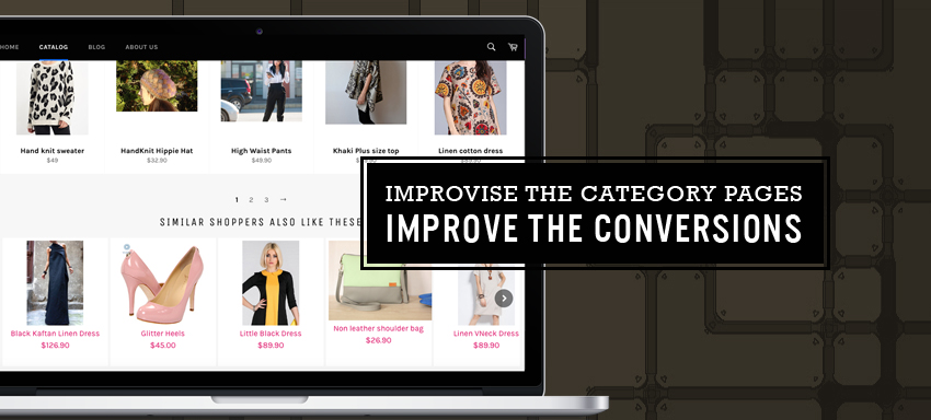
Optimizing or facelifting a website requires a good analysis on deciding which page can offer great conversions and thus deserves a huge time to optimize. At the home page, a customer hasn’t given you a profit yet and may leave anytime but at the category page, the chances of him going to product pages and thereby towards conversions are quite high. It’s from the category page, a customer directs to the product page so you know how important it is to the show the right ‘stuff’ (information) on the ecommerce category pages. Lets take a look at optimizing category pages for an Estore/ ecommerce store.
- Make the parent categories linked to a page and not just as “text displayed”. Most users expect to navigate from the parent category, to see the sub categories and overall details of the category.
- Add a subcategory within multiple parent if you find it relevant. For an example, a watch can be under “accessory” for men and also under “Men’s watches” under Men.
- Having “What’s new” page is a great idea since most users love to know what’s different in the site from the last time they visited. This even lessens the time of browsing through multiple pages and the effort to remember what went on last time.
- Strictly avoid vague category names. Card sorting (getting a group of users to check over products and make them suggest a category name for the group) to sense what’s great in a customer view, try testing and so can help to deduce customer behaviour. Use descriptive names and not technical jargons.
- Filters are a great way people find the right product on an online store. They have been known to improve the conversion rates to a big extent.
- High quality “zoom-able” detailed consistently styled relevant images are a must to give the customer a feel of the physical shop buy. Try to show the products from different angles and various perspectives to attract varied user lookout and vision. Use men/women images where necessary as it attracts people generally.
- Uniform image size in the product archive is known to create more conversions than inconsistent product grids.
- Category pages and product pages with reviews add to the confidence of customers on the site. This improved the click through rates, search rankings and thus the conversions to a big extent.
- Use bread crumbs to ease the navigation; you may get to reduce the bounce rates by improved search ability. Using <, placing at the top of category page, different font styling, using the last level as a non-link, not using fly out navigation, showing the full path back to the first level, using full title matching the actual web page title in bread crumb are all good practices known to excel.
- Simple categories and less filter options tend not to confuse a user but too many categories do. Complex filters make the find-ability tough for the user thus cause an increase in bounce rates
- Advanced search feature works better than simple search as in, showing alternative products when no search results are displayed, autocorrect in search texts, dictionary feature in search to show dynamic results.
- On-page SEO optimizing using SEO permalink, keyword in page title, keyword in page description, keyword in alt name and image file, keyword in h1 tag, lsi keywords in the post is highly recommended. Contextually appropriate quality links improve the search rankings.
Having said, we are sure now you have a good idea on what to look for and how to focus on optimizing web pages to move towards better conversions. While consistent high rates may not be a potluck for all at all times, we can always do the best in the decision so we have a high chance reaping great results. If you require assistance further here, or in graphic design services or in any estore aspect, contact us now.


