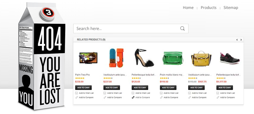
As you are reading this article, this is damn sure that either you own an estore or want to step into the world of web development. No matters if you are new to the respective field, you are going to be benefited by the advice we are going to give you today.
No matter how brilliant a website is designed or developed, there comes a time when a so called 404 page appears. The reason may vary. But the reaction to the appearance of that page does not vary. It is the same for every user. They get frustrated. So, as you read more, you will get to know the importance of 404 page and also the ways you can handle it.
For business growth, it is extremely important for the owner to focus on all the loopholes of the business and to get rid of them. Though 404 page is not the only reason of losing the customers for an ecommerce website, but in some manner it affects the profile of a web development company.
To create a userfriendly eStore where people can access what they want to, even when the 404 error pops up, follow the below instructions:
- Customize the 404 page:
If you own an estore and are very much concerned about the business growth, customizing the 404 page can help you reach closer to your goal. How would you feel when you are eagerly waiting for a web page and instead of the expected page, 404 page appears? You would either abandon that website or would visit it out of the blues. So, to prevent the people from giving a negative feedback for your website, make an attractive 404 page, which does not really looks like an error page.Responsive Websites or static websites, both can have their own customized error page. Try to add colors to the boring 404 page, which can entice visitors instead of driving them away from the website. Graphic designs, cartoons, etc. can be used to develop the page.
- Add a search box:
We all know that error pages are irritating, but we can’t help it as this is common for any ecommerce platform. So, instead of cribbing about the same add a search box on the error page that can be help the user to reach the right direction. - Add navigation to the page:
We all are familiar with the word “navigation” as it is a common term used in every ecommerce platform. As this article is about the importance of 404 page, so we will not deviate from the topic and continue the discussion over the same. Navigation can be provided on the error page to help the visitors to continue browsing the site immediately after it appears. - Make 404 page fun:
To make a userfriendly eStore, you can also add funny animations to your 404 page that can make people laugh. Or you can add games to the page just like Google has introduced when the internet is not available. It can engage people and instead of getting bored, they will start loving your error page.
If you are lacking any kind of information, you can check out the services on our page and contact us for more details.


