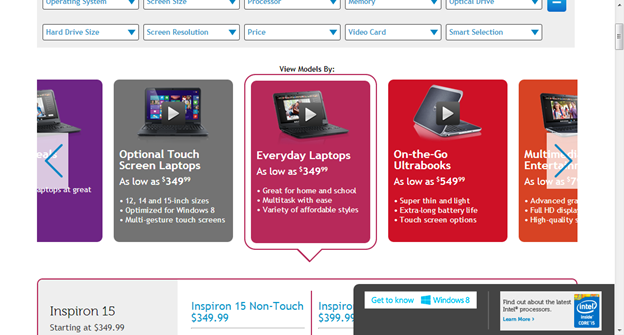
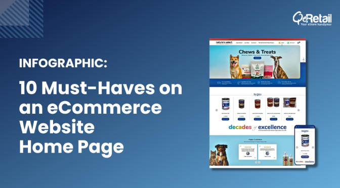
Carousels, also known as sliders and rotators are heavily debatable these days. To implement a homepage carousel or not, is the question that arises in the minds of eCommerce marketers.
We at QeRetail, believe that Carousels should be included on the Homepage for various reasons like –
Saves Space – Instead of forcing website visitors to scroll down a long page to view multiple offers and products, the same can be shown in a small space above the fold.
Grabs Attention – In carousels, the images and text keep on rotating. The right kind of rotation helps in grabbing the attention of the visitors.
Eliminates Clutter – For eCommerce websites, there are multiple offers required to be shown on Homepage to get the benefit. The sliders can show the multiple offers and at the same time eliminate clutter on the website.
Targets Different Buyers – Each and every customer in your store has a different requirement. The homepage carousel can target different buyers by showing diverse products and offers with sliding effect.
Can Replace Video – Not all businesses can afford the expense of getting a video created which can showcase their products or services with a moving effect. The carousel can be a great alternative to video.
47% of top eCommerce websites include carousel on the home page.
In short, homepage carousel can work well, provided it should not spoil the user experience.
In this blog, we will focus on few practices which would help in implementing a UX friendly homepage carousel on eCommerce sites.
Slide Sequence
When it comes to homepage carousels, visitors tend to click on initial slides more than former slides. The reason behind that is visitors are not likely to stay on the homepage for a longer period of time and certainly not on the first fold. This makes the sequence of slides in homepage carousels extremely important.
The offer for which you need maximum exposure should be kept in the first slide of the carousel. Your first slide should be attractive enough to sell your rest of the slides in homepage carousel.
It is obvious, that the visitors are not going to view all your slides. The carousel slides should not be the only source to provide important information about your online store. The information which is being shown in the slides of carousel should also appear in rest of the page. This way, your visitors would not miss out any important information on your online store.
Automatically Rotating Slides
The automatically rotating slides can improve the exposure of information you want to your visitors to view and react to it. When the slides would automatically rotate in a carousel, it forms a better impact in the mind of visitors.
The visitors can consider your carousel as a static banner if the slides are not moving automatically and also might not grab their attention.
But, in case of auto-rotating slides, you need to ensure few aspects –
1. The slides don’t rotate too fast
If the slides rotate too fast, the visitor might miss out reading on the important content displayed on the carousel. Moreover, if the slides rotate too slow, the visitors might not find it interesting and leave the website.
Deciding the time for which the slide should be shown depends on the content of the slide. The slides with more content should be shown for a longer period so that the visitors can easily read the entire message on a slide.
2. The auto-rotation should pause on mouse hover
Whenever the mouse hovers on the carousel, it is understood that the visitor is focusing on the content of that particular slide. In this situation, the auto-rotation should pause so that the current slide doesn’t change and the visitor can continue reading or looking at it.
If the auto-rotation doesn’t pause on hover, the visitor may click on the wrong slide and land on the page they don’t want to visit. This becomes annoying for the visitors to then again come back to the homepage and click on the slide consisting the content which they found interesting.
3. The Auto-Rotation Should Stop Permanently After User Interaction
For example, when the visitor clicks on the arrow to change the slide manually, the auto-rotation should stop permanently. The user interaction indicates that the user wants to have control over the content they would like to view or pay attention to.
4. Auto-Rotation Not to be Used for Mobile Sites
Mobiles work on touch-based technology and cannot recognize on-hover effect. It is not at all advisable to use auto-rotation for mobile sites. If the carousel on mobile site, auto-rotates, the visitor might tap on the wrong slide which would not be a good user experience.
Valuable Content
The content on the carousel should add some value to the visitors. There should be an attractive call to action on the carousel. Also, the placement of the content on the carousel should not be similar to an advertisement banner. All these aspects, if taken care of, would ensure that they grab your visitors’ attention towards the carousels and make them effective.
Limited Slides
Your visitors are not likely to view more than 5 slides in your homepage carousel. So, just keep the slides limited to 5 or less than that. The carousel with less number of slides can load quicker and improve the user experience.
Indicate the Number of Slides in the Carousel
There should be a clear indication of how many slides are there on the carousel and the position of the slide the visitor is viewing at present. This helps in eliminating uncertainty and gives the user control over browsing which they like immensely.
Prominent Call to Action
There should be a prominent call to action on the carousel. The call to action button color and text should be attractive enough for the visitor to click and enhance the effectiveness of your carousel.
Optimize Carousel Content for Mobile Devices
Most of the people now use mobile devices for shopping products. Thus, the content on carousel should be easily readable on mobile devices too. It is not at all advisable to use large images and long content on carousels designed for mobile devices.
The buttons on carousels used for mobile devices should not be tiny without any spacing and cluttered background. This would make difficult for mobile site visitors to click buttons on carousels.
Back and Next Navigation Control
The back and next arrows on the carousel leverages the navigation control to the visitor of the website. These back and next buttons should be on the carousel itself. This navigation control should not be below the carousel or below the fold. Otherwise, the user would not be able to move on next slide if they want to before the slide automatically changes.
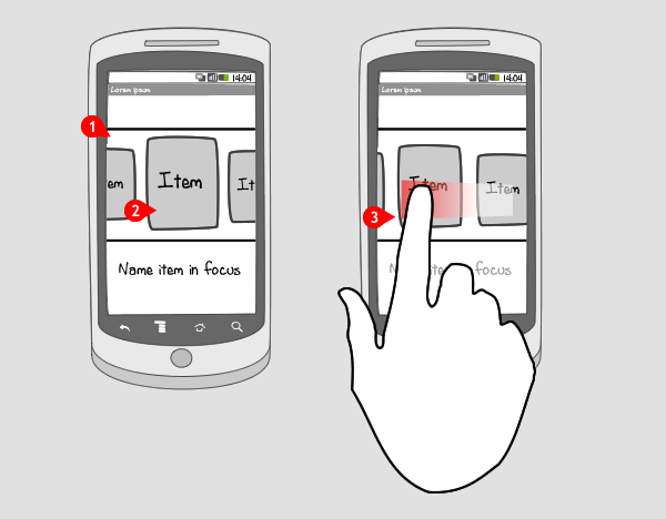
For mobile devices, the users should be have the control to change the slide on swiping. This doesn’t mean that you display back and next navigation control in the carousels designed for mobile devices. The back and next navigation should be additionally present besides swiping gestures.
Don’t repeat H1 tags
Generally, there is a different heading on each slide of the homepage carousel. All the different headings are assigned h1 tag which duplicates the tag on the same page.
The search engines like Google, Yahoo, Bing, etc., consider h1 tag as the heading of the entire page. As per these search engines, there cannot be more than a single h1 tag on the page. Just make sure that there is no h1 tag assigned to the headline of any of your slides in the homepage carousel.
Homepage Carousel : The Key Takeaway
If your homepage carousel is not getting enough clicks, then it cannot be assumed that the trend of the carousel is dying. On the contrary, the carousels are highly prevalent in eCommerce sites. Homepage carousel has been proven to be an effective element helping to improve conversions.
The content on the homepage carousel should be relevant, appealing and attention-grabbing. So, if you are asking yourself, should I use carousels on the homepage, the answer would be yes, but it should be providing a high-level user experience.


