Customers today have short attention span; this topic has been discussed time and again in digital marketing. And because this sentence is so true, the artisans and influencers of digital marketing emphasize website owners, online retailers and entrepreneurs to focus more on this underlying factor.
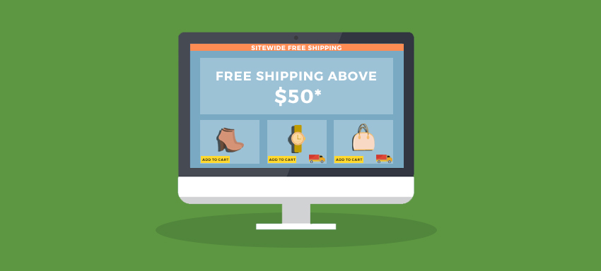
Website owners run various offers and discounts on their store in & out. One such offer that everyone loves to see is Free Shipping. Offers such as sitewide discounts and free shipping compel the customers to buy something automatically even when they did not come to your website with a similar intention.
Nine out of 10 of the survey participants said Free Shipping was the No. 1 incentive when asked what would make them shop online more often. (Marketing Land)
Customers are so used to seeing offer banners, ads etc everywhere on the website, that their Prefrontal Cortex makes them ignore such offers after a certain point in time.
People have developed the ability to discover the value amongst the chaos and clutter.
Therefore, web designers and online retailers need to be really strategic when placing such offers on their website.
Table of Contents
Here is how you can make Free Shipping offer noticed by your customers; with examples
1. “Free Shipping” placement is instrumental
It has been a practice since long to display Free Shipping offer or banners on the homepage. Keeping the Free Shipping offer restricted only to site-wide headers is not advisable.
Some users tend to ignore the text displayed in headers. Since generic advertisements and website offers have increased with time, users assume that the text is in respect to the same generic options. Sometimes the text displayed in headers is difficult to spot.
This is because a lot of other information is also displayed alongside the headers. Shopping cart, Search bars, Navigation, Links etc take a lot of space in the header section.
So, where should you display the Free Shipping Offer?
Ask this: On the entire website, which is that one place where users are most likely to spend more time scrutinizing the information?
Very likely, it is not the homepage. The only place where a user will spend more time after product page is, right at the checkout. Right before someone clicks on the buy button, they would want to make sure everything is as they had expected.
On the homepage, there is great chance that a user might not see or miss the Free Shipping Banner displayed on the top.
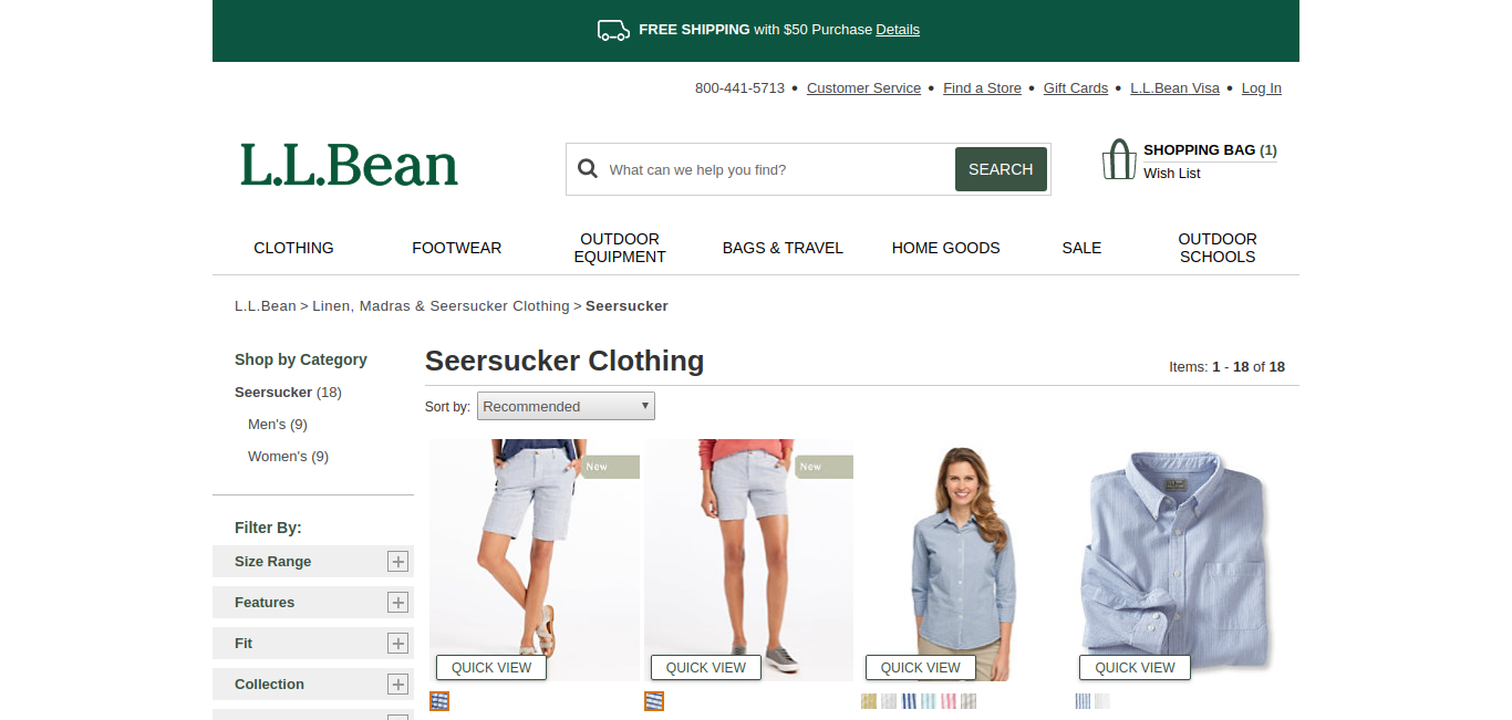
Understanding the metrics, L.L. Bean strategically targets users with the Free Shipping Information being displayed throughout the entire journey of the buyer.
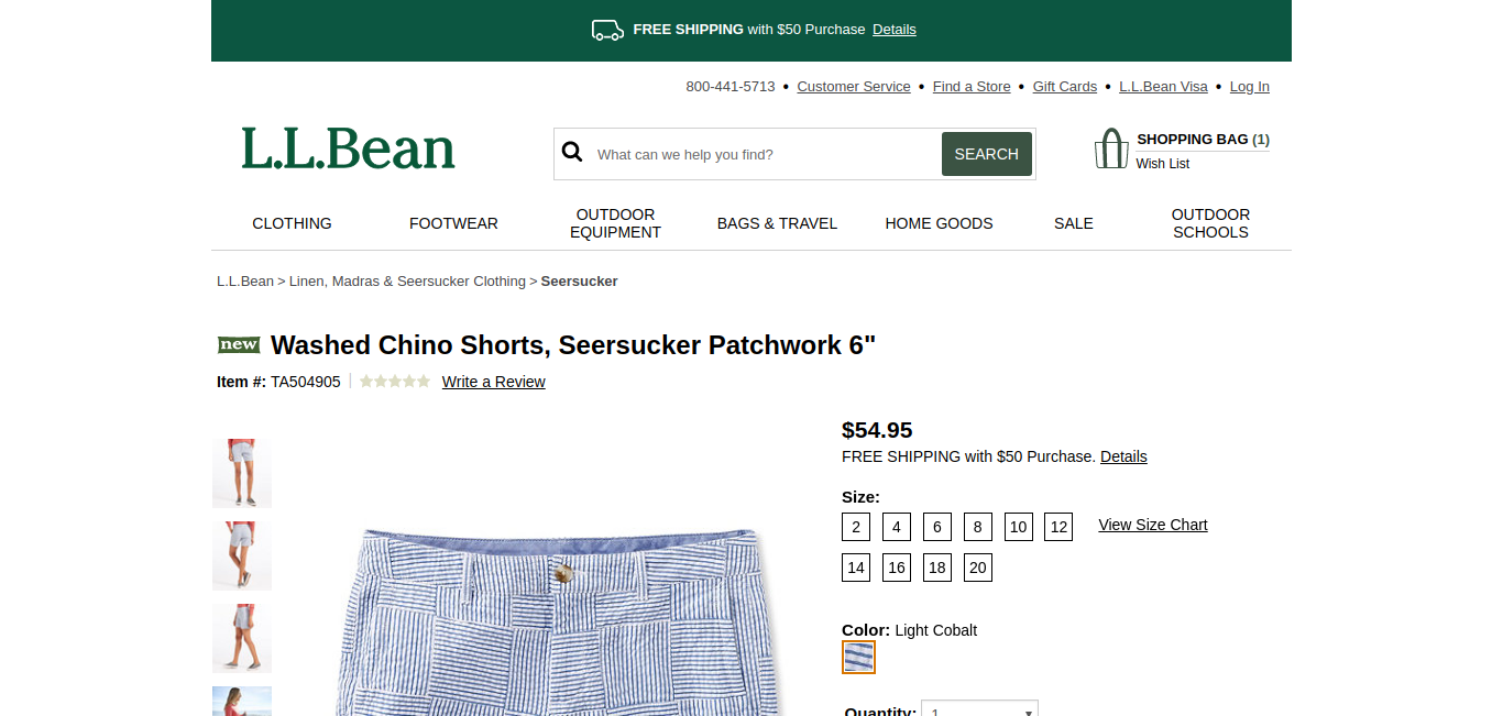
When a user lands on the product page, Free Shipping offer is displayed right below the price. Now, this is hard to miss since a user will definitely check the price before adding the product to the cart.
This establishes a sense of trust in the buyer’s mind. Displaying the offer clearly on the right page with the right information shows transparency.
2. Free Shipping offer should not be limited only to Site-wide banners
“Banner blindness is a phenomenon in web usability where visitors to a website consciously or subconsciously ignore banner-like information, which can also be called ad blindness or banner noise.”
Believe it or not, this is an actual issue existing today. The human brain has quickly adapted to (not) seeing the unnecessary blast of banner ads on every second website that they visit.
With time, people have found a way to filter relevant information from the noise.
Hence, keeping the Free Shipping offer or the Free Shipping banner just limited to a site-wide banner or just as a header is not recommended.
How should one proceed in this case?
This calls for a very simple yet an efficient design tweak. All you need to make sure is that the Free Shipping information doesn’t leave the user’s eye even for a single second.
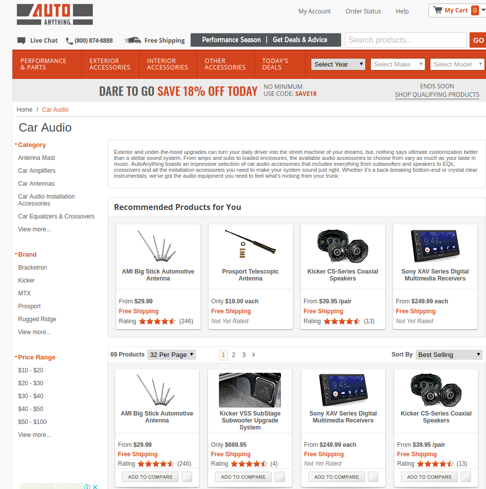
Notice how Auto Anything displays the Free Shipping offer on the homepage banner as well as on the header.
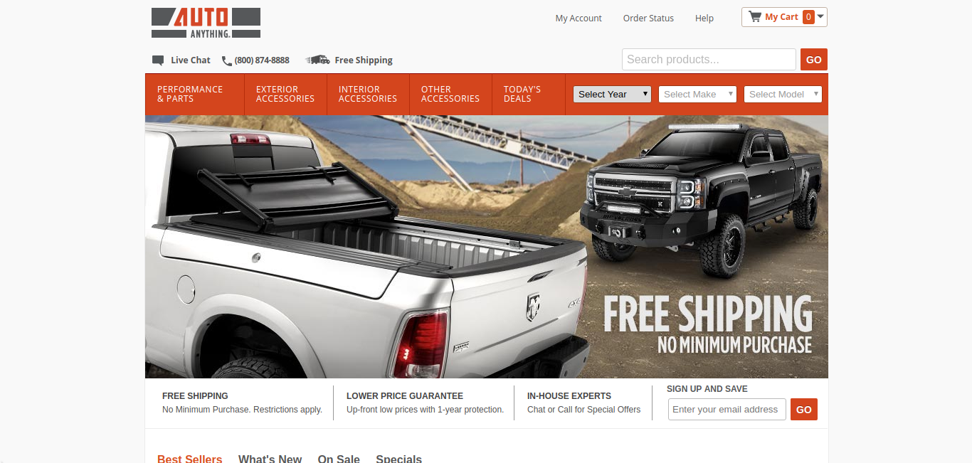
But that is not all. Once you select the category and start searching for the products, Free Shipping information is displayed in bright fonts on every eligible item. This makes it very clear to the customer from the very start. The website has already gained the customer’s trust before they even started shopping.
3. Thinking out of the box; going above and beyond
Sears managed to find an unusual way to display their Free Shipping banner to the customers. When you add eligible items to the cart; no sooner do you try to switch tabs than they show this big pop-up which displays that items in your cart are eligible for Free Shipping with the option of Same Day Delivery.
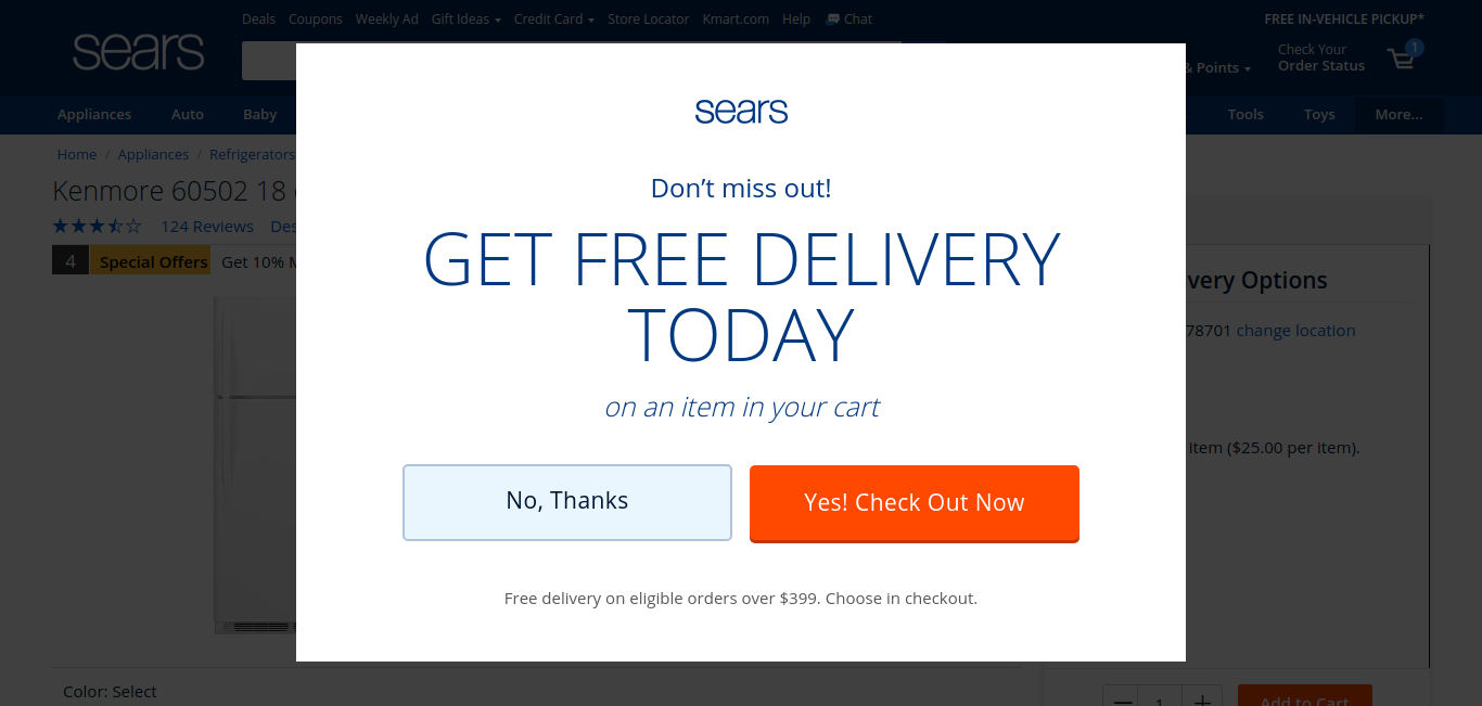
Now, we cannot call it the most effective way to display the Free Shipping offer due to the sole reason of banner blindness that we discussed earlier.
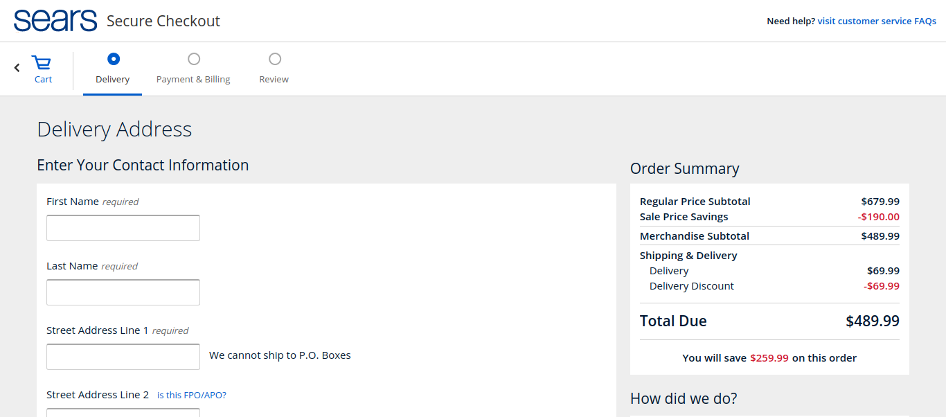
However, there is a high chance a user may stop and have a look before going where she wanted to. Once she clicks on the checkout button, the prices clearly display the discounted shipping.
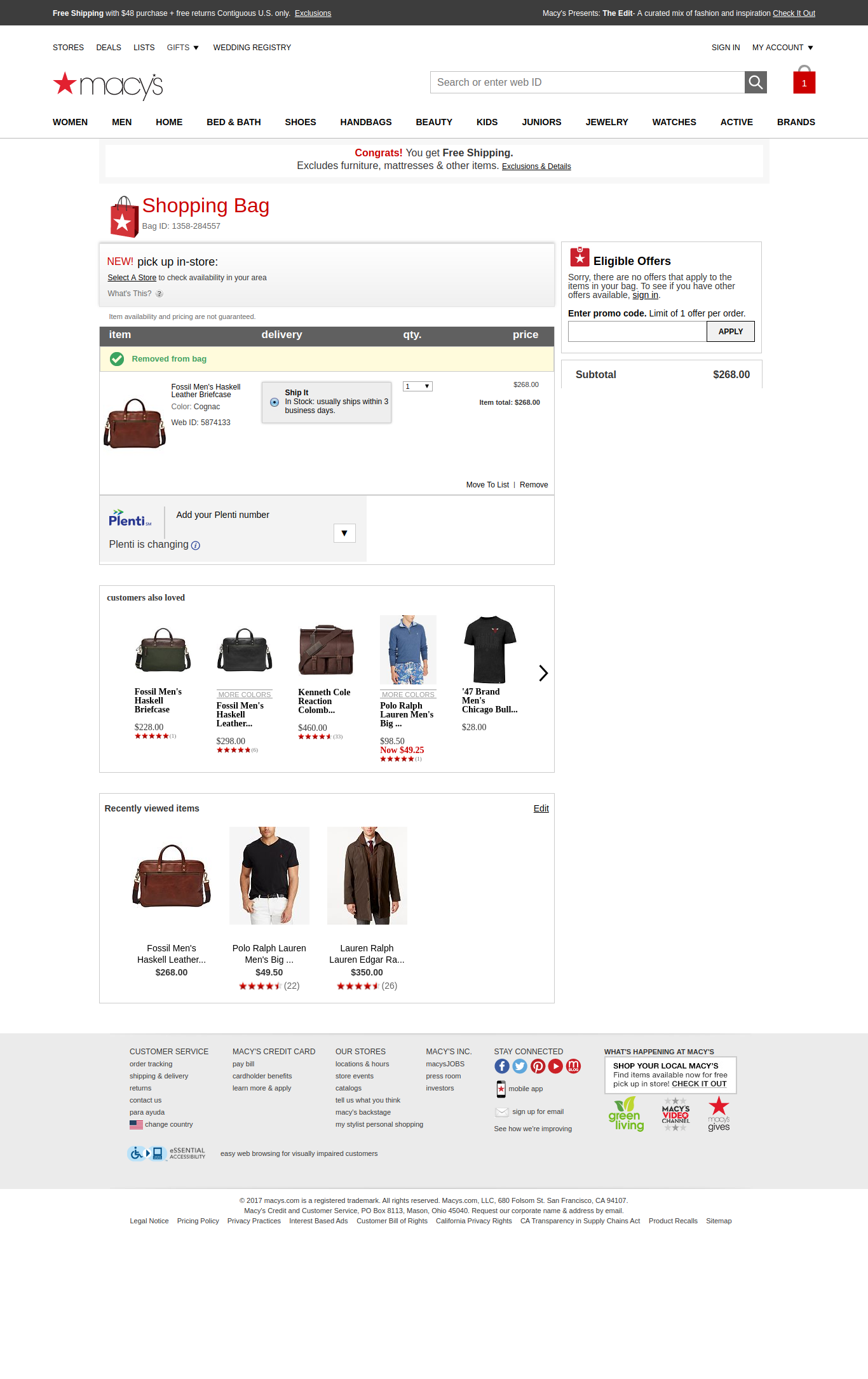
Now take a look here. Macy’s cleverly displays the exclusions right there on the page. This makes it very clear for the customers to know which items are not eligible for Free Shipping.
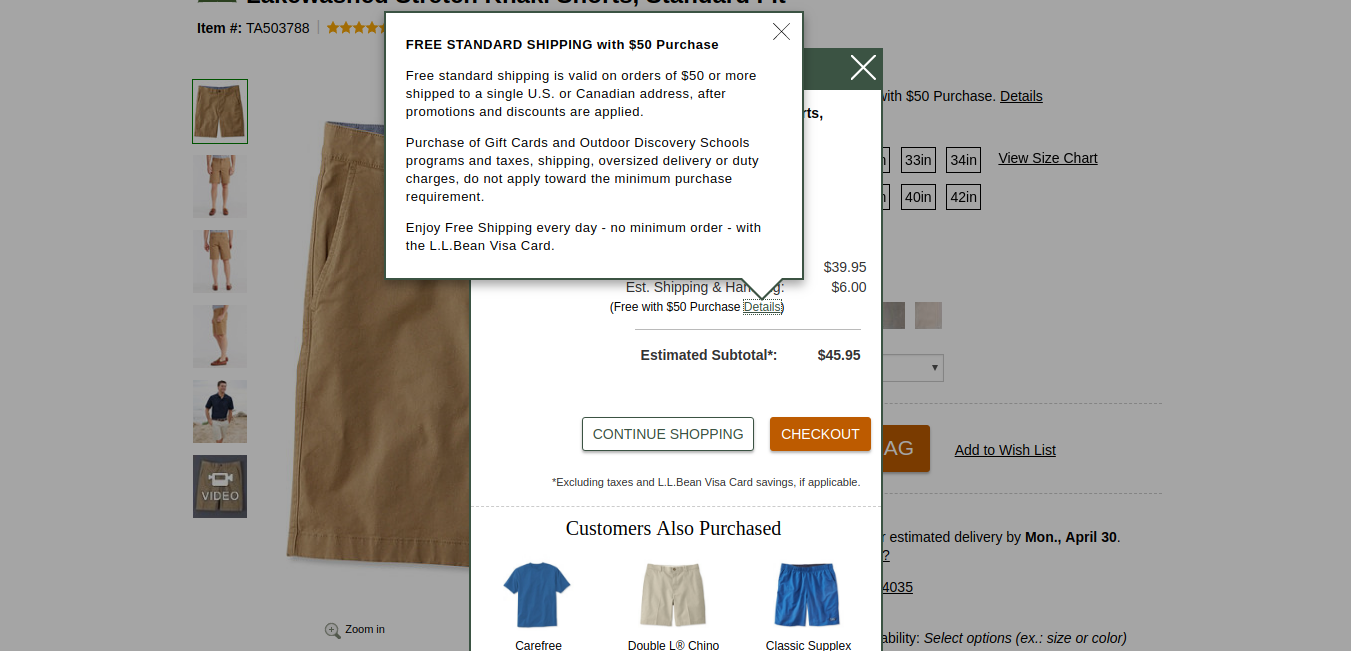
 L.L. Bean hit the home-run with this laudable display of the Free Shipping offer right on the product page. All a user has to do is click on the details link before adding any product. And there it is; all the exclusions displayed very clearly along with the shipping threshold.
4. Use the Dynamic Display method
What is Dynamic Display? In terms of UX design, a dynamic design is something that adjusts the displayed information according to an individual’s preferences and choices.
Here is one classy example. The Free Shipping threshold on Walmart is $35. When an item worth $15.60 is added to the cart, the website intelligently suggests adding items worth $19.40 to get Free Shipping on that particular order.
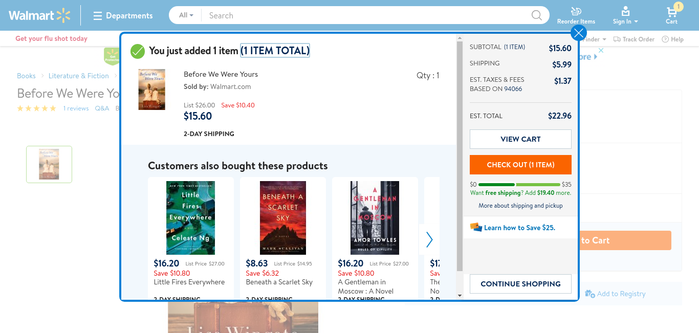
This suggestion changes every time a user updates the order. Using dynamic display provides a sense of personalization to the customer and builds trust. The transparency about the free shipping offer provides confidence to the customer all the while allowing customers to buy more from your website.
The Do’s and Don’ts of Free Shipping Offer
Customers do like surprises. So, surprise them with a good offer or special discount at the checkout. Sometimes, websites surprise them with a list of exclusions not displayed clearly or minimum threshold being displayed at the checkout.
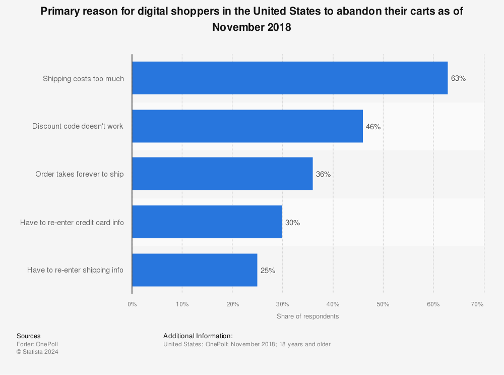
A worldwide average of close to 30% people abandon their shopping carts due to unexpected shipping costs. So, what is unexpected here? It is nothing but lack of clarity about the Free Shipping offer.
Many websites may put a small asterisk at the end of Free Shipping header which signifies hidden conditions. Unsuspecting users may find it annoying to discover hidden shipping cost once they have added the items to their cart.
To Ensure That Users Clearly See Free Shipping
Placement and flexibility of ‘Free Shipping’ offer are what matters the most. All you need to make sure is that:
- Free Shipping offer is clearly visible to a customer on every step of their buying journey.
- Any threshold or exclusions related to the offer should be displayed clearly.
- Before the final checkout the free shipping offer is displayed distinctly and placed near the “buy” button.
- The Free Shipping offer is not just limited to homepage banners.
- Either remove half-baked Free Shipping offer or clearly state the exclusions and threshold
Make your customers feel comfortable while shopping and they will definitely return to your website. This is the foremost step in attaining lasting customer loyalty.


