Trends keep changing in every field, the base of all being the raising customer expectations; ecommerce portals are no exceptions.
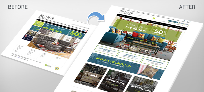
Taking a look at the 2015 trends so to know if they are getting carried over to 2016, flat designs remove shadows, depth effects, gradients and 3D effects for the best simple look giving an excellent match for responsive designs and are surely getting forward to 2016 as well. In the queue is the scrolling web design which looks great and also highly suited for story like designs limiting the number of user clicks; this is sure to be seen in 2016 for the mobile trends are increasing the scrolling is going to stay a preferred user way.
Animations are all time user favourites. Well-designed classy animations enrich the website aesthetics to a large extent; to mention some of them, Loaders grabs the visitors by letting them what goes on, Hover elevates the user experience giving them feedbacks without having to click, and Slideshows are well known for clear images and videos for a stunning web design.
There are some that see their end in 2015, as in the flashy slow websites which don’t entice any user but just attempts to flirt and flabbergast rather than giving a fruitful class experience. Clean, engaging and easily usable designs alone are carried over/created new for 2016.
To mention on the new comings for the upcoming year, typographical way of using larger fonts expressively can be seen commonly, big length devices give us the privilege of using their full width where the sliders can be replaced with single high resolution images, also larger designs could be made with improved hardware. Burger menus quite prevalent in responsive websites and used for mobiles are now expected to be used in all websites and as well for the desktop drop downs. Ghost buttons virtually invisible activated via hover attract the users for secondary actions. Websites showing a lot of information can follow the pinterest way of grid for unlimited easy content navigation.
Web designers are in the urge to increase usability for people with less mobility to internet or computers. Less mobile users aren’t to be ignored but given the same access as others if we look forward to multiply the website bandwidth.
Online retailers looking for website redesign or designer working on Pretashop themes should bear in mind,
- Web design has to support the nature of the online store and regular redesign is something that’s a must keeping in mind flash designs is dying out.
- Converting the visitors into customers is the goal at the end of the day; make sure not to make them go away from your web!
- Not every trend needs to suit you. Check for the trends you feel feasible, test them, dry run before you put in to live so that they add a value rather than getting down sales!
Turning smarter to check on using the trends or rummaging for more to give the best to your website? Looking for the best web designers to perform the same for you? Expertise in ecommerce solutions is an asset we promise you; just ask us for more details.


