Building a great fashion ecommerce store invariably depends on having great products. But then despite having genuinely wonderful clothing or cosmetics or jewellery, you may fall behind if you don’t set up a great looking online store.
What goes into your online fashion store or online clothes store, as in about the company, experience of the company in fashion, speciality of products you sell, shipping options you provide, contact details and so, really matters.
The lowest price, unique make designs are increasingly becoming less popular to impress people today for the simple reason they see most sellers saying the same old phrases and descriptions! How can you stand ahead of contemporary sellers? You may have a page that says,
- Who began the store, when and where, in a story script!
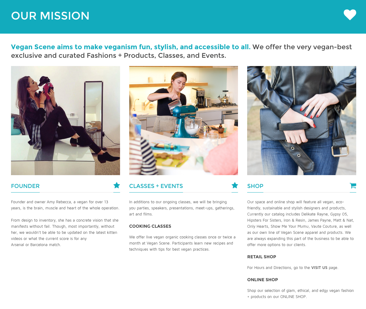
Eg. Vegan Scene, has a wonderful “our mission” section on About page where they profile their founder, explain very well the purpose of their retail location, and sum up the products that they sell both online and in-store.
- What instigated you to get this store set up and what sets you uniquely apart from others in the field!
- Phone roducts and what is your goal out of those? We’re sure you definitely don’t want to say you want to win the business but would mention what your goal is with regards to the customers, as in giving them the world’s best jewellery or so.
- What inspired you to sell clothes online!
You may provide details on the physical store as well, to accommodate people who would want to visit the shop for their buy; add on why you set up the store in the specific location and what all you provide in the online and offline stores as a whole? How about adding a mission statement? (Of course in clear simple terms and not using jargons or boasting on self!)
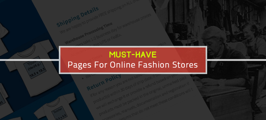
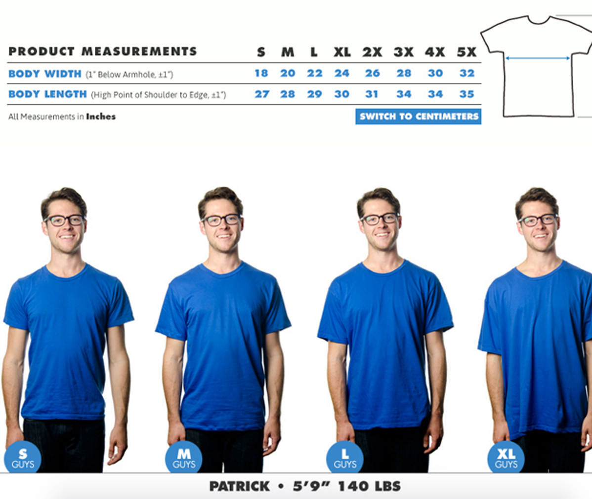
One of the known problems buying clothes or body wears online is the size & fit not being as said. While you mean 7 in men’s shoe, you may be meaning it in a specific brand while it may differ for others. How about putting up the size guidelines in each fashion product page, size & shape templates for foot wears for men and women separately, similarly for eye wears and for others? You would be definitely making it easy for the customer to confidently choose!
Eg. TeePublic‘s sizing chart is a great example of how to go the extra mile for customers who might be unsure about sizing.
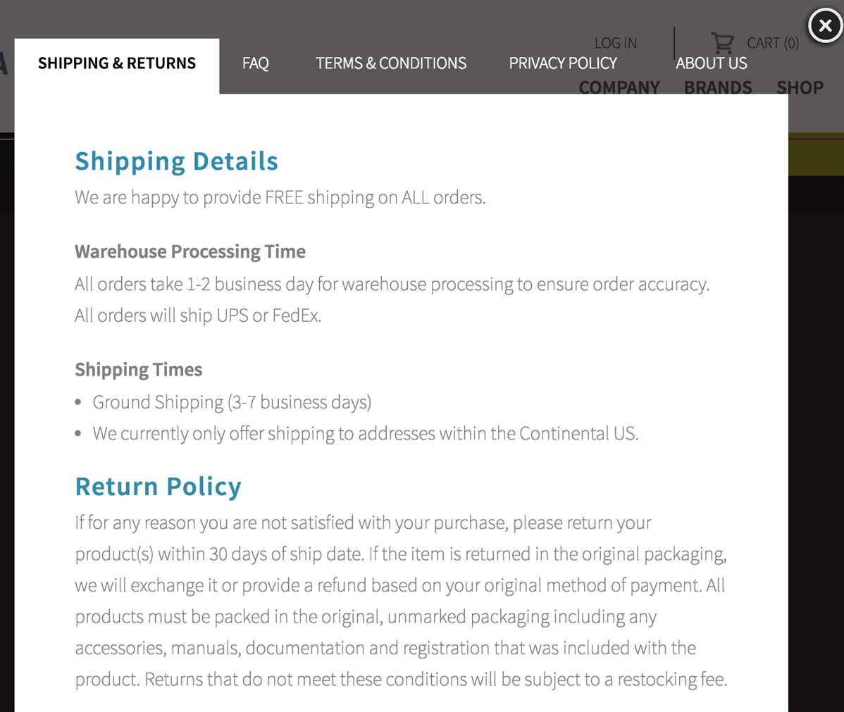
Make sure to detail on returns and refunds or exchange policies so the customer knows you care for their money and do handle the products not up to the mark. Alongside the main menu showing categories of products, it’s necessary you place the shipping & return notes as it is crucial to any buy.
Eg. Allure Eyewear places their information on returns in an easily accessible modal popup window:
Apart from these, include on shipping modes, turn-around times, tracking methods, tax information, shipping taxes, and all clearly in the product summary page so that there’s nothing hidden from the customer!
Don’t you have a blog site yet? Make sure you have one where you put up customer feedbacks, product details, trends on various categories, what’s going on in the industry and anything that you may want convey people!
Right photo editing, apt price tag, supporting media file, fabric details, brand tag, security seal, size tag, clear colour, sufficient details to say why your rates are more than the customer perceived value and all that’s possible you can let the say the customer to instil his confidence on you, to be set up in the web pages. Need assistance here to facelift / redesign your eStore in the lines? Ask us now!


