As soon as we hear about Pop ups, the first question that comes into our mind is do they really work? The surprising fact is – Pop ups generally have decent click-through rates – often around 2% – higher than other kinds of ads. Not getting desired conversions even after using several pop ups on your website? If yes, you need to reconsider your pop up design practices.
The crux of the matter is – Pop ups work. Actually, we can make them work better by designing appealing pop ups. Your Pop Ups should be successful in grabbing the attention of your online store visitors.
Here are the 10 secrets to creating effective pop ups helping to increase conversions on your online store –
Unique Headlines
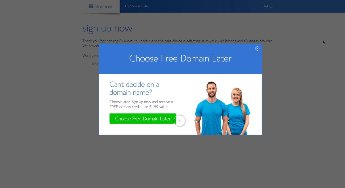
Instead of writing “Subscribe to our Newsletter”, if you write “Get a Free One Year Subscription” would be more effective. It is extremely important to craft unique headlines.
Your website pop ups need to grab the attention of visitors within minimum time. The headline of the pop up should provide benefit to your visitors. Then only, it will be able to attract the visitors.
Timing & Frequency
The secret to successful marketing strategy is presenting right offer at the right time. The same applies to the website pop up. If you present a pop up to visitor immediately after they enter the website, probably they would exit the pop up without having a look at it.
Instead, show your pop up after some seconds to your visitor. In that case, they may be willing to see what you have to offer.
Also, if you display several pop ups frequently to the visitors, one after the another, you may annoy your visitors and they leave the website without purchasing anything.
Design Representing the Brand
The design of your pop up should match with the other elements of your website representing your brand. Design of the pop up can help you in staying different from your competitors.
Use attractive colors and readable fonts in your website pop up design which can help you in converting your visitors to customers. An attractive pop up design consistent to your website and brand image would enhance the website experience too.
Relevant Offer
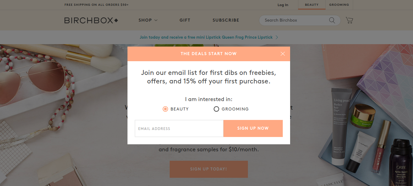
The offer you are giving out in your pop up should be relevant to the page on which it is appearing. For example, the pop up on your product category page can have a discount offer on that particular category. Whereas, a pop up on your blog page should have an offer to download an e-book.
The website pop ups showing irrelevant offers annoy the visitors and can never attract them.
Attractive CTA
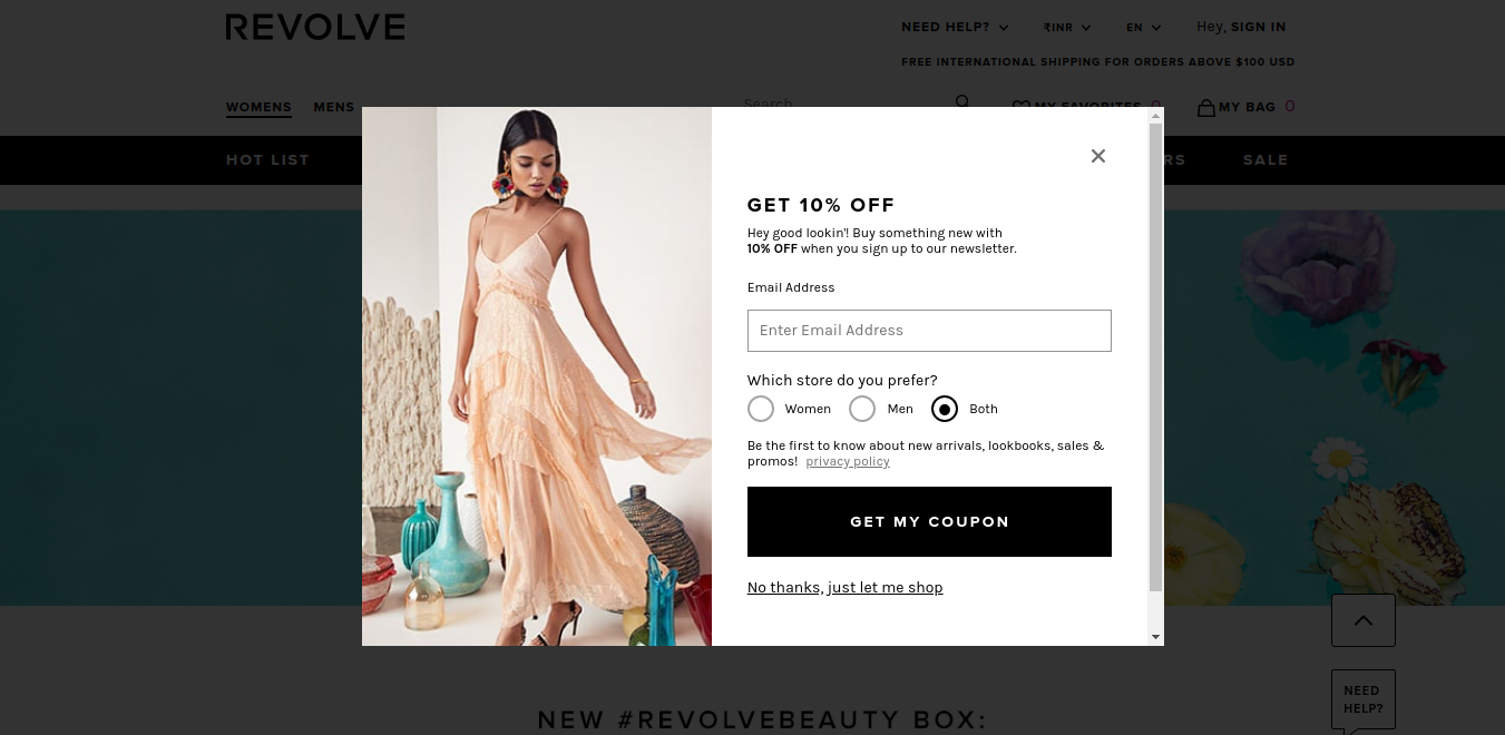
The color of the “call to action” button should be contrasting to its background. Also, your CTA content should not be too generic like “Submit”. Ensure it is precise and to the point. For example “Grab 50% discount on shoes.”
The color and text of the CTA plays a major role in the success of a website pop up. Thus, you should choose these elements intricately.
Mobile Pop Ups
The mobile experience is different than the desktop experience and so the pop up design should be different too. The popular resolution for mobile devices 360X640 and for desktop is 1366×768.
Also, the space is limited on mobile devices. Thus, longer sentences and large images cannot be used for pop ups for mobile devices.
Smart Opt-Out Text
Whenever a visitor clicks to close the pop up, there should be a message which should convey a fear of losing something valuable.
For example, there is a pop up asking the visitors to download an eBook named “How to maximize organic traffic to your website.” As soon as the visitor clicks to close the pop up there should be a message – “Are you sure you don’t want traffic to your website?”
Creating an Emergency
Showing that an offer on your website is for a limited period only through a pop up is a great way to increase conversions. You can include a countdown of days or hours left for the offer to be applicable.
This can encourage your visitors to take benefit of the offer as soon as possible which can help you in improving sales. Generally, you can use this strategy during holiday season while introducing new offers.
Use Visuals
Using visuals like a photograph of a beautiful model or any eye-catching picture in your pop up can help you to grab the attention of your visitors.
Pick the Right Format
You can use different types of below-mentioned pop up formats –
Entry Pop ups – Shown when visitors enter the website for displaying the offers or increasing email subscribers.
Exit Pop ups – Shown when visitors exit the website for retaining them.
Timed Pop ups – Shown to the visitors after they stay on a particular website beyond a specific time.
Scroll Pop ups – Shown to the visitors after they scroll a specific percentage of the web page.
Click Pop ups – Shown to the visitors after they click an image, banner or an advertisement.
Just use the right kind of format depending on your target audience, type of business and buyers’ journey. Choosing wisely is quite critical in this matter and so just review each of them and decide the best for your business.
Conclusion: Creating an Attractive Pop Up Design
Pop Ups can be a great way to improve conversions of your website, provided they are crafted very well using all the tweaks mentioned above. Consider a pop up to be a bridge which can convert your visitors to customers and thus should be ensured that it is strongly built.
Besides, all the above pop up design ideas, you also need to check that the exit button of your pop up is clearly visible, otherwise you may end up in increasing bounce rate of your website.
Need experts’ advice in designing pop ups for your store? Just get in touch with QeRetail – your eStore Handyman.


